


Collection 35: The Atlannipeg Transition
 6 Comments
Since it's not likely many more Atlanta Thrashers concepts will make their way to my inbox now, I thought I'd share some of the ones I've been hanging onto. But within the same post, I'll also transition to some Winnipeg works of art. And while a name still has yet to be announced for that team — Jets appears to be the favorite of our designers.
This is probably the last you'll hear from me until June 21. I'll be on vacation until then. However, I have prepared several concepts posts to auto-publish while I'm away. Check back on Monday, Wednesday, Friday and next Sunday for new stuff.
And as a side note, your comments on these posts may not be approved until I return. I'll be at sea during my trip and therefore likely without Internet access. But we'll see how that goes.

Reader Comments (6)
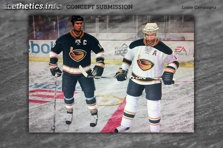
The 1st one by Louis, it's a shame those were not the real jersey's for the Thrashers ... they look sharpe and not the joke like ALL of the Thrashers jersey's since day one (that includes ALL home, Away and 3rd jersey's).
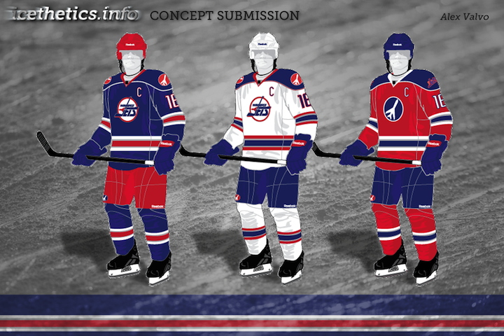
Alex's Jets concept is awesome. The red helmet with the blue jersey is amazing. I love the red jersey too!
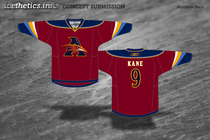
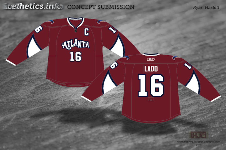
Louie's Thrashers unis are so great in their simplicity. Too bad they never went that route. The other concepts, not spectacular but not horrible. I'm curious as to how Ryan came up with that wordmark, as I've never seen anything like that before for Atlanta - kind of looks more appropriate for New Orleans.
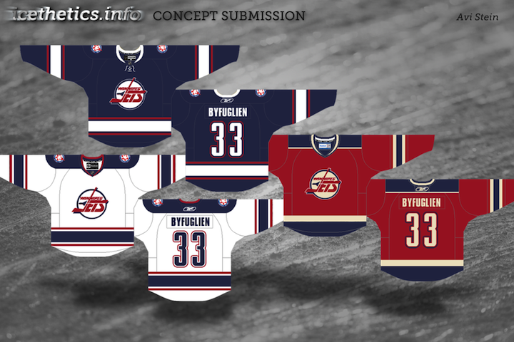
The Jets concepts are pretty darn good. On Alex's one thing that I'm not a fan of is the white piping on the blue jersey's shoulders; I'm just not a big fan of using different-colored piping when the shoulders and body are the same color. I might consider making the shoulders white with the piping red, if the thing's not solid blue. On Avi's, I like the idea of flipping the colors on the 90s logo, giving it a different yet familiar feel. I'm not crazy about one particular element of that third, though (but I won't waste a lot of time beating that vintage creme-colored horse into the ground again).
That first ATL concept makes me very sad. Why? Because it's PERFECT! The Thrashers should have had those jerseys from day one, and the fact that they'll never wear something like that is disheartening. I know Canada is happy to get a team back, but I'm a big supporter of trying to grow hockey in the south - and maybe putting southern teams into classy jerseys like this could be a small but significant part of bringing hockey to the south.
Those Blues-Hawks jerseys look amazing.
Avi's winnipeg jersey's are amazing... I know that dude above me doesn't like the creme vintage, but I'm a fan... big fan! Im a huge Penguins fan and I would rock that red winnipeg jersey any day! good stuff avi, good stuff... as for the first atlanta concept... i agree with everyone else, why didn't they wear those in real life???