Monday
Jun132011
Collection 36: Conceiving a Classic
 Monday · Jun 13 · 2011 | 9:00 AM PDT
  10 Comments
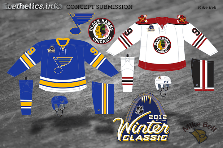
 If all has gone according to plan, I should be spending the day on the high seas en route to some tropical island somewhere. But I'm going to put you guys in the opposite state of mind with something a bit more wintry. Collected here are some sharp Winter Classic concepts.
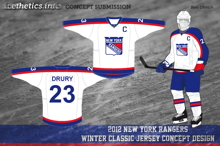
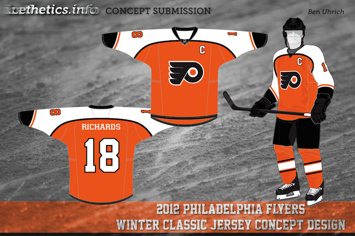
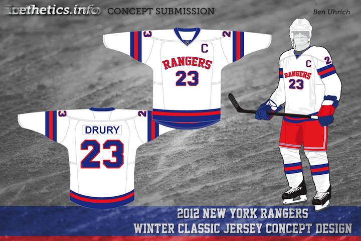
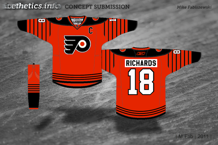
The most prevalent rumors have the Flyers hosting the Rangers on the day after New Year's 2012. Of course that hasn't stopped some from hoping for a Western Conference match-up. Look for a new set of concept art on Wednesday.


Reader Comments (10)
I am a huge blues fan and I have been saying that the blackhawks and blues should be in a winter classic. I love the logo and the blues early 70s style jersey. I think the blackhawks jersey would look better with a black line on top of the red line at the bottom
everything in this set is amazing except te rangers basketball jersey. i'm particularly fond of the blues jersey though
Best thing about these concepts? No "vintage" non-white!
I like the idea of inverting the 1946-47 Rangers jersey (they didn't have a white jersey until 1951), but the positioning of the sleeve numbers is awkward at best. I think it'd look better without the sleeve numbers, if the stripes are kept that high up (Reebok would probably push them down to the elbow panels anyway, though).
The Blackhawks concept is an interesting hybrid, particularly since the 'Hawks haven't ever worn that particular configuration on their sleeve stripes (it's been black-red-black since '55, save for a few seasons where the sleeve stripes were pushed into the black cuff, effectively eliminating the bottom black stripe, although the black-red-black pattern remained intact on the waistline and socks).
Thank god I'm not the only one who thinks the Blues and Hawks should have a winter classic at Busch. Only 4 months 'til October, LET'S GO BLUES!!!!!!!!!!!!!!
The first Ranger jersey is a been there done that and it didn't go over too well. when the GM John Ferguson was fired, the Rangers went back to the current jersey and Ferguson used the design in Winnepeg, The second set has some "Old School" looks, with the Flyers using the Phialdelphia Quakers designs. I would just make the Rangers and the numerals match
The second one would be better in black i think
I love the Blues and Hawks set. I've always thought that a Blues-Hawks classic at Busch Stadium would be a good idea, but maybe that's just the Blues fan in me talking. Well done on the logo concept too and both jerseys at that.
Massive thumbs up for the Hawks/Blues. Hopefully we get that Winter Classic sooner rather than later.
Nice work on the Blues. The one thing though that you need to rectify, no lace front. The laces on the Edge jerseys seem pointless, and the Blues never had laces until the current 3rds. Now if that was a regular jersey.
Mike Fabiszewski's Flyers/Quakers combo looks great. I would really like to see Philly go in that direction.