


Collection 37: Rebranding the Ducks
 7 Comments
Not to rub it in, but once again, if all is going to plan, I should be docked in Jamaica right about now. Anyway. I don't keep a tally of what teams get the most love from our concept artists. But if I did, I'd wager the Ducks must be right at or near the top of such a list. I guess there's just something about the Ducks brand that makes everyone want to rebrand them. So today I present some of the many attempts at fixing the look of Anaheim hockey.

Has there been another NHL team since the '90s expansion with such an automatically identifiable color scheme? When you see that combination of eggplant and jade, you instantly know what it represents. The next closest thing might be the black, silver and blue of the Lightning — and even that's going away now. But I digress. Another set of concepts will auto-publish on Friday morning if I've set up everything properly.

Reader Comments (7)
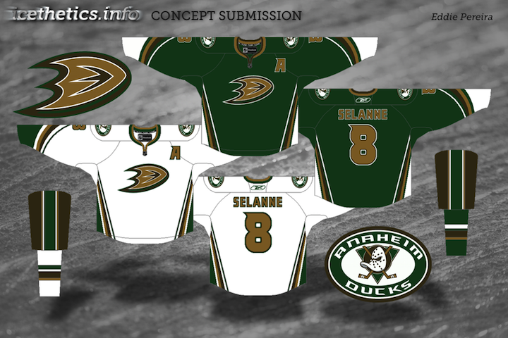
I love Eddie's set on top
you forgot to mention San Jose, I'd say the teal/black/orange scheme is pretty identifiable, plus its a color scheme that has remained pretty much the same since their induction in 1991.
I understand that you're a dyed-in-the-wool Lightning fan, but do you honestly believe that their black, blue, and silver color scheme is 2nd on the list of most instantly identifiable hockey franchises?! Not the Sharks? Avalanche? North Stars? Flyers? Nordiques?
Don't get me wrong, this is a ridiculous thing to even argue about in the first place, but to claim that the Lightning's color scheme is even in the top half of most recognizable hockey franchise color schemes just seems like blatant homerism. Or, at best, just a innocently skewed vision of the league.
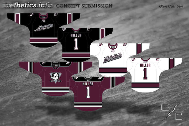
I really really love those Mighty Ducks ones, the RBK edge Paul Kariya ones...... I would buy a few of them thats forsure
Eddie's concept is the best ducks concept I have ever seen !! Great use of green and gold, with a touch of black as black and orange on a team named the ducks reminds me of certain looney tunes character . This is the way the ducks should look IMO.
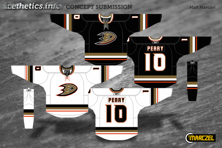
I don't think the Ducks should be using too much orange and black. That image belongs to the Flyers.
I also don't think the Ducks would go black and purple, even if the Kings do look like they may be eventually abandoning the purple. That would be like the Rangers switching to red and green (and then putting horns and a tail on the shield). I saw that and thought, "this has to be a joke", and so maybe it is.