Friday
Jun172011
Collection 38: Seeing Stars
 Friday · Jun 17 · 2011 | 9:01 AM PDT
  11 Comments
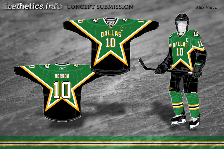
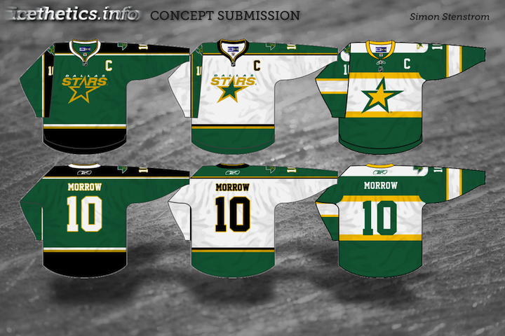
 Sadly, my trip will be wrapping up soon but as promised, I did prepare a new concept art post. Today's theme is stars — of all varieties. We'll start with the Dallas Stars, work in the Minnesota North Stars, and finish off with an All-Star design. Enjoy!


One more auto-published post awaits Sunday before I get back on Tuesday.


Reader Comments (11)
Lovin' Simon's alternate design.
Wow. I hate Dallas' current uni set... But for some reason im totally cool with Alex Valvo's design, I love it actually!!! It makes total sense to me, good job!!!
Also love Simon's 3rd design, big fan of that one. If only the stars would make a home and road design of Alex's and make Simon's the alternate, they'd be much better off..
i love that dallas 3rd by simon its amazing!
The all-star jersey looks way too Ottawa-y for my liking. Which makes sense, what with the 2012 ASG being in the nation-to-the-north's capital, but as a Sabres fan I just can't accept it. I'm a fan of the 3rd jersey in Stenstrom's design.
The first one is perfect, just one problem. PLEASE put a real logo on the front, not the "Dallas" like the home and away.
Simon knocked it out of the park! that would be a top 5 set if the stars adopted it
That first concept is very nice. The "DALLAS" wordmark and number on the front just look right on the star-pattern jersey.
Alex's concept is SUPERB! My only concern is whether that pattern could be achieved on the EDGE template and applied in reality. Does anyone know if it's possible?
Alex's concept reminds me quite a bit of the Stars' pre-Edge uniforms. I would love if the Stars could return to that uniform, and perhaps brighten the green a tad. It would be perfect.
The third/alternate designed by Simon is my favorite. I would love to see that in action. I'm not a fan of vintage jerseys or vintage looks at all, but I love that design. It's unique but has a vintage touch that reminds me of the North Stars. The home and away designs are great as well. It's not hard to beat Dallas's current jerseys, but Simon's designs need to be look at by Stars management. 5 star vote. Great job.
I like Simons and Alex's - The stars suck right now but they could look great in any of those. Not exactly sure how they could ever go Retro since they're a relocated team. Well unless they plan on a N logo like the North Stars... Or else their boring first jersey they had in 1994. Bring back Mooterous! Logo sucked but jersey was a nice design....