


Sunday
Jun192011
Concept Collection 39
 18 Comments
Today we go without a theme. Just a few random concepts I thought you might appreciate.


This is the final auto-published post of the week. I should be able to get the site back to normal in the next couple of days. Hope you've enjoyed these concept designs during my absence.

Reader Comments (18)
That is the most awesome Preds concept I have ever seen, and it makes for nice color coordination versus my Jackets. Bring on the butternut!
The Nordiques conceot is nothing short of perfect .
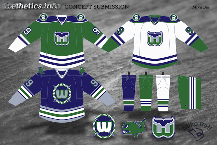
the blue whalers one makes me feel bad for the whales.
Very strong showing today. I didn't give anything less than 3 stars. Love that Whalers concept.
while i'll never be a huge fan of the dijon mustard color, that preds jersey actually looks really nice, something totally different from every other jersey in the league. and the nords set is quite awesome as well
Those nordiques and predators jerseys are great. I would really like to see them actually worn in a game. As an Islanders fan these black jerseys are kinda freaking me out. I hope they dont try to completely redesign the jerseys and use colors that are not a part of our teams history, like black, but there was one a few weeks ago that I did like in black
islanders concept is fantastic, like the black coloring
Chenard's Nordiques concepts are perfect. At first glance, they seem a little underdesigned, but I think that fits perfectly with the French design sensibilities. The stick in the fleur main crest is very nice and subtle too. I'm usually opposed to jamming a stick and/or puck in to a logo where it's unnecessary (see: Thrashers, Sharks, Panthers), but it looks very nice here. The 3rd jersey is where it might be nice to see some more action happening. Incorporate some of the fleurs and take that blue back to the old powder/baby blue. Very cool, though.
I'm surprised by how much I like Majeski's Predators concepts. I hated that mustard sweater, but with the right logo, they look very nice. Even the colored vertical piping running down the front, which I'm usually not a fan of, these look nice because the rest of the sweater is so clean. I'd like to see Nashville go all mustard like this, rather than their current, schizophrenic color scheme.
The Nordiques one is absolutely phenomenal !!!
The Preds one is good and would be great if the vertical piping was removed.
The rest are OK.
The Nordiques is amazing!!!! I love the Preds one too! Great work everyone!
Still not sold on the full-on mustard, but the mustard-with-white (mayo?) is really nice.
Not a fan of the attempts to Mets-ify the Islanders color scheme in general, but even aside from that, the wordplate, captain's lettering, and the logo are all too tightly bunched to be really effective IMO.
The Nordiques logo concept was AWESOME and i'm now a fan of mustard yellow.
not a bad collection of concepts.....
quebec, good design, but i think WHEN they come back, they will be a team that has a complete re-design & new logo / name.
nashville, thats a VERY bright gold jersey, think it needs a fair bit more navy blue just to tone it down a bit.
ottawa, mmmm, a bit plain if it's a retro / heritage / anniversary jersey, think it needs a few more stripes maybe?
hartford, love that, wouldnt change a thing!
isles, meh......actually, thats probably a bit harsh of me, i actually do like the colors, just not sure about the script word logo.
Love the Mustard... love it!
Love the Nordiques and Preds concepts! I genuinely hope this is very close to the direction Nashville takes with their update.
Les Nordique jersey is awesome! I woul have liked to have seen what the numerals would look like, though.............. great look!
Nordiques - looks a bit plain to me, i do enjoy plain jersey's, I just think it needs something more... anything more maybe some light piping on the first 2
Pred's - I wasn't a huge fan of either at first but the away's look pretty good, better than what was debuted last week- the Home... A little too much mustard for me.
Sen's - Not a fan at all, I'm very against retro jersey's, I belive a new jerseys is a rebranding of a team and going retro doesn't appeal to a new and improved team.
Whale - not a bad concept at all - I'm still very against them using the same logo for anything other than a sholder/pants patch - give us a new logo something that would say BOOM We are HERE
Islanders - The only thing I like about it the black... and it might work if I didn't automatically think of the New York Mets for baseball, similar color schemes but doesn't have to be that close.
Kudos to all that make concepts makes the days go by quicker
love david's nordiques concept! holy jumpin'