


Tuesday
Jul262011
Collection 44: Some More Jets Sets
 20 Comments
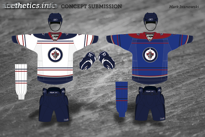
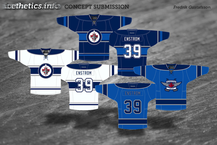
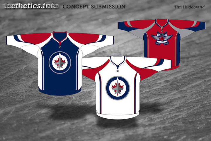
Everybody seems to be taking advantage of the "jet-set" puns lately, so I figured I'd join the crowd. Tonight, a fine collection of Winnipeg Jets jerseys for your enjoyment.

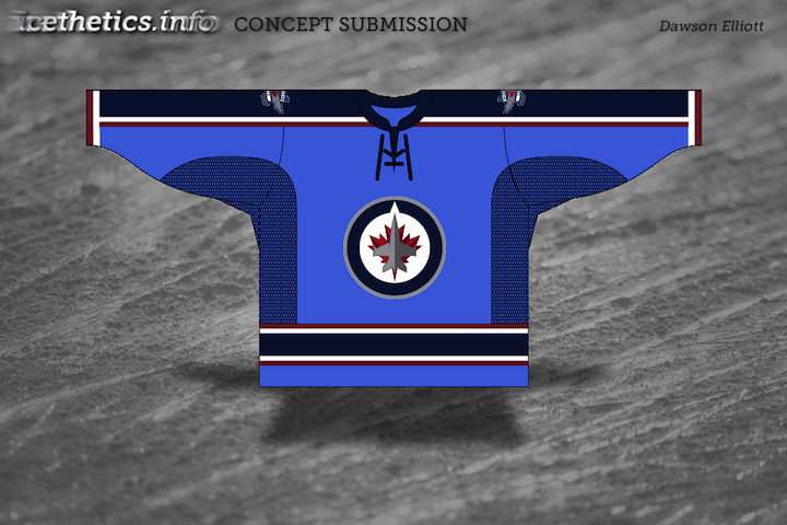
That last one would just be absolutely hysterical! One thing the team has said about its uniforms is that the only red on them will be the maple leaf. So all these red stripes are just not meant to be. More Jets concepts coming Thursday!

Reader Comments (20)
LOVE the first 3 sets. Well done gentlemen...
I'm expecting 2 tone blue similar to Fredrik's design. I really like that set, my favourite for sure.
For Ryan's design, when I first saw the numbers I was turned off, but the more I look at them, the more I like them, they're so different from any other teams regular jersey numbers (except maybe the penguins 2011 classic uni's) but i love it, they have character.
I REALLY am liking Ryan's design.
I don't like how blue is the new black. I'd really like to see them go with a red home jersey or some of the concepts to feature red more prominently.
I have a sneaky suspicion that the silver, dark blue and light blue used on the jets website will be incorporated into the jerseys. It's a shame there won't be red however cause Ryan's concept uses it perfectly.
Yay, I finally made it. ;)
some very very good sets here, get the feeling that tim's could be the typical rbk template, if it is i would be a litte bit disappointed but it could be a lot lot worse.
I'm a big fan of Ryan's too. When all you've got is unoriginal red, white, and blue (Ok, and silver) to work with, that's a pretty good outcome.
Yes, yes, and more yes to Fredrik's concept.
I think we're done here. Now, to buy the alternate...
Ryan & Fredricks are the two best I've seen for the Jets so far. part of me wants to say swap the grey stripes for red in Fredriks...
both really good,
The Jets should use one of the Thrashers templates
Love Mark's - my only criticism is that the sock seems a little plain. I think it could use a thicker blue stripe either in the middle or at the bottom of the sock.
Fredrik's design is GORGEOUS.
HA! Shouldn't that last one say "WINNIPEG" down the one sleave?
I like Ryan's version the most!
I wonder how the back stripes near the yoke work if the name's too short (Yuen, e.g.) or too long? (Khabibulin, Letorneau-Leblond?)
Ugh! Whats with these chest stripes that end at the arm pit!? They are showing up more and more, but they are awful to look at.
Am I missing something that would make the last one absolutely hysterical?
Also, I went back and made an actual comparison between the RCAF roundel and the Jets logo. They are not nearly as similar as many would suggest. I think the Jets have made it worse! The roundel is very well balanced, while the weighting is off with the Jets logo.
I'm going to vote against any palate including red. With all due respect hopefully TN takes note that there's already multiple teams with Red, White, and Blue sweaters, one of which already plays in Canada. Two-tone blue is fine - no one else has that, and that lighter shade of blue is unique.
I agree with Whiter Mage, not that I am completely averse to red, but I seem to keep voting against the designs with red in them. It just does not go well with the shades of blue I have seen.
so, definitely no red?? ok, in that case get ready for a variation on the old tampa bay colour scheme & i bet they use tampa's old RBK template as well.......hope i'm wrong......
Tampa was black and blue. Winnipeg will essentially be dark blue and light blue. I think their jerseys will be more like the Fresno Falcons or Chicago Express. That sort of color scheme. As far as the template, I don't see it being anything like Tampa Bay's. My money is on a brand new template. They've fallen down with the logo design so I feel like they'll make up for it with the uniforms.