Entries in bruins (10)

Thursday
Apr292010

Numerous Northeast Concepts

Settle in, folks. This is one of the biggest sets of concept art I've ever posted. Because I haven't had a lot of time to write new posts, obviously the artwork has been piling up. The Northeast Division seems to be the most popular for Icethetics artists, so I thought it'd be the best way to unload a dozen new designs. Here we go.


John Fusco

Had to start with this one. It's just phenomenal. You wouldn't think this type of design would make a good hockey sweater. Then you look at it. I'm waiting for an NHL team to jump onto an idea like this. Very sharp look. Well done, John!

Drew Krause

Another great Maple Leafs concept comes from Drew. He's made some updates to the traditional leaf logos, and they look great. Even the striping on the uniforms really works. Can't believe I haven't gotten around to posting some of these sooner.

Matt Marczel

By now we all know the Sabres will go back to their original uniforms next season — or at least something similar. Matt's put together a solid concept here with a nice modern flair.

Joni Oksanen

However, if you want more of a throwback feel, Joni's concept is the way to go. It's much simpler and features a royal blue just like the originals did in 1970. The only thing he's changed a bit is the striping on the dark jersey.

But either way you go would be a win for the Sabres and their fans, desperate for a return to the vintage uniforms. Sometimes you get it right the first time, don't you?

Jake Slavik

And sometimes we mix things that probably shouldn't mix. Jake's concept plays off of every era in Sabres history. And it's not ideal. Stare into those yellow eyes. Stare deep.

Frightening. Let's move onto another team.

Joshua Heckman Adam L'Italien

Joshua and Adam have both opted to experiment with brown jerseys for the Bruins — something I half expected to see at the Winter Classic earlier this year. Joshua's could even work as a third jersey this coming season if they were up for a change.

Adam's isn't bad either but doesn't lend itself well to Reebok Edge or television, for that matter. It's a very drab-looking jersey with the dark brown and the slight striping. However, I really do like the crest.

Dallas Hicks Ryan Haslett

Got a couple of new Senators concepts here. Dallas tries his hand at a Winter Classic-insipired concept... you know, in the event the NHL decides Canada should play an outdoor version of its own sport.

Ryan's isn't bad either — though without the stripes, the O just looks like a zero and nobody wants that associated with their team. Unless it's in the goals-against column, I guess. But if nothing else, this uniform has the best socks so far!

Ryan Haslett

That's right, it's all Ryan all the time for the rest of this post. This is his Canadiens throwback. Unfortunately, the numbers are rather illegible on the striped back of the jersey. Other than that, it's a nice-looking sweater with an old-time feel.

Ryan Haslett

Lastly, as a bonus, this concept is based off of a Quebec Nordiques logo that designed in 1995 but never implemented as the club was relocated Denver to become the Avalanche. And that is, in fact, where Ryan gets most of the elements of his design. I'll be honest. Makes more sense in the Rocky Mountains. Oh, what could have been.

And breathe. That was a lot to take in. Up next, it's Elliott Strauss' final rebranding set. That comes this weekend. After that, I'm implementing a new element into our concept posts. Details to come.

Monday
Apr122010

Strauss NHL Rebrand VIII

After a slight delay we pick up with Part 8 of the NHL Rebrand series by Elliott Strauss. Today we see big changes out west and sometimes change isn't really necessary — if you're part of the Original Six.

The Kings, Bruins and Canadiens are featured this week. Elliott's descriptions are in bold text.


Elliott Strauss

This is the one concept that gave me the most trouble. I went through about five drafts, with secondary logos that included a lion and an interlocking LA, but all secondaries were eventually scrapped.

I finished with this rendering of a crown and the lack of purple in favor for the Gretzky era colors of black and silver. The striping is very atypical and was inspired by the old alternates from the mid-90s.

Unfortunately I am not happy with the final product here but I'm showing it anyway. I'm thinking about a complete redo, which I will send to Chris if I get around to doing it.

It's certainly not as bad as Elliott is making it out to be. But it does look like it is still in the process of being perfected. Is it better than what the Kings currently have? Maybe not. But with a little more work it could be.

Elliott Strauss

Not many changes here. I made the stripes on the arms go white-yellow-white on the home to match the white outlining on the numbers. Same goes for the shoulders, reversed on the roads. A new thing is yellow socks on the roads as well with stripes tweaked to match the arms.

Not much has changed at all here. Kudos to Elliott for recognizing some teams are perfect already.

Elliott Strauss

Obviously this team's identity is timeless but lets face it, the home and away aren't consistent, which is slightly bothersome to me. I tried making them correspond more, it's a little hard to even explain my thinking here, but hopefully you can see the consistency this design brings. I actually sort of like the blue backdrop stripe for the logo and numbers, which plays off the current homes.

The uniform change is significant and might require some getting used to, but it's certainly not the worst thing we've ever seen. And here again, there are some classic, iconic logos you just can't change.

Just six more teams left to cover in this series. Check back for some very sharp rebrands for the Predators, Canucks and Rangers in the next two weeks.

Saturday
Nov072009

IX: Oddball Parade

As most of you noticed, I took the past week off. Plenty of stuff to talk about but not enough time to write updates. So I made a change. The Concepts section is now the Icethetics home page — rather than the blog. The blog is still there but now you'll find it in tab bar at the top of the page.

Over the past week while I was away, a fair amount of concept art came in — some worthy of posting, some not (for various reasons). But for the most part, it was all pretty odd. Tonight, we're taking a look at it.

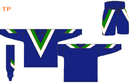
We'll start with the Canucks in a combination I don't think we've ever seen here before.
Tristan Parfect

Last week I posted a Vancouver concept after which I mentioned the Canucks had never before worn a red jersey. Naturally, I was inundated with emails telling me how wrong I was. So I should explain. That mid-90s third jersey you're all referring to — I consider it orange and black, not red. Fine line? Maybe. Let's move on.

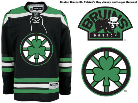
The New Jersey Devils announced over the summer that they're planning a special green-infused throwback jersey for St. Patrick's Day 2010. But what could be more fitting than the Boston Bruins going green for St. Patty's?
mcskilz

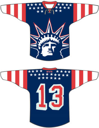
That same artist also delivered a pretty shocking concept for a Rangers third.
mcskilz

You know, I used to like that Lady Liberty logo. Yikes.

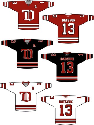
I know none of us can really imagine the Red Wings making a major uniform overhaul, but consider these for a moment.
Paul Chamberlain

Then quickly wipe them from your memory.

I also have an announcement coming tomorrow relating to a new concept art series that's starting soon. Remember the old days of Matt (aka GhettoFarmBoy) and his incredible NHL rebrands? If you don't, I highly recommend catching up. (Hint: No, he's not back... yet.)

Check back tomorrow for details on this new series.