


Predicting the Future
 20 Comments
Hey, looks like it's time again for our monthly concept post. Really sorry about that, but as I've said, the blog and logo tournaments come first because that's what most people seem to be interested in — though I recognize there's a core group here that just can't get enough concept art. This one's for you.
Today's theme deals with the future — our designers taking a stab in the dark at what could be. Bookmark this page. We'll see how close they get.
 Brian Brideau Brian Brideau |
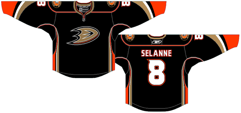
First up, Brian sent in this concept based on a description I wrote of the Anaheim Ducks' new third jersey. Based on what I saw, it's pretty darn close. There are some minor dissimilarities, but for the most part, he's got it.
The Ducks will sport their new alternate sweater for the first time on Nov. 26 against the Blackhawks. That's probably the first time we'll get to see it legitimately. |
 Jayde Garrow Jayde Garrow |
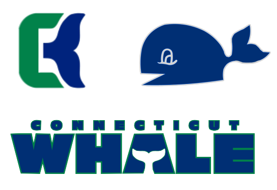
The other day, the Hartford Wolf Pack announced Howard Baldwin is taking over business operations and his first act will be changing the team's name to the Connecticut Whale at midseason. So Jayde took a stab at a possible logo. Very nice tribute to the classic Hartford Whalers mark and very simple. |
 Stephen Griesmer Stephen Griesmer |
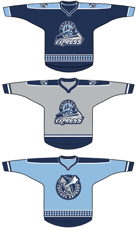
Yesterday, it was announced the newest ECHL team will be named the Chicago Express. Logos were unveiled but jerseys are still under wraps. Here's one idea from Stephen for home, road and alternate sweaters. The team doesn't begin play until the 2011-12 season. |
 Mike Wytrykus Mike Wytrykus |
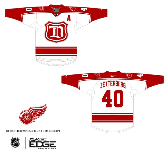
The next two aren't really future jerseys — but I suppose they could be, right? Mike's rendition of a throwback-inspired Red Wings jersey is, well, inspired. This is one example of a jersey that in no way takes away from the team's long history. In fact, it plays it up. Count me a fan. |
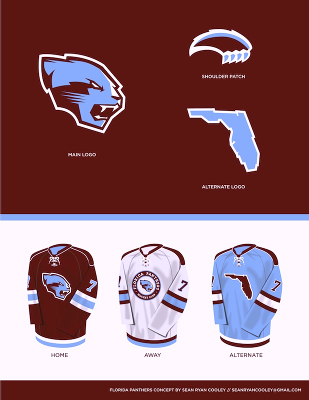 Sean Ryan Cooley Sean Ryan Cooley |
And lastly, Sean tried his hand a rebrand for the Panthers. As I told him, I feel like the colors don't work together that well, but I like the direction and the logo designs are solid. I think the Panthers have one of the best logos in hockey, but they're certainly working toward something simpler as evidence by last year's third jersey. |
Until next time... (which I do hope to be sooner than a month from now.)
