Entries in connecticut whale (4)

Thursday
Jan202011

Concept Collection 1

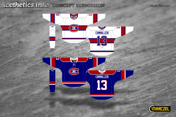
I'm testing out a new format for concept posts. It features a standardized look for all submissions as well and limited commentary from me. Some posts will still have a particular theme, but from now on, most will just be a hodge-podge of whatever's in the Icethetics inbox. Feel free to leave your thoughts in the comments.

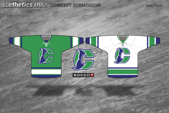
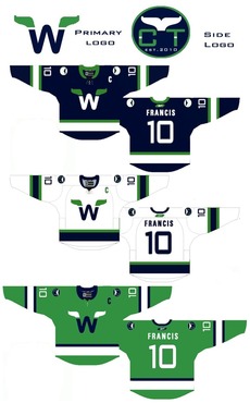
I know I said the last Connecticut Whale concepts would be the last. But Ross' attempt was too good not to share. We always talk about logo simplicity. This is one of those great designs that you can see a kid drawing on his notebook.

Unfortunately, this new format doesn't yet include ratings but I'm sure the artists will appreciate your feedback in the comments. Just added ratings. Enjoy!

Monday
Jan102011

Fixing the Whale Fail, Part 2

The Connecticut Whale concepts continue pouring in at a slow but steady pace. I'm starting a new post tonight to share them with you.


Caleb Fuller

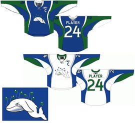
We'll begin this set with the only one that's actually made me laugh out loud as I perused my inbox. Caleb took his inspiration of the infamous Twitter fail whale. And the execution is an absolute riot.

As if the crest alone weren't enough, he's created the sweater from a combination of elements from some of the worst NHL uniforms in recent history — namely the Sabres and Senators. This may have been a joke and doesn't "fix" anything, but it wins for the laugh factor as far as I'm concerned.

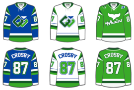
Brendan Klein

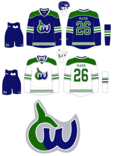
Next, Brendan has gone in a new direction while still keeping the spirit of the old Hartford Whalers. I don't think it needs an explanation as the logo pretty much speaks for itself. But I'm not sure I'm a fan of the white jersey's complete lack of blue. But maybe I'm alone there.

Christopher Lewis

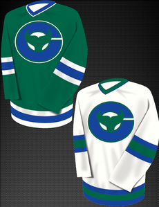
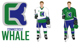
Finally, Christopher came up with a fix that simplifies the idea of a logo built around a C for Connecticut. He shows you don't have to draw a cartoon to do it. And I like that. Still, I can't help but feel like the logo is more of a fusion of the Whalers and New Jersey Devils. The pointy tail just looks a little demonic.

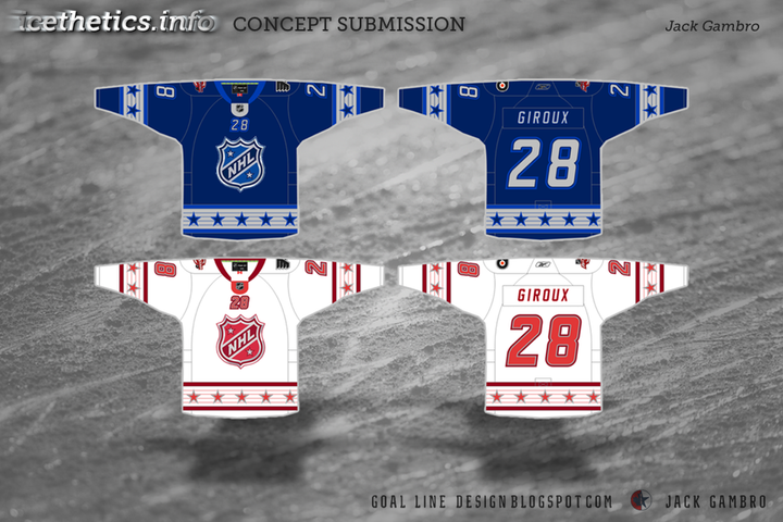
Later this week I'll have new concepts, including some All-Star designs. I think we've put the Whale subject to bed at this point.

Thursday
Jan062011

Fixing the Whale Fail

In a recent blog post about the miserable failure that is the branding of the AHL's Connecticut Whale, I put out the call for Icethetics concept artists to improve it. Here's what they came up with.


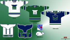
Jayde Garrow

In a concept first posted back in September after we learned what the team's new name would be, Jayde Garrow took the best if not most obvious route with his design. Quite simply, bring back the classic Hartford Whalers logo but with a unique spin.

Christian Ryder

Working on the same theme as Jayde, Christian Ryder elaborated with new style for the tale and a pair of uniforms. Thought the use of the Canucks font for the wordmark was an interesting choice, but I guess the teams do share the same color scheme.

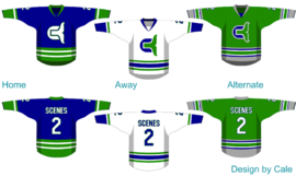
Cale Putnam

Do you see a pattern forming here? The clearest solution seems to be play on the old Whalers logo. And it's not as though it's never been done. The Binghamton Whalers merely turned the Hartford logo on its side back in the day. But I digress.

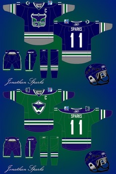
Cale Putnam brings us a full uniform set with his concept. Perhaps the best part is the Whalers-inspired striping on the green alternate sweater. And overall, I have absolutely nothing to complain about here.

Joshua Heckman

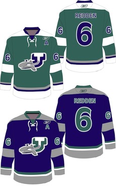
It appears Joshua Heckman was on the same track as most everyone else. But I can't help but feel like he took a wrong turn in getting there. I understand the use of the Whalers' W, but I'm not sure about the protrusion beneath it. Don't know what that's supposed to be.

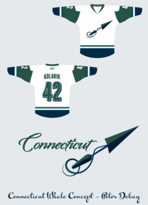
Peter Debay

And finally, for something entirely different, Peter has gone with an entirely new approach that is a little ironic. His symbol for a team called the Whale is a harpoon — the very item used to kill whales. Hmm.

Still, it's clear he's taking his inspiration from the old New England team from the WHA, as he points out himself. I'm just not sure it would be received any better than what the team actually used. But I'm often wrong.

What do the rest of you think? Are any of these the way to go or is the Whale better off with what they have? Weigh in, and if you have a concept of your own, email it in and I'll add it to this post.