Icethetics

via Blogger

Entries in concepts (41)

Saturday
Aug092008

Make Your Own Jerseys

A reader named Mike recently brought to my attention a cool service that I'm sure would be of interest to the rest of you here at Icethetics. A company named Athletic Knit, which specializes in custom sports jerseys, has a special feature on their web site that allows you build your own custom jerseys. For those of you lacking the more creative Photoshop abilities but wanting to express your ideas for concept jerseys, this could serve as quite a useful tool.

Click here to visit their web site and see the graphic below for where to access the Online Customizer feature.

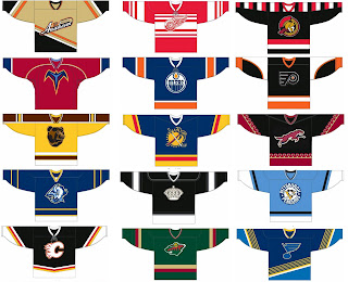
So naturally, using this feature, Mike tried his hand at all 30 NHL clubs and came up with his own concept third jerseys. I've split them into two sets for your viewing pleasure.

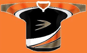
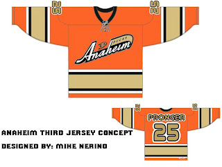
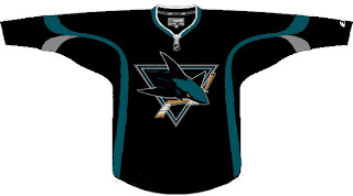
Very unique look for Anaheim. Everything else looks pretty tame. (Maybe Detroit and St. Louis are a little funky.)

Colorado and Washington. I'm just shaking my head. Got some odd striping for Columbus. Odd colors for that particular Vancouver logo. But I'm a fan of Tampa Bay so I can rest easy.

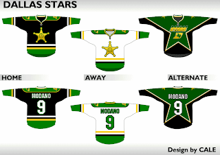
And because lately we can't seem to get enough of the Dallas Stars, here's a concept design that was sent in recently.

There are sweaters to go with these logos as well.

Interesting take on the Texas team.

Now feel free to spend the rest of your weekend at Athletic Knit cluttering up my inbox.

By the way, logo finalists for the IHA Northeast coming tomorrow. And boy, is it a doozy (I mean that both good and bad). You'll be stunned by what folks came up with for the Rouge, Capitals and especially Glacier. The Bears and Royals, not so much. Mainly the Royals. If anybody feels like cracking out an awesome logo for that team tonight, I'd be eternally grateful.

Friday
Aug082008

Freak Out Friday XLI

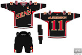
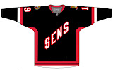
Another Friday is upon us and it's time to freak you out. I'm starting with a rather frightening rendition of a Senators third jersey concept.

Just look at those eyes staring back at you. Scary stuff.

We've been talking a lot about the Dallas Stars lately. Anybody want a real Old West theme for the uniforms?

If you did, I'm sure you don't anymore.

Stripes for the Sharks?

You know you'd buy that jersey. Don't try to deny it.

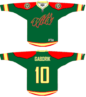
Here's a somewhat less freaky Wild concept sweater.

A new series within a series I started to FOFs ago showcased the infamous Mighty Ducks third jersey with the logos of other teams from around the league. We've done the Atlantic Pacific Divisions and today we've got the Southeast.


And while we're on this topic, under the heading of Other Things That Just Won't Die, the Iowa Chops are back for another round of mockery.

I don't think I need to say anything more. Just try to enjoy your weekend now that you've been freaked out.

Thursday
Aug072008

Overnight Art: California Style

It's late and I feel like you guys got shortchanged today with only an IHA Poll being posted. So I'm sitting here and I feel like writing up a pretty big concept art post — all about California. We'll start in Anaheim.

Here's an unusual idea for the Ducks — get rid of everything in the logo except for what's inside the D.

Or, to be more conservative, I've got an orange third jersey that's pretty sharp.

And an orange third jersey based on a purple one from the old days.

We could just go an entirely new route and find ourselves with a unique, new logo.

But maybe we'd better not. Continuing our California trip, let's head to L.A.

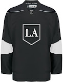
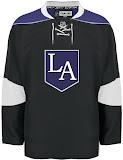
Same logo, two drastically different uniform designs. This next one loses the color altogether with a callback to the Kings' Gretzky days.

Now we head north to San Jose where we start with a new logo for the Sharks.

Notice the complete lack of orange. I always thought it was a nice accent. But that's why we have the one on the right. Though comparatively, those sweaters are a bit boring.

One designer suggested the team keep the shark of their current logo with the triangle of the old days.

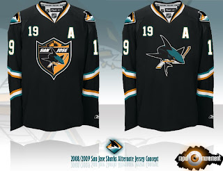
And this last one was forwarded to me, I believe, from a message board somewhere. If anyone's got the link, I'd be happy to add it. (Update: See the original post at HFBoards.com.)

I like both but the shield logo is my personal favorite.

Happy now? Go get some sleep. (And if it's morning where you are when you're reading this, have a nice day.)

Wednesday
Aug062008

Rebranding The Stars, Revisited

I've got new artwork from Matt today and an update on his next rebrand.

Two weeks ago he added the Dallas Stars to his Rebranding the NHL series. One major factor in his design was dropping one of the primary colors — green. He even explained why but that doesn't mean green wouldn't have looked good on the uniforms.

Here's a different take on the uniforms of his latest rebrand.

The St. Louis Blues are next on Matt's list. He's planning to have it done soon and has offered up a few tidbits about what to expect from it. He calls the new primary logo a "tasteful, vintage style" modernization of the Blue Note the club has worn for more than 40 years. He is, however, working on two additional original logos so you will get something new.

I know I'm looking forward to seeing what he comes up with.

Tuesday
Aug052008

Jerseys For Your Tuesday

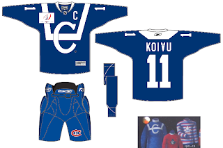
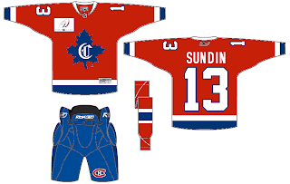
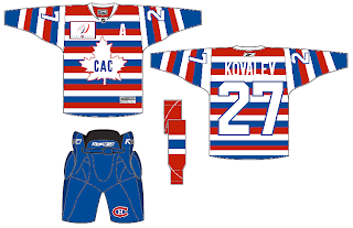
I've had a few jersey concepts sitting around that I thought I'd share this afternoon. I wanted to start with the Montreal Canadiens — who, according to a few sources will have a number of vintage sweaters throughout the season to celebrate their centennial. Using some past looks, one designer came up with this three.

Solid if not a bit boring.

Notice the name on the back of that one.

And those stripes are making me hallucinate.

Moving to the west now, we've got a cool concept for the Stars.

Seems that Bruins jersey would work for just about any team with a little recoloring. And while we're on new colors, when Matt did his Dallas rebrand, a couple of people brought up the idea of using Cowboys colors. Here's how that might manifest itself.

It's not bad but a little to close to my Lightning, you know?

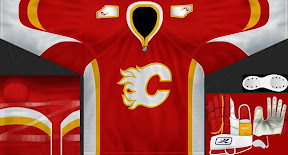
And speaking of the Lightning, they're currently facing the Flames in the Center Ice Tournament — last day to vote on that poll, by the way! Here's a Flames concept jersey with their original colors and an interesting new alternate logo on the shoulders.

It's not the outline of Alberta I'm impressed by, but the small flame within it. Anyway, keep the concept art coming. We've also got a Wallpaper Wednesday tomorrow. Get excited!

Sunday
Aug032008

Inspiring Concepts

It's been a while since I've done a concept post. But as you know I've been busy redesigning the blog this weekend (again). Before I get into today's artwork — and there's a lot of it — I wanted to share my inspiration for this latest round of design upgrades.

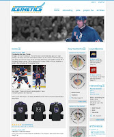
A reader and graphic artist named Guillaume Bellemare emailed me a couple of weeks ago about the design of Icethetics. He said he had some ideas for improving it and I asked him to send me whatever he came up with. I just wanted to show you guys what he sent.

First of all, Guillaume obviously does really great work. You can check out his web site for more like it. You can click on the images above to enlarge them. On the left is the logo he created. I don't plan on using it (not a big fan of the font) but I do like the concept a lot. And on the right you can see the site design he came up with. So I have to credit Guillaume with putting the idea of a pollbar in my head. It wasn't until I saw his design that it really clicked with me.

One of the main focuses of this site is the polls. Why am I letting them get buried in pages of posts? It didn't make any sense. Now you have a quick at-a-glance way of seeing what you can vote on — and how long you have left to do so. That was the main element I took away from his demo here.

As for the rest of it, like I told him, the majority of the people who visit Icethetics are designers or otherwise artsy people who tend to use higher resolution monitors. Tiny text is difficult to read so I prefer large text and lots of spacing. I also widened the page for the same reason. Anyway, there's no need to beat this to death, so I'm not going to go into anymore details unless specifically asked.

If you have any questions, email me or comment. Now for today's concept art...

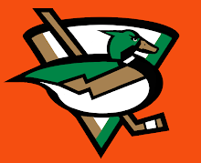
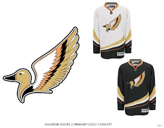
We're beginning with the Ducks because I have two great logo designs for them.

This one I like a lot but it's funny to me that, like the Canucks, the uniform would feature a prominent color not in the actual logo itself. The designer created orange uniforms for this concept. Still a great logo. The next one, I don't know.

It is quite duck-like, but I'm not sure that's winning it points. A little detailed perhaps, it makes great use of Anaheim's new colors. Moving on now to the Coyotes.

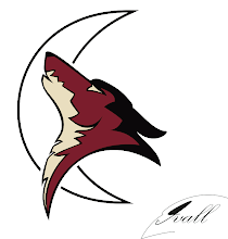
I think this logo would be improved by filling in the moon with a color. And while I like Phoenix's actual logo better, in this one, the coyote actually appears to be howling.

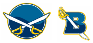
Another interesting Sabres design to add to the pile.

Simple, straightforward, traditional. Nothing wrong with that.

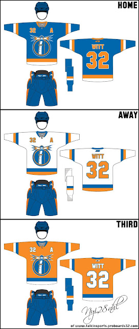
The next piece is based off an Islanders concept logo I posted here about a month ago.

Those are some nice jerseys and I can't see how the club from Long Island could go wrong with a logo like that.

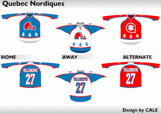
We'll finish things off with a little something for the Quebecois population out there still missing the Nordiques. Here's what the old club might've looked like in today's Rbk EDGE sweaters.

Not bad at all.

Sunday
Aug032008

IHA West Finalists Unveiled!

Last week you saw the logo finalists for the IHA Atlantic. This week, I've narrowed down three finalists for each team in the West Division for the logos I received. You'll begin voting on them tomorrow but for right now, have a look. I think we've got a good batch for this division.

CALGARY MAVERICKS

DALLAS PATRIOTS

DENVER MOUNTAINEERS

EDMONTON SEAHAWKS

HOUSTON COMETS

Like last time, I've left off credits here for a couple of reasons which I won't get into. However, if your logo is featured here and you would like a credit, drop me a line via email and let me know and I'll be happy to add it. Otherwise, I plan to wait and credit the logos that win for each team.

Also like the last division, polls will be posted throughout the week to decide which logo should be used for each team. Along with each poll, I'll show some of the logos that were submitted but didn't make the final cut for one reason or another. So if you sent in a logo that wasn't selected as a finalist, it should be there. If it's not, the image you sent was probably somehow unusable.

By the way, I've tried to weed out any logos with elements stolen from actual professional sports team logos, but if I've missed anything be sure to let me know. I've got backups to put in for most teams as far as the polls go.

Post your comments and critiques below!

Thursday
Jul312008

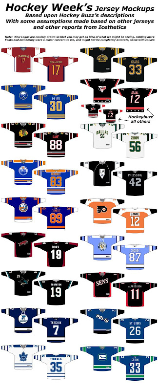
Previewing The New Thirds

All right, so much to discuss. This is the post I promised days ago but I kept putting it off every time new information leaked. So far I haven't heard anything new today so here are some of the concepts folks have put together based off of the latest design rumors. We're starting with Hockey Week, who put together a graphic that includes all 18 possible thirds!

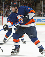
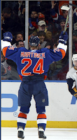
That's a lot of work he put into that. But there's still more. The Islanders wore special vintage jerseys briefly two seasons ago that will probably serve as a basis for this year's alternates.

Very sharp. Those are the only photographs I have. Everything else is fan made art.

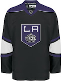
Next up are the Kings in a variety of different looks based off of Howard Berger's description.

I'm pulling for the one on the left, personally. Here are a couple of concepts for the Senators — or should I say, Sens?

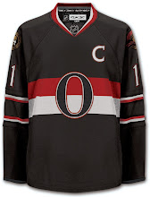
While I'm on the subject, a group of fans in Ottawa are pushing a "heritage jersey" as they call it. This is what it looks like.

You can sign their peititon if you're so inclined. Honestly, they could do a lot worse. That's a very nice sweater.

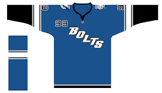
You want to see what's not a nice sweater?

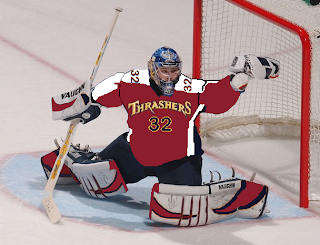
With the text on the jersey, I don't imagine the Lightning will use the numbers on the front. I do like the arm stripes here, though. Staying in the south, we've got Kari Lehtonen with a possible third jersey design painted on.

I'm not a huge fan but I think I need to see the actual sweater.

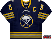
And finally, our friend Dave (aka DRutka) has come up with a little something for the Sabres. Charlie posted this at Sabres Not Slugs.

By the way, as you guys know, Dave's been adapted Matt's rebrands for use in EA's NHL video games. I'll have links to those coming shortly. You'll find them in the Rebranding The NHL section of the sidebar.

If you guys have anymore third jersey mock-ups, feel free to send them along for posting here.

By the way, almost forgot to mention it. All 18 teams getting third jerseys are now featuring in the sidebar.

Sunday
Jul272008

IHA Atlantic Finalists Unveiled!

Over the past couple of weeks I've been inundated with logo submissions for the IHA project. Some of them are top-notch, professional grade logos, others... not so much. But after going through all of the logos sent in, I've narrowed down three finalists for each team in the Atlantic Division. You'll begin voting on them this week but for right now, have a look at the competition.

ATLANTA FIRE

NEW YORK AMERICANS

PHILADELPHIA TITANS

PITTSBURGH MINERS

WASHINGTON STARS

I've left off credits here for a couple of reasons which I won't get into. However, if your logo is featured here and you would like a credit, drop me a line via email and let me know and I'll be happy to add it. Otherwise, I plan to wait and credit the logos that win for each team.

Polls will start going up on Monday to decide which logo should be used for each team. I was going to let this be a surprise but I'll go ahead and tell you anyway. Along with each poll, I'll show some of the logos that were submitted but didn't make the final cut for one reason or another. So if you sent in a logo but it's not among those above, it may still be posted on Icethetics this week.

By the way, I've tried to weed out any logos with elements stolen from actual professional sports team logos, but if I've missed anything be sure to let me know. I've got backups to put in for most teams as far as the polls go.

Now I'd like to hear what you guys think of these logos. Post your comments and critiques below!

UPDATE (5:21 PM): It seems as if the IHA project is nothing if not controversial. A number of readers are concerned that the second Atlanta Fire logo above is too similar to the old Atlanta Flames logo. My opinion is that it's different enough to be considered original but yours is the only opinion that really counts as far as I'm concerned so I'm doing a quick reader poll here to gauge the general feeling on this. It'll be open until tomorrow at noon.

Saturday
Jul262008

Blues, Blackhawks & Blue Jackets

Hope you guys are psyched for the Center Ice Tournament. I've been busy getting that prepared but in the meantime I did promise you concept art. Today's theme is the Central Division.

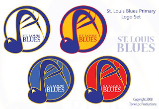
First up, the Blues — in an assortment of different colors.

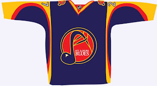
These logos have a very different feel to them as well because of the hand-drawn look. The NHL has never really done anything like this. Also, there's a jersey to go with them.

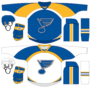
But back to a more simplistic approach, what about a striping pattern on the jersey that alludes to the Gateway Arch?

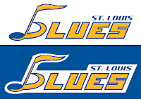
Here's an interesting wordmark.

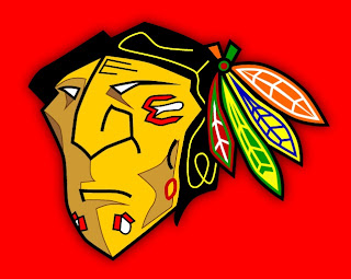
Next is my favorite subject, as you know, the Blackhawks. The designer tells me he came up with this logo around the time the Senators first introduced their 3Dish logo. You give the Indian head a quarter turn and he might look something like this.

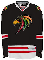
I like it a lot — maybe not as a logo, but just in general. Plus, remember this logo? Somebody put it on a jersey.

Not bad at all.

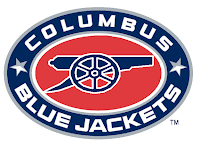
We'll finish things up here with the Blue Jackets. Here we're replacing the hat with a cannon on the secondary logo.

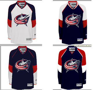
And here's a variety of color patterns for Columbus' jerseys.

Nothing really jumps out at me (in fact, it took me a minute to notice they were all different).

Don't forget, tomorrow you'll get your first look at some of the logos designed for Project: IHA. I can't wait to post them and get your feedback. Plus the Center Ice Tournament bracket will make it's debut. So there's a lot you won't want to miss.