Icethetics

via Blogger

Entries in concepts (41)

Saturday
Jul122008

The Sabres, Revisited

Following Matt's rebrand this week, many of you have been hard at work on your ideas for what sort of logo and uniforms the Sabres should really have. Reaction was mixed with many people looking for something completely new...

...while others enjoyed the update on a timeless symbol. And there's more where that came from.

By the way, you've seen other work from this designer. He's quite talented. Here are the jersey designs that go with his logo.

I've got another, more unique logo to share.

It has jersey designs as well.

In addition, I have more unrelated sweater concepts.

Interesting image. And this I believe is similar to concepts we've seen before, but it does tend to be one of the favorites.

I've got a big project in the works here at Icethetics. This goes out to all of the talented artists and designers who submit artwork on a regular basis: How would you like to brand an entire league? (And it's not the NHL.) Details to come.

Friday
Jul112008

Freak Out Friday XXXIX

Today marks the debut of the Freak Out Friday on Icethetics. The series carries over from my old blog — NHL Tournament of Logos. If you're new to this, you might want to have a look at some of the ridiculous items that have been submitted to me over the past year.

Along with this comes a new name. The series was formerly called "Just To Freak You Out" — but it is more commonly known now as Freak Out Friday. And as you can see, this is the 39th edition since August of last year. Yeah, we've had a lot of weird and crazy artwork to post in that time. Remember, too, that is a biweekly feature so you'll only see it every other Friday.

With that out of the way, let's dive in because there's quite a lot to get to. I'm beginning with Buffalo. The unveiling of Matt's rebrand of the Sabres this week was met with a rather mixed reaction — that spawned a lot of attempts to fix it. Now, there were some good ones (which I'm saving to post over the weekend) and there were some bad ones (which you will see now).

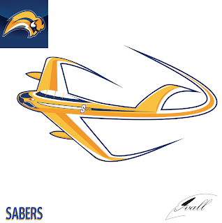
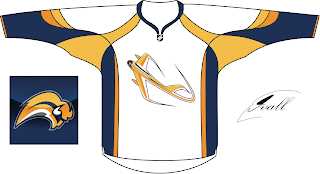
You may have to stare at that for quite a while to figure out what it is. Kudos to anyone who can figure it out without me explaining it. Naturally, there's a jersey concept to go with it.

Thing about the Sabres, though, is while there are a number of very vocal fans opposed to the "slug" logo, it just so happens that plenty of folks like it. So the trick because how to make it less about the buffalo and more about the sabres.

All from the same artist. Comments?

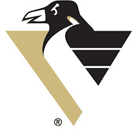
Let's move on now to the Atlantic Division where we have a number of Combo Concepts, as I think I'll start calling them. First is a current Penguins logo mixed with an old one.

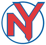
There are some things we should just never have to look at.

I'm sure you can figure out the relevance here. One more...

And now we move way out west for a simple concept based on the old Mighty Ducks secondary mark.
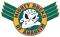
It has wings!

Speaking of Anaheim, if you remember back to the last Freak Out post, you might remember the series of logos based on the Mighty Ducks' old third jersey with the giant duck bursting through the ice. I'm presenting them one division at a time. This time it's the Atlantic.


You'll get another division next time but that's all for this week. Express your disbelief and hysteria in the comments area below if you're so inclined and get ready for No. 40 in two weeks!

Thursday
Jul102008

Maple Leaf Sweater Concepts

Maple Leafs fans, yesterday I promised you some concept art and I'm making good on it. I've gotten half a dozen different jersey designs over the past few weeks and today I'm happy to share them with you.

The first one here is a take on Minnesota's home sweater crest. It's cool even if it's somewhat unoriginal.

But if originality is what you're looking for, see the graphic on the right. It's probably a little too awkward to make for a solid design what with the unbalanced logo, no striping on the white and too much striping on the blue. But maybe I'm just being critical.

These two are cool if Toronto were to add black to the color scheme. But obviously as a Lightning fan I would be somewhat opposed to that.

And finally, on the current jersey design is an interesting logo I've been waiting to see someone make — the CN Tower in the veins of the leaf.

It's not perfect but how cool is that?

You know what tomorrow is. Yes indeed, another Freak Out Friday is nearly upon us. Stay tuned for that.

Wednesday
Jul092008

Sens, Wild Sweater Art

Remember that video I posted over the weekend teasing the new Senators jersey designs from capn89? — a guy named Paul, actually. Anyway, the final designs are done and ready for posting.

You can't deny the awesomeness of those. I personally love the third jersey. There's even a set of three with lots of crazy stripes.

I have some more stuff you need to think back for. About a month ago I posted a bit about what the new Wild third jersey might look like. A reader submitted a few designs based off of what was seen at the event.

And just for good measure, there's even this one.

Short post today, I know, but you've got wallpapers too. Maple Leafs fans, I've got some great stuff for you tomorrow. And don't forget, this Friday brings another edition of the Freak Out series — not to mention the new iPhone 3G. I think it's about time for me to upgrade my $15 cell phone. Don't be surprised if you don't hear from me over the weekend. It'll be because I'll have a new toy.

Tuesday
Jul082008

New Logos For Windy City & Big D

You know I had another Sabres concept logo to post today but considering the reaction in the comments to yesterday's post, I think I'll hold off.

Instead, I've got concept logos for other teams out west. Well, I don't know, Chicago's west of something, right? We're starting with the Blackhawks and you know I'm always up for a good 'Hawks logo. Take in this one.

Here's how it looks on a jersey.

It's really quite something. It might be a little too intricate to make a good hockey logo, but then you could say that about the current Blackhawks logo. Anyway I enjoyed it and I figured you guys might too.

But moving on now to Dallas. I have a few Stars concept designs.

And on a jersey, it may look something like this.

These designs are of a lesser quality, but you get the idea.

And finally, one more logo from the same artist as above — I think an alternate incarnation of the tertiary from that logo set.

I know I didn't have much to say today but it was another one of those long days. Started work at 3:30 AM. Finished at 5 PM. Not exactly my idea of fun, but I'll live. Enjoy your night. Wallpapers tomorrow!

UPDATE (7/15 2:15 AM): As has been mentioned in the comments, the Stars logo above is actually the logo of the Texas Stars, a new AHL franchise set to begin play in 2009 as a Dallas affiliate — and not original concept art.

Monday
Jul072008

Rebranding The Sabres

As promised, today brings the unveiling of the 11th design in Matt's Rebranding The NHL series — the Buffalo Sabres.

And naturally, he's designed uniforms to go with these logos.

To me it seems like the best Sabres logo always revolves around the same basic theme — the original logo from the team's inception. Sometimes you just can't improve upon what came first. Or at least it's just difficult to come up with something entirely new.

Anyway, as soon as Matt tells me what team he's rebranding next, I'll tell you. In the meantime, let us know what you think of the new Sabres artwork. Leave a comment!

Sunday
Jul062008

New Rebrand Coming Tomorrow!

You got your first peek at it on the day Icethetics launched. But just wait until tomorrow! Matt's Rebranding The NHL series continues with the unveiling of his new Buffalo Sabres logo and jersey designs.

Don't you hate being teased? What's that? You say you love it! All right then, you know the uniform series you guys have been enjoying from capn89? He's currently working on the Sens' new duds and put together a video to tease you.

Not to worry though, tomorrow afternoon you'll get to see the Sabres rebrand that's been almost two months in the making. Get excited!

Sunday
Jul062008

Design Tweaks

If you've been paying any attention at all over the last few days, you've certainly notice that I've been doing a lot of tweaking to the design of the blog. I'm interested in some feedback. Let me know if you guys think I'm heading in the right direction.

I'm also introducing new logo graphics for the various polls and tournaments. I've debuted the new design with the two polls currently posted for the QMJHL Tournament of Logos. Have a look and tell me what you think.

It's been a lot of work for me this weekend but I still felt like finding the time to put together a concept post for you. We're starting with a new artist with work labeled under King Creative Design. First, check out the Islanders logo he's come up with.

Outstanding, if you ask me.

He's also got a cool new mark for the Stars and even a set of jerseys to go with it.

I'm a fan I hope to receive more from this guy to share with you all.

But moving on, here's an interesting Maple Leafs logo that turned up in my inbox.

And as you know, I've always got room for a new Blackhawks logo.

Obviously it's a tweak of the current logo. I wouldn't say it's better, but it's no worse really. Just something to look at.

I'm not sure if I do it enough, so let me take the time here to express my appreciation to all the talented artists who submit their work for me to post. You guys make this blog what it is. Anyway, that's it for today. Gotta get back to work on the site design now.

Friday
Jul042008

Red, White & Blue

I don't plan on blowing anything up tonight. It's not really my thing. Instead, you guessed it... concept art. And what NHL team is quintessentially red, white and blue? If you're Canadian, you might say Montreal, but then they're actually bleu, blanc et rouge, aren't they?

No, I'm speaking of the New York Rangers. And one reader has submitted some rather unconventional designs.

Doesn't really scream New York Rangers to me, but I see where he was going.

Another red, white and blue team is the Washington Capitals but that's a recent development after they spent more than a decade in navy and bronze (which I always loved, by the way).

That's a rather simple design and, if I do say so, not entirely worthy of this club. I've also been sent a peculiar design for a blue third jersey.

I'm not sure where they eagle came from, but it just feels unoriginal. It's a simple design but not in the good way.

And finally, I hate to leave out our Canadian friends, so with the next all-star weekend being held in Montreal, enjoy this set of concept jerseys for the big game.

American folk: Enjoy the fireworks tonight. Try not to blow off any appendages and we'll consider it a success. Canadian folk: Carry on as usual with your Friday night.

Thursday
Jul032008

Reworking NHL Uniforms II

I'm sure many of your remember a new series we started last week from an artist under the moniker capn89. He's been redesigning the uniforms of each team league-wide, doing so without drastic changes to the colors or logos. It's been amazing work and while he began the series in alphabetical order, we're going to step out of that pattern for today's post.

We're starting with the Hurricanes.

Again, he's only making slight adjustments, mainly to the striping and design patterns on the sweaters, but in some cases that can make all the difference. Next up, my personal favorite as you well know, the Blackhawks.

It's amazing how the addition of a shoulder yoke suddenly changes my mind completely about these uniforms. For some reason it even makes the logo look better! I might be going crazy though. Finally, we have the Panthers.

And just for good measure, he wanted to see what the Cats would look like without the red.

I'll keep these posts coming as long as he continues to submit his artwork. I expect to have a post tomorrow but with it being the 4th of July, I may be out so don't hold me to that.