Icethetics

via Blogger

Entries in sabres (25)

Monday
Sep082008

Sabres New Third Leaked?

Apparently, the Buffalo Sabres' new third jersey has been leaked! Or so it would seem. I first revealed the image in today's Live Chat which went exceptionally well.

But I thought you guys might like it in blog form for anyone who was unable to participate live.

The image was sent to me anonymously. I don't know if it's appeared anywhere else.

Interesting striping along the sides and arms. I like the addition of silver. It looks classy but not dated. What do you guys think? Comment away!

Wednesday
Sep032008

Sabres Tease Third

The splash page for the Buffalo Sabres' official web site has what appears to be a new third jersey teaser on an ad promoting the sale of preseason tickets.

It's a close-up of a blue jersey with a yellow collar. There are laces and a silver section at the neck with the NHL shield. Here's the image appearing on the web site.

Remember, they will officially unveil the new third jersey two weeks from Saturday.

Thanks to everybody who sent in this info. And seriously, there were a lot of you. I appreciate that.

Monday
Sep012008

New Sabres Logo On Merchandise

The guys over at 3rd Man In allegedly stumbled across some Buffalo Sabres merchandise today with the new third jersey logo on it.

They snapped a couple of pics. Here's one of them.


credit: 3rd Man In

To see the other one, check out their blog. By the way, these are not pictures of the jerseys, obviously. I think they said they were t-shirts.

I have no reason to doubt the veracity of these pictures. Notice the silver outline around all of the elements of the logo. That's really the only thing that makes it "new." Otherwise it's just the old logo from the Sabres' early days.

So it's not conclusive evidence, but one more reason to believe that 18 days from now, this is the logo we'll be seeing on the Sabres' new third jersey.

Thursday
Aug212008

Catching Up On News

It seems I've been slacking a little this week when it comes to news coverage. I really try to stay on top of this for you guys so here's a wrap-up some of what's going on.

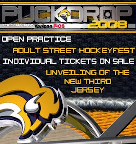
The Buffalo Sabres became the first team in my book to bring the new third jerseys into their marketing campaign. This ad began appearing on their official web site this week.

This comes after Sunday's announcement of a sweater unveiling ceremony to be held on September 20.


On Monday the AHL's Wilkes-Barre/Scranton Penguins — better known as the baby Pens to fans — unveiled their new third jersey. Yes, even the AHL is going that route this year.


No word on whether the green plaid shorts will be part of the official uniform.


The WHL's Prince George Cougars unveiled a new logo on Wednesday.


You may remember the Cougars saw a first-round exit courtesy of the Regina Pats in the WHL Tournament of Logos back in March. Perhaps this logo will give them a better shot at advancing further in the future.

Such a cute kitty.

There you have it. Sometimes I think it's just better to get it out all at once.

Sunday
Aug172008

Official: Sabres To Unveil Thirds

This was posted on the Buffalo Sabres' official web site on Thursday but I figured it was worth mentioning. The Sabres have officially announced their intentions to unveil a vintage style third jersey at a team event on September 20. The following was pulled directly from their site.

When the Sabres hit the ice for their first full practice of the season, fans will get their first look at the team’s new third jersey that will make its debut during the 2008-09 NHL season. The jersey features a modernization of the team’s vintage design elements, while incorporating the latest in sports uniform technology. Fans will be able to pre-order the new jersey at a kiosk in the Sabres Store.


Nothing really new but it's another official statement from the team. We've already had that date in the countdown for a while. If any of you attend the event next month and take pictures, I'd be more than happy to post them for everyone here to see.

Friday
Aug082008

New Logos For 'Yotes, Bruins, Sabres

I saw a reader posted links to images of new logos for the Coyotes, Bruins and Sabres and figured I'd post them for everyone to see. (Also, it will serve as a backup in case the original images disappear at some point.)

I'm not worried so much about crediting the original person who got these graphics considering they probably shouldn't have had them in the first place. But this is the internet. What can you do?

We can start with Phoenix. First, we've got a better shot of the alleged third jersey logo I first posted last week.

It's an amazing looking logo. Let's hope the sweater design can live up to it. There's also what may be a secondary logo for the alternate jersey along with a brand new wordmark.

Nothing bad to say about either of those.

The Bruins have a new wordmark as well.

Very cool. And we've got a bit of a better look at the vintage logo the Sabres will wear on their thirds.

Thanks to Resist The Machine for finding all of those. If you guys come across anything else, email me and we'll let the world know.

Sunday
Aug032008

Inspiring Concepts

It's been a while since I've done a concept post. But as you know I've been busy redesigning the blog this weekend (again). Before I get into today's artwork — and there's a lot of it — I wanted to share my inspiration for this latest round of design upgrades.

A reader and graphic artist named Guillaume Bellemare emailed me a couple of weeks ago about the design of Icethetics. He said he had some ideas for improving it and I asked him to send me whatever he came up with. I just wanted to show you guys what he sent.
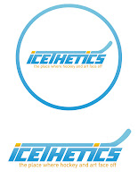
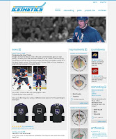
First of all, Guillaume obviously does really great work. You can check out his web site for more like it. You can click on the images above to enlarge them. On the left is the logo he created. I don't plan on using it (not a big fan of the font) but I do like the concept a lot. And on the right you can see the site design he came up with. So I have to credit Guillaume with putting the idea of a pollbar in my head. It wasn't until I saw his design that it really clicked with me.

One of the main focuses of this site is the polls. Why am I letting them get buried in pages of posts? It didn't make any sense. Now you have a quick at-a-glance way of seeing what you can vote on — and how long you have left to do so. That was the main element I took away from his demo here.

As for the rest of it, like I told him, the majority of the people who visit Icethetics are designers or otherwise artsy people who tend to use higher resolution monitors. Tiny text is difficult to read so I prefer large text and lots of spacing. I also widened the page for the same reason. Anyway, there's no need to beat this to death, so I'm not going to go into anymore details unless specifically asked.

If you have any questions, email me or comment. Now for today's concept art...

We're beginning with the Ducks because I have two great logo designs for them.
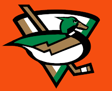
This one I like a lot but it's funny to me that, like the Canucks, the uniform would feature a prominent color not in the actual logo itself. The designer created orange uniforms for this concept. Still a great logo. The next one, I don't know.
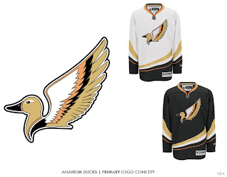
It is quite duck-like, but I'm not sure that's winning it points. A little detailed perhaps, it makes great use of Anaheim's new colors. Moving on now to the Coyotes.
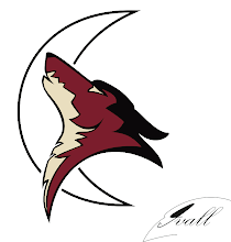
I think this logo would be improved by filling in the moon with a color. And while I like Phoenix's actual logo better, in this one, the coyote actually appears to be howling.

Another interesting Sabres design to add to the pile.
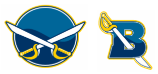
Simple, straightforward, traditional. Nothing wrong with that.

The next piece is based off an Islanders concept logo I posted here about a month ago.
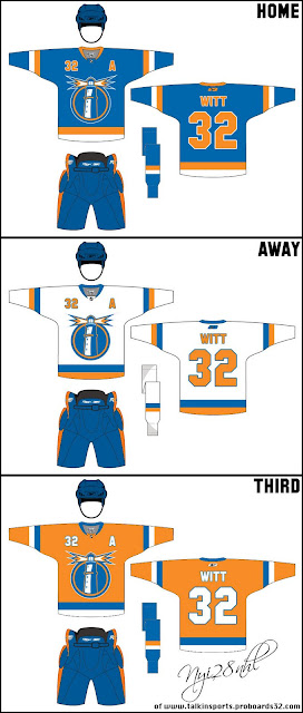
Those are some nice jerseys and I can't see how the club from Long Island could go wrong with a logo like that.

We'll finish things off with a little something for the Quebecois population out there still missing the Nordiques. Here's what the old club might've looked like in today's Rbk EDGE sweaters.
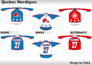
Not bad at all.

Friday
Jul252008

Freak Out Friday XL

This is the 40th installment of the Freak Out Friday series. And the Roman numeral for 40 suggests I'd better have an extra-large helping of freaky hockey artwork this week. Let's hope I can deliver.

The biggest real-life freak out of the last couple weeks has been the public unveiling of the Iowa Chops along with their new logo. But someone's made an improvement.

(Apologies for the low image quality, but this is what was sent to me.)

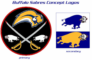
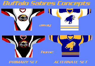
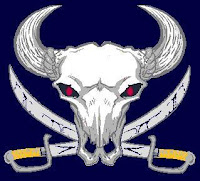
It seems that with the Buffalo Sabres, when it comes to fan made concept art, you either love it or hate it. I wonder what you guys will think of these.

But wait, there's more.

There have even been jerseys designed for them.

And more along the lines of Matt's recent rebrand of the Stars, check this out.

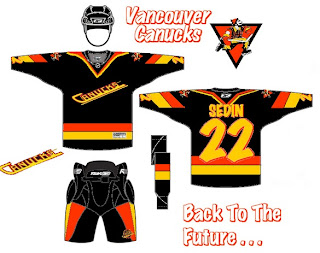
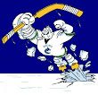
Something else I got this week that made me chuckle were concepts for the Vancouver Canucks.

Don't get me wrong, I appreciate the effort someone put into this but wow, you can't help but shake your head in amazement.

Here's a concept jersey for the Chicago Blackhawks.

Don't shoot the messenger.

Sometimes folks send in team-branding concepts that miss the mark a little.

I can only imagine the nightmares the children of Cleveland would have to endure.

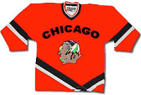
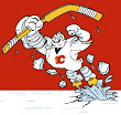
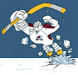
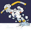
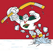
Speaking of nightmares, if you recall about a month ago I started a series within a series for the Freak Out Friday. One reader created 30 logos based around the Mighty Ducks' third jerseys from the mid-90s — one for every NHL team. Last week I posted the Atlantic Division and the week before was the Ducks' own Pacific. Today we're going to the Northwest.


Be sure to notice the half-stripes on the Oilers logo. Yes, all of these are based on last year's new Rbk EDGE jerseys.

And that's all folks. We're back with another Freak Out Friday in two weeks — assuming you get all your ridiculous artwork sent in! My big thanks to everyone who's submitted work — good and bad alike!

Monday
Jul212008

Third Jersey Fan Renderings

It's been mostly quiet on the third jersey news front so far today. But several fans have been hard at work designing sweater concepts based on the rumors that have been swirling lately. There's a lot to get to so I'll dive in.

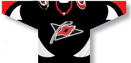
The Hurricanes may adopt a third jersey this season that looks a little something like this.

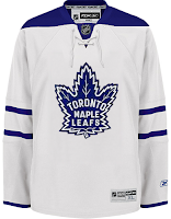
Meanwhile the Maple Leafs will likely take a more traditional path.

It's more likely they'll end up with a white sweater, but blue is certainly a possibility as well.

The Bruins have sort of already leaked their third jersey design and it looks like this.

The Oilers will probably go with a retro look...

...same as the Sabres.

Still other teams may ditch the historical look for something more contemporary. If the Stars go with a green third, it could look like this.

And the Lightning and Senators might go with informal nicknames on the front — the Bolts and Sens.

Not sure about the gold Ottawa sweater. I like black better for them. I also wouldn't expect to see the 2D logo on the front of a jersey anytime soon, but that's just me. I've been wrong before.

I'll have more later today including the next division in the IHA branding project.

Friday
Jul182008

Third Jerseys For 'Canes, Sabres, Oilers

Long day. I've been awake for too many hours now but I've just gotten so many emails I'd feel bad about going to bed before updating you guys on the news of the day.

The biggest news — what I got the most emails about today — the Hurricanes have confirmed a third jersey for this season according to a report from The News & Observer's Luke DeCock. He wrote the following in his blog today:

When the Hurricanes take on the Red Wings in the second home game of the season, there's a good chance only one team will be in red.

The Canes hope to unveil their new, NHL-approved alternate jerseys — expected to be black with the team's secondary, waving-flag logo on the chest — at the Caniac Carnival in September and could wear them on the ice as early as Oct. 13 against Detroit.

“We wouldn’t wear it Opening Night,” Hurricanes general manager Jim Rutherford said. “Our jerseys as they are now are really nice jerseys in red and they’re really popular. … It could be (Detroit). It won’t be Opening Night, but after that sooner rather than later, probably. We haven’t made that decision.”


A little research on the Hurricanes' official web site turns up a date for the Caniac Carnival — September 21. That's going in the countdowns.

By the way, DeCock even cites a graphic found on NHLToL. You can read the full post at Lord Stanley's Blog. For what it's worth, he says 18 teams could have new third jerseys this year.

The other third jersey news for today comes by way of WGR 550 Sports Radio out of Buffalo.

The Sabres will indeed have a third jersey for the new season — to be unveiled to fans on September 20. The following was posted on their web site:

Sabres managing partner Larry Quinn ... announced that the Sabres will unveil their 3rd alternate jersey at an open practice to the fans on Saturday, September 20th. Fans will have to wait until then to see the new-look uniforms.


Another radio station has third jersey news. Dan Tencer of Alberta's 630 CHED reports on his blog that "the team will unveil a new 3rd jersey for the 2008-09 season, likely with an announcement in August."

It's not very informative as far as the design of the jersey, but it's one more source confirming that an alternate sweater will exist for the Oil.

The reason I'm more apt to trust this information is that they're coming from reputable media sources and not random personal blogs (like this one). So as with anything, take it for what it is.

By the way, the next time I'll be able to update the site will likely be tomorrow night. If any news surfaces, I'll get it posted then.