Friday
Dec142012
0300: Anaheim Freak Out
 Friday · Dec 14 · 2012 | 9:00 AM PST
  10 Comments

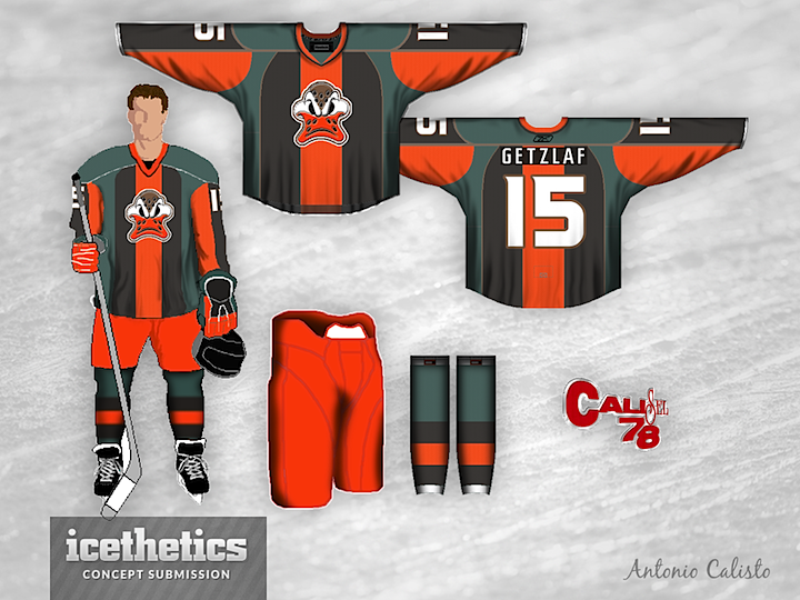
The Concepts page reaches another milestone today. Our 300th concept falls on a Freak Out Friday, so check out what Antonio Calisto has come up with for the Anaheim Ducks.
Designed by  Antonio Calisto
 Antonio Calisto


Reader Comments (10)
That is definitely freaky.
hate to admit it, but its not terrible. Bring back the old ducks logo!
The jersey is certainly a freak out, but I actually like the logo.
there seems to be two tones of orange in the design. i don't like that. it stands out mostly clearly in the pants. they should either be the same color as the orange stripes or be another color altogether (i'd like to see the desaturated green in there).
beyond that it's ghastly and awesome at the same time. i like it.
I like the logo but IMO the color scheme is terrible.
I don't know what it is about this, but I like it.
The colour scheme & logo are a bit weird, but I actually really like the layout of the colours.
It does catch the eye quickly, which is good. However, either the green or black need to stand out more to have a better effect.
Like the jersey and logo, hate the pants.
Hate the colours, love the general design. Far from perfect but definitely an interesting attempt.