


Friday
Mar232012
0034: The Colorado Rockalanche
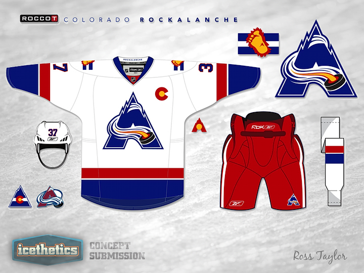
Ross Taylor is tossing NHL history into a blender for a three-week series here on the Icethetics Concepts page. Last week, it was Minnesota and a mix between the North Stars and Wild. Today he sets his sights on Colorado with the Rockalanche — a combination of the Rockies, who played from 1976 to 1982 before becoming the Devils, and, of course, the Avalanche.
Sure, it's strange, but my goal with this series of posts is to demonstrate that the Freak Out Friday label doesn't have to be a bad thing. There are some very talented artists with some very interesting ideas. I hope we continue to see more of them.
Designed by  Ross Taylor
Ross Taylor 
Reader Comments (38)
With the addition of a thin gold stripe somewhere in this sweater, it would easily be one of the sharpest concepts I have ever seen during my time on icethetics. The "C" and "A" are a spectacular subtle touch, and this is the perfect balance of modern logos and traditional styling. If this sweater were to ever make it to retail I would be the first one lined up to purchase it.
Another excellent concept of two logo's I really like this idea, however one thing sort of strikes me here. The puck with the red glow and the yellow tail, has me screaming out loud. Why put the FOX puck on a logo??? aahhh.
I know it wasn't meant to be that, but it's all I can see when looking at that. Apart from that minor detail I think it works really, really well. Freak Out Friday was never the worst shirts going, it was for me the most outlandish concepts good or bad. Keep up the good work with FoF.
This would be pretty incredible for when Colorado (inevitably) plays in a Winter Classic. That is, assuming that Pittsburgh, Philadelphia and Detroit aren't in every single WC from now until the end of time.
Obviously it'll never happen as a primary or third, but these jerseys are unbelievably cool! If the Winter Classic ever moves westward enough to include the avalanche, this is something that the Av's should consider, since their jerseys have never changed much.
I actually LOVE this!
these are fantastic, the only thing needed is a tad bit of yellow on the jersey, this should be an alternative for Colorado
This looks fantastic. Really enjoy this concept. I think the only thing that i would play around with is the puck in the logo. I feel maybe the rockies C would work there. Or have a puck with the ice or what not coming off of the front like the current logo, not coming from the center.. i know this sounds strange but it reminds me of an alien tenticle or something.
Other than that, i think if the Denver fans have much of an appetite for retro rockies these would sell for sure.
Great Job!
This is beautiful!
This is great! I really like the 'flame' coming out the middle of the puck. Great blend of the two identities.
Okay, that is actually cool. I could see that for a throwback night. Thumbs up.
That's scary good. Wow. It works beautifully.
One word. AWESOME!
That looks better than anything the Rockies or the Avalance have worn (and I LOVE the old Rockies uniforms)!
Inspired by Jiggy should have been the freak Out Friday these are just awesome
Im guessing the next one will be Atlanta Thrames.
:)
I like this alot, especially the captain and alternate letters. I looks really good. The logo still cant beat the one they have now but still verry solid design!
When I lived in Colorado, I always thought that the old school Rockies were 100% overlooked. I would totally buy this.
Huge Avs fan here.
Loving this jersey. An amazing job of incorporating and combining both Avs and Rockies. Looks classic yet new and fresh at the same time.
Only complaint is the bottom right of the logo, the puck looks a little awkward where it is. Maybe if it were covering the very bottom of the A's right leg, like the Avs logo does?
Very nice indeed!
Ooooh, a three week series! Really love this, but what do we get next week? The Jet-yotes? The Thrash-jets? The Blue Barons? Maybe the Ranglanders? I can't wait.
Future winter classic jersey!! And an excellent one it would be to.....
Dang. I actually really like this!!!
this is just became my instant favorite 3rd jersey
make it happen and i will BUY IT!!
love the retro logo and the new colours
great job on this design
WOW
Drew- Detroit waited their turn to get a second classic. It's Crybaby and friends that get on every year, and will inevitably be in at least 2 more before the end of the decade.
These are fantastic. Clean, simple and yet it still manages to be completely original. Love the colour scheme.
Very very very good concept. Lets get it done, I want to see the Rockalanche wear this next year. Haha..
Seriously, there is nothing I don't like here, the captain and alternate marks are awesome, and the main logo is in my opinion better than their current one.
The Avalanche would be the luckiest team in the league to be able to wear this..