


0041: The Identity Crisis Islanders
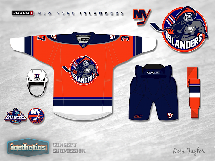
On this Freak Out Friday, we continue a neat series by Ross Taylor. Over the last couple of weeks, he's merged identities of teams from different eras but tied to one city. For this one, it's one team with multiple identities rolled in to one. I have to be honest, I don't hate it. But then I never hated the fisherman as much as other people did. It was really just the wavy striping that got me. Very amateur. The rest of the uniform was pretty solid.
As it turns out, this series won't be ending here. It was originally planned for three weeks, but Ross has since provided a lot more examples of his brand blending. So I'm sure we'll see more next week. But I won't give anything away yet.
Meantime, if what you want has more of an Ohio flavor — say, a combination of the Columbus Blue Jackets and Cleveland Barons — then you're in luck with tomorrow's Winter Classic concept. Don't miss it.
 Ross Taylor
Reader Comments (13)
Making his face white instead of orange (as on the original) makes the Islander fisherman look more human, and the gray in the beard stands out better as a result. A white helmet wouldn't look right, though.
Definitely much, much, MUCH better than the black-for-black's-sake crap they threw out there this season. And certainly far more creative!
i like it and this would have fit better then black although i would love to see the isles do a simple logo like the ny on the pants in the concept for a real alt. jersey.
Should be the alternate! The real, black one for this year is hideous. Orange is the way to go, this one looks great. Love the fisherman being brought back.
As an Islanders fan, it is great to see a pretty good concept design. I was really hoping that the team would be sporting an Orange third jersey this season, but alas, it was black... I would really like to see an Orange third, introducing an alternate logo for the team. I've always thought a Lighthouse would be appropriate. I also think it would be neat to have a Lighthouse shoulder patch incorporated into the home and away jersey.
Yar me wan't my Fish and chips! This would be good for a third jersey I think
It's actually less freak out friday-ish than the fishsticks jersey... not keen.
At first, I found it kind of jarring at first to see the combination of the two eras. But strangely enough, it works.
The one thing I liked about the 07-10 jerseys was the passant/epaulette style shoulder patch. If that was incorporated on this I think it would be incredible. But then, I was always a fan of the Highliner jerseys, and this pays a nice homage to them. Just needs more teal.
As a concept im not sure if this could get any better
but as a final design, I would make some color tweaks...
I think the grey kind of makes a mess of the yokes and sleeve stripes, so I would change them to white.
The blue stripes that are slightly different colors doesnt look right to me, I think they should be the same color or more noticeably different.
I think I would also change the fishermans hands to white, they look a little odd.
But when all is said and done this is definitely one the best NYI concepts out there.
I noticed some talk of a light house logo.. I totally agree with the light house idea and there was a concept posted here about two years ago that I think should bring referenced here.
http://www.icethetics.info/storage/concepts/IslandersNew_L.png
http://www.icethetics.info/storage/concepts/IslandersNew_J.png
I wonder what kind of magic Ross can work with the Canucks. No shortage of identity crisis there.
i actually like this quite a lot!! its a million times better than the black 3rd jersey, one tiny tweak, bit more blue in the socks & a bit less orange......otherwise i wouldn't really change anything else......
I'm an Islanders fan and honestly up until this set that they wear now I didn't love the Reebok set or the one before that. But my favorite jersey they had out of both of those sets, was the orange alternate. So glad to see someone use the orange for the Isles. When I heard that there was going to be an alternate this year I was hoping it would just be the orange brought back in royal and not navy. This definitely works tho, great job....also in reference to those things about the lighthouse (which I completely agree with as a logo or shoulder patch) you could put that on the shoulder of this concept, and for all those people that hate on the Isles real black alternate, think how it would look with the lighthouse from the fisherman shoulder patch as the primary on the black. Just make the light beam royal instead of navy, and replace the teal with gray (considering that's in the black jersey). Sorry lots of opinion in this post, but all in all 5/5 on the concept. Good job.
This wouldn't be allowed. They need a dark helmet under NHL rules for a dark jersey.
The Islanders shouldn't have an alternate jersey at all. Their home and road uniforms are perfect as they are.