


0016: Mixing Old & New in SoCal
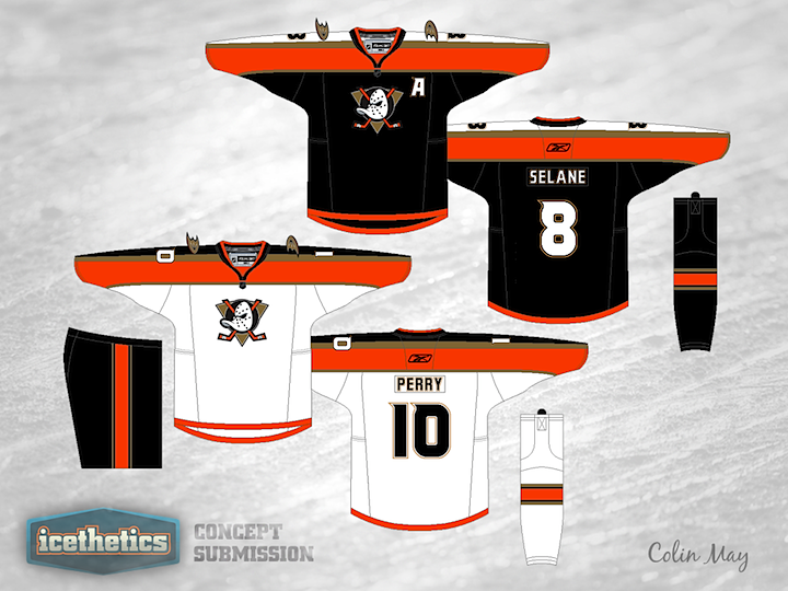
Colin May proposes mixing the old and new for the Anaheim Ducks. Back in the late '90s, the Mighty Ducks, as they were known, used a sweater design quite similar to these. Think they looked better in jade and eggplant or the more modern orange and black? What do you think of the old logo coming back? (And before you comment on the misspelling of Selanne... we know.)
 Chris
Chris
It's not uncommon for concept posts to yield lots of suggestions from readers for revisions. Every now and then, the artist will take a few cues from their critics and I'm always more than happy to add their revised work to the original post. Here's what Colin had to say:
Hey everyone, thanks for your compliments and feedback.
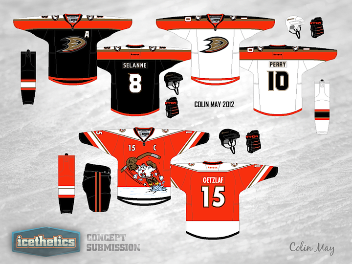
I made [the original] concept a long while ago. I have since updated it to feature the D logo on the chest. I also made up a Wild Wing alternate to go with these, complete with the duck mask shoulder patch that Bryan Wright mentioned.
To other concept artists: If your work has been featured and you'd like to submit a revision, feel free to do so.
Colin May 
Reader Comments (12)
I like this better than what they have now! A great concept, I just don't know if I would like to see this happen. Like i said though, would prefer this over what they have now.
i love the logo in these colors but the jersy style, not so much... the original ducks jersey with the diagonal waist stripes was by far the best uni they ever had. this design was another flaw of the late 90's early 00's that made hockey look super goofy. traditional is the way to go with any uni these days.
I always liked that jersey design - was different before we were made to suffer this Edge product. Not sure about bringing back the old duck head though. At one point Disney wanted a lot of money for the use of that logo and I am not sure how they squeaked it back on to the shoulders of the newer sweater... but this could work, would love to see it with the "D".
i tryed it before (being a ducks fan) and something didnt look right to me what ever it was you fixed it
I'm curious what others think, since I live here in Placentia (bordering Anaheim) and own quite a bit of Ducks gear. I am still hesitant (read: don't like) the D as a logo. They didn't eliminate the Duck Mask logo entirely as the put it on the shoulder patches on the third jersey this season. I think the current thirds have too much orange and look too much like a Calgary jersey. And the earlier version you reference above is one of my favorites they've ever worn, teal or white. With all that said, this jersey doesn't work for me. I can suggest more white on the lower half of the dark set... and maybe try switching the orange and gold although not in the logo. Same for the white set, switch the orange and gold, and throw some more black in. I always thought that if they were to bring the mask back, they'd update it or use the old 2nd straight forward mask... the one that appeared on the shoulders for a while.
I kind of like the white one. I can't get behind any jersey that's based on black though, really overdone in my opinion. Personally I wish the ducks would go back to their original jerseys, the ones they wear now are a close second to the current Dallas jerseys for the worst in the league.
Ducks should just stop messing around with the orange and black already. leave them to the Flyers. BRING BACK THE JADE AND EGGPLANT, OLD LOGO AND DIAGONAL STRIPES. MIGHTY DUCKS 4 LYFE
The old logo needs to come back... WITH the old colors. That was their identity. Black and orange is Philly and black and gold is Pittsburgh, leave it to them
I loved the old logo and very much dislike the new design. But for the sweaters. Anything is an impovement over what they wear now, why doesn't someone update the Wild Wing sweater with the modern colours. This design looks better in the darker colours, but is still missing something.
I think these are pretty cool. Much better than what they wear in reality. I really don't like the webfoot D logo though. I agree that their old unis and logo were far superior, but I could imagine that professional hockey players might have an issue with being clad in the image of a fictional peewee team from a Disney movie.
I notice some changes right off. I like the white in the dark socks for sure, if you're going to use striped pants, I'd put white in there too. I would have liked to have seen you try the straight forward mask as the main crest. People aren't all that familiar with it, so the colors would likely not be as etched in minds as the old left facing mask. Plus it has the text circle around it to give you more fill shapes and color play. Maybe use it on home but not on the road... By the way, even a lot of Duck fans don't remember that the triangle was grey on the dark jersey, but teal on the white jersey. Amazing that I have time to critique, but not just submit myself! Thanks for picking the Ducks though, they need a change!
I absolutely love that alternate Wild Wing jersey. If it went into production, I'd be the first to pick one up!