Tuesday
Apr102012
0052: Revamping the Rangers
 Tuesday · Apr 10 · 2012 | 9:00 AM PDT
  8 Comments

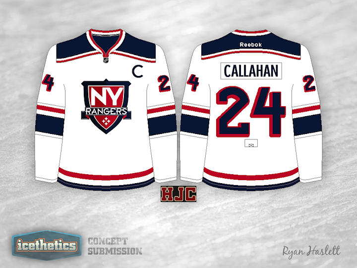
It's not that the Rangers are in need of new uniforms. If they ever changed them, I'm sure there'd be rioting in the streets. But that's what this page is for. What if things were different? Ryan Haslett tells this is one his first attempts at logo design, and honestly, it's not bad at all.
Designed by  Ryan Haslett
 Ryan Haslett


Reader Comments (8)
It would make a nice alternate. If that was made into the primary, we blue shirts would not be happy
I love the jersey, it's a fresh look for a team that I think needs updating. The logo doesn't say NY Rangers to me but it would be an okay shoulder patch to use with the Lady Liberty logo
This is actually a really great design, wouldn't mind seeing that and maybe another dark alternate with the lady liberty logo.
The hem striping is a little too similar to the habs white jesey for my taste
The logo screams "soccer" to me, I'm not sure why...
Good concept though.
very soccer, very contemporary, still preserves some traditional elements. i like it.
You can't mess with a classic...just ask John Ferguson. Nice colours and a sharp design, but the NYR jersey has gone relatively unchanged since its inception. The drop shadow letters and numerals are CLASSIC!
It's basically the LA Kings jersey in Rangers colors.