Friday
Apr272012
0069: Blue Eagles & Golden Sharks
 Friday · Apr 27 · 2012 | 9:00 AM PDT
  15 Comments

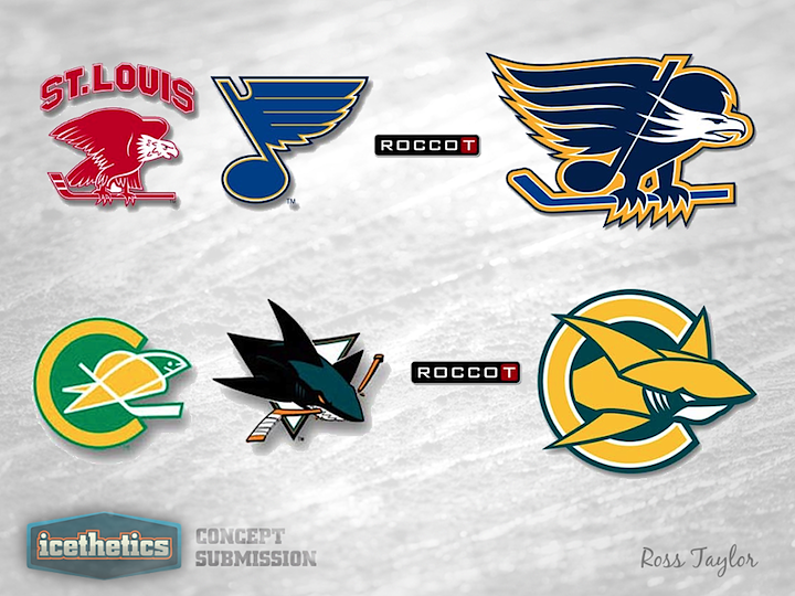
Freak Out Friday brings another couple of brand-blending efforts from Ross Taylor. This time around he's focusing on St. Louis and the San Francisco Bay Area. It's the St. Louis Blue Eagles and the California Golden Sharks... or San Jose Shark Seals. By the way, I just noticed that while both the Seals and Sharks logos feature a hockey stick, the mutant version doesn't. I kind of like that. What do you think of these?
Update on Friday · May 4 · 2012 | 12:57 AM PDT by
 Chris
Chris
 Chris
Chris

At the request of some readers, Ross has provided full uniform designs for his blended logos.
Designed by  Ross Taylor
 Ross Taylor


Reader Comments (15)
I LOVE the Golden Sharks logo...only thing I would change in the Blue Eagles logo is to move the blue note to replace the hockey stick in the eagle's hands. Either that, or turn the logo to the other side so that the blue note can be used in its original layout (blue note leaning left, wing goes to the right).
these. are. awesome!
Is it just me or is the Golden Sharks logo better than the current shark logo?
I don't like the idea, but the logos look so good that I would actually reconsider it to be a good one.
How about the Montreal Maradians (Maroons,Canadians) and the Quebec Nordogs (Nordiques,Bulldogs)
Please make home and away jerseys for these, i love the designs!
excellent now let's see the jerseys!
I really like the sharks combo and nice colors but the st Louis one is not as catchy to me , I think the blues note is placed oddly in the body of the bird . Sharks is very nice
As a Sharks fan, I strangely kind of like it.
there nice, but can we have some jerseys plesase?
Don't know how I feel about the Eagles mashup. It seems like it's trying to do too much. The Sharks one is incredible though.
The "Shark in the C" needs to be on a third jersey right now. Or with colour changes it could be a great shoulder patch on the current home and road sweaters.
That Sharks+Seals logo would be brilliant as a San Jose jersey for the Winter Classic. Absolutely gorgeous and creative.
Shocked, shocked to see a potential Pacific Division design that isn't big scary intimidating black. It may be popular with the gangs in Compton, but can we get over the edgy black crap once and for all, Sharks/Ducks/Kings? If you aren't the Pens or the Bruins, it ain't your color. Sharks should definitely adopt this proposal, colors and all!
Both the jerseys look awesome, the way you combined both of the logos with the old a new looks
was an amazing idea.