


Friday
Jun012012
0104: The Brand-Blended Ducks
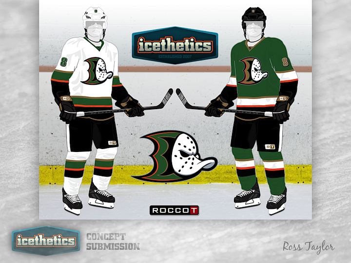
This week, Ross Taylor continues his brand-blending series by merging the new Ducks with the old Mighty Ducks — and throwing in a little green for good measure. I love the colors but I'm not sure the webbed D and the duck mask work all that well together.
Designed by  Ross Taylor
Ross Taylor 
Reader Comments (9)
I love the idea... I just hate the result. Just my opinion, but I think it feels too forced. It seems like the old duck bill was thrown on there because the thing is so recognizable. Sorry, but I just don't like the big duck webbed D and the numbering. It all just looks too forced.
I like the jerseys, but the logo is a little strange.
However, take these jerseys and use the mask logo by itself and you have a winner.
That whole outfit without the logo is very NHL-esque. I could see that in the league.
I'm not a big fan of the logo mash-up but definitely applaud the effort. I wonder what the Webbed-D would look like in the old primary triangle logo. Just swap out the mask and put the D in between the crossed sticks.
I think as far as the color scheme goes, ditching the black altogether in favor of the dark green would look great. Not too sure about this logo, but it's a step in the right direction considering what the Ducks wear on their sweaters these days.
Not personally a fan, I know he's done great mashups before. This one just seems thrown together and forced.
The Ducks should bring back their purple and teal colors.
This is pretty cool. I would want to see a black version of this though
Where can I find the template for the standing players like that?
For the logo, try pushing it back further towards the back of the D to cover more of it, and put some kind of strap on it to look like it's being held on. Thats my idea.