


Tuesday
May082012
0080: Southern California Green
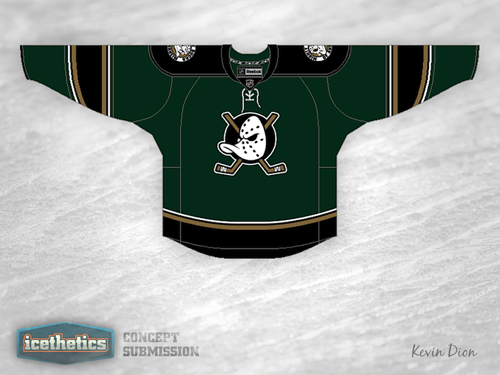
California Week rolls on with another shot of green in Anaheim. Kevin Dion proposes a rather dark jersey that swaps the Ducks' orange for a rarer hue. Of course that classic Disney logo is back on the front. What do you think of the overall feel of this one?
Designed by  Kevin Dion
Kevin Dion 

Reader Comments (13)
Looks like a Stars jersey.
That is probably the nicest Ducks jersey concept I have seen. Too bad it looks too much like a Stars jersey though.
I find this design has more of a collegiate feel to it, which certainly isn't a bad thing. I'm a fan of using dark green and gold for the Ducks and am curious to see how this would look with their newer webbed D logo on the front.
Dallas Stars colors...?
Pretty nice idea for the Ducks. I think if orange was re-introduced as an additional color in this concept, it would bring the whole thing together and provide some pop against the darker tones. Then you'd have a really effective color scheme! I personally would add the orange sparingly, as not to ruin the overall color scheme. Nice work though!
Good, but switch the Ducks' logo for the Stars' and we'll have a real winner!!
I like it, but the thing I noticed the most is the Circle behind the Duck mask rather than a triangle. Nothing really too important, just found that interesting.
I like it. Hey, if the Stars are going to use as little green as possible in their jersey, then let the Ducks go for it! I agree with Johnny C about working in some orange. Go ahead and ditch the black entirely.
Dallas Ducks?
Besides the clear resemblance to a Stars jersey, I don't think this works. Too many teams have circular logos, the triangle keeps it original. Ditch the dark colours as well. The striping is definitely on point, so there's potential here.
Jacob the triangle has been removed the circle has been there from the disney movies it represents a puck, but i do like it but it is to dallas like i say gp back to the original jersey as a ducks fan i like the current ones but i grew up with eggplant and jade
The green is way too dark. A lighter, more vibrant shade would probably work better.
Very beautiful! Even if, IMHO, Disney is nothing but a joke and should stay away from professionnal sports... but this is another debate. Congrats! First time I don't puke while looking at a Mighty Ducks logo :P