


Friday
Jul132012
0146: Opposite Day
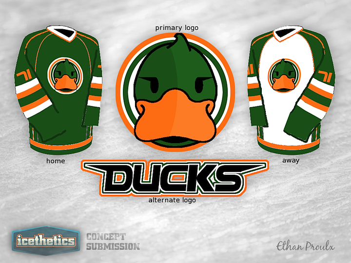
I knew we had another Friday the 13th coming up and this time I wanted something really memorable. Something that would be the complete opposite of what you'd expect to see on such an ominous day. Then I came upon Ethan Proulx's Ducks concept and I couldn't believe my luck. I don't have any words for this thing, so maybe you guys will. Comment away.
Designed by  Ethan Proulx
Ethan Proulx 
Reader Comments (12)
It would be the only jersey to ever make me smile because it smiled first.
I actually really, really like it. The logo is obviously a little cartoony, but the piping, colours, and numbers are all really slick. If the webbed D, or even the Disney era logo were recoloured and put on this jersey, I think it'd look amazing. Regardless, I still think this is great stuff.
That logo looks like it came straight off a hat.
.........I like his pretty eyelashes
a great jersey design.....for a junior girls team.
The logo is a little too cartoony, but then there's not much you can do with a moniker like "Ducks".
What I like is that someone tried to do a green/orange tandem. There are too many teams in the NHL with red-white-blue or blue-and-gold or black-and-gold or red-white-black. There isn't enough green, and this colour combo has never been attempted in the major hockey leagues to my knowledge. It's very distinctive, if nothing else.
In addition, the piping looks good, I like the stripes, and the fonts are something I haven't seen before.
It actually isn't too bad.
D'awwww
I actually really like the color scheme and striping. If the Duck didn't look like it was flirting with me, I think it'd be a winner.
Agree with Jim - I think it looks great except for the logo. Absolutely cool color combo.
I love it!!! Definetly not enough green in the NHL. I love the Ducks current third jersey, but I'm not a fan of their wordmark logo or their home/road jerseys. This would be a cool third.
That is crazy...crazy enough to work given the right elements such as pants and socks.
Somehow, that Duck looks bored.