


Saturday
Jan262013
0343: Waddell's Winter Classic, Part 11
 19 Comments
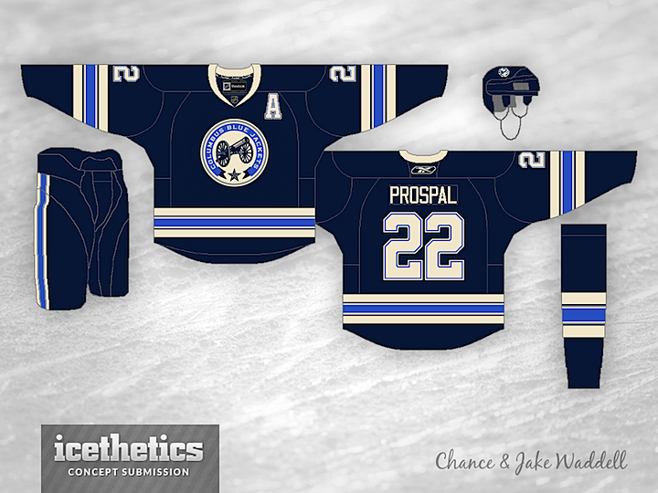
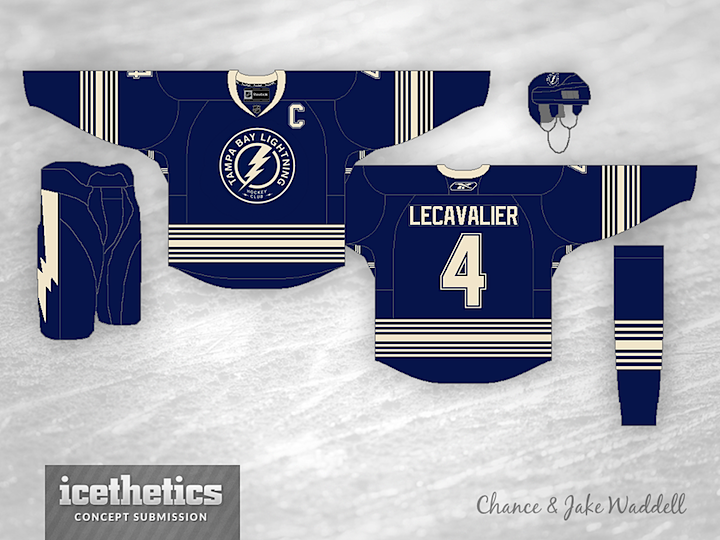
This weekend, Chance and Jake Waddell bring us the next set of jerseys in their Winter Classic series. Last week, Caleb was first to comment and asked to see Columbus and Tampa Bay featured in this one.
If you want to pick the next two teams, you know what to do.

Reader Comments (19)
Calgary and edmonton
Jets and Flames
Bruins and Blues
Sabres and Caps Please!
I would love to see the flyers and Phoenix
The Jackets concept is a significant improvement over their current third. Getting rid of the dirty shoulders and using a more normal number font are two huge steps forward. I also like the collar and the striping.
The Lightning concept's okay, though I still don't care for that "vintage white" nonsense. I am glad there aren't any lace-ups for either of these concepts.
Sorry, but the Waddells' concepts are completely mediocre and uninspired. it seems their entire formula for making a WC classic jersey is to use "vintage white" and a crap ton of stripes.
and that Columbus jersey is literally their third minus the shoulder yoke. zzzzzzzzzzzzzzzzzzzzzzzzz..........
@Tom K.
I would love to see your attempt at making these types of jerseys. Don't come out and criticize the Waddells' work if you can't do anything better yourself.
BTW, it's hard to do a retro jersey for teams that haven't existed more than 20 years, TB has only had two different jersey designs over that time, and Columbus has essentially used the same design since their inception, with one logo change thrown in somewhere.
My main thought is that these two jerseys couldn't face off against one another because the colours are far too similar. That and why on earth would anyone want a Columbus/Tampa Winter Classic?
Tyler: Just so you're aware, no one ever said these posts were intended as Winter Classic "match-ups." I'm just presenting the 30 teams two at a time, allowing readers to choose which two we see each week.
Dont understand how the Columbus concept is a Winter Classic type. Would make for a great current third though. I would have used some green, and the old CB logo.
Oh. I always thought it was intended as a matchup. That makes more sense though.
Agree that the Columbus jersey is essentially their current third. I do like the Tampa jersey though; the logo works well, it just seems like there might be one or two too many stripes.
You guys are right that the Columbus jersey looks a lot like their current third, I didn't even notice that until you guys pointed it out and I'm really sorry that they are so similar. But also thanks a lot for standing up for me Vancity, you saved me a ton of trouble there by saying what you said : )
Boston .vs, Philly
No problem Chance
Understanding it's difficult to come up with jerseys for teams that haven't been around very long, but Columbus has had a handful of minor league teams before the birth of the Jackets (Chill, Owls, Checkers, Golden Seals). A little homework and some of those jerseys could have formed the basis or inspiration of a CBJ Winter Classic jersey. Althought I like the updated third, that's all it is, and= update. Disappointing that there wasn't very much thought put into this jersey. I'm with Tom K., zzzzzzzzzz
As for the Lighting, can we possivble add another stripe? A little overdone me thinks. This series has been pretty good overall, however, gotta give these sets a thumbs down. Sorry.
Phoenix and Winnipeg
@Vancity
This is an open forum where all of us are encouraged to express our thoughts, regardless of personal ability. Just because someone doesn't have the same ability, doesn't make his opinion any less valid. Cool your jets.