


Friday
Oct182013
0609: Florida Fauxback Freak Out
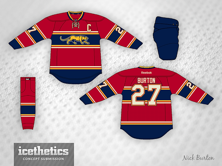
Maybe this Nick Burton design is what the Florida Panthers would've looked like 80 years ago. But since they've only been around 20, I'm a little freaked out. What do you think?
Designed by  Nick Burton
Nick Burton 
Reader Comments (21)
This is amazing. Florida was probably the last team for whom I would have thought a vintage-style uniform would have worked, but this does it perfectly
i think i kind of love this. it's horrendous and super awesome.
Wow, these are incredible! One of the best concepts I've ever seen on here, well done Nick Burton!
Just modifying the colors this would be a great Hamilton Tigers Jersey Concept :)
Canadiens jersey + thin yellow stripes = 4 1/2 stars??????
shut up and take my money!
Maybe it's a little strange because it has a very old school feel for a team only 20 years old, but this is actually really sharp, I think the Cats would actually look really good wearing it as a 3rd.
That is a pretty nice Jersey. I like the Panther, very old school.
It will probably be a long time before the panthers play in a winter classic or stadium series outdoor game, but if they do, this is what they should wear. Love the look!
Eh...it's good at best. I don't really want to see a vintage style jersey with an identity like the Panthers, it doesn't feel right (though that's how I felt about the Wild and Blue Jackets, but the former did it very well and the latter pulled it off decently).
As always, I'm a sucker for the Panthers' color palette. This does scream vintage though, I see some similarities to one of the Hamilton Tigers jerseys from the early 20's. Is that wear you got the inspiration for the striping and logo, Nick? Either way, it's a nice little allusion. I wouldn't be mad if they brought out something like this for a Winter Classic. But as their first actual attempt at something other than normal, their light blue alternate was just mediocre. This is a better attempt at it.
Wow. I like it!
There are a few too many stripes, but other than that it's awesome. I love that logo!
That is really cool. Love it. Would love to see a fauxback series/week with all modern or sunbelt teams.
@Alex: You might want too check out this series from last fall.
Don't know if anyone else has noticed, but the Panther is a direct lift from the university of Pittsburgh's logo from 80-96.
(http://www.sportslogos.net/logos/view/80383781980/Pittsburgh_Panthers/1980/Primary_Logo) not that I'm saying that its bad or Nick is a fraud or anything, I actually really like it. But I'm just pointing it out cuz I knew it looked familiar. :)
I'm a huge fan of this one!
Great classic-style logo! I think it could maybe do without the white stripes and just a heavier yellow stripe instead, but regardless this looks fantastic.
It's perfect. One of the best jersey concepts I've seen on this site.
It actually looks good, but I think it's infringing on the Canadiens design a bit too much.
Looks like the Panther is walking through a tunnel or some kind of tube.
I like the logo, its very close to the old Chicago Cougars (WHA) logo. I love the way it fits within the chest stripe.