Tuesday
Oct222013
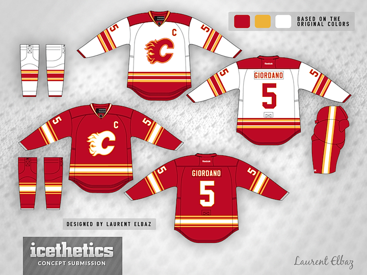
0613: Fixing the Flames
 Tuesday · Oct 22 · 2013 | 9:00 AM PDT
  12 Comments

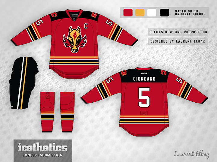
Laurent Elbaz may be a bit clairvoyant. He writes, "These designs were created before season started. To my surprise, I found out through your site that the leak is very similar to my design. Although I still prefer my 3rd jersey that the one leaked."
What do you think? Has he fixed the Flames once and for all?

Thought I'd add a separate rating box for the third jersey to see how it compares with the retro set.
Designed by  Laurent Elbaz
 Laurent Elbaz


Reader Comments (12)
I really like the primary uniforms. They harken back to the 80's and early '90s uniforms, but with a subtle change to the striping that works well. The third doesn't do much for me though.
I think the real question is why aren't those main threads being used right now. Never been a fan of the horse head though.
Really cool. Love the home and road jersey. The third one doesn't look bad at all with the flaming horse on it.
home and away set look great, but the striping on the third jersey is a bit of a mess
Love this, it's a perfect renewal of old style, making it worthy of a new team. Ken king needs to see this, in all seriousness. Well done!
I was totally on board with this until I scrolled down and saw that horse head.
Calgary does not need black in their primary uniforms!!! Thank you for this, these are great. And this is from someone who hates the Flames. I'd like to see what they come up with for their official third though as I never liked the flaming horse as well.
Ice-worthy!
Those primaries should be used immediately, those are perfect. The 3rd I'm not in love with it but I like the creativity, which is what a 3rd's all about.
The primary jerseys are excellent and I always like the Flaming Horse thirds, would love to see them bring those back. I also liked when they'd use the Calgary "C" and Atlanta "A" for the Captain and Alternates.
I absolutly love the home and road jerseys. I think the third would be great if the shoulders weren't black and there were fewer stripes. I always liked the horsehead jerseys.
How 'bout doing this yesterday?