Friday
Oct252013
0616: Music City Freak Out
 Friday · Oct 25 · 2013 | 2:00 PM PDT
  8 Comments

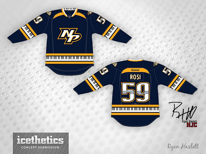
Yeah, I don't have the words for this one. Obviously, Ryan Haslett was inspired by the "hanger effect" on the existing Predators jerseys. Maybe he went a bit overboard with it.
Designed by  Ryan Haslett
 Ryan Haslett


Reader Comments (8)
great for a freakout friday, but, having said, that, there are a couple things on here i like. (like the chest logo. works well on the navy blue sweater.)
That's actually pretty nice!
I understand how this is a Freak Out, but I love this one! Incorporating the hometown elements into the jersey was rather popular in the 90's. (Each word is a different link, by the way.) This is the sort of thing I'd expect from that era, and I absolutely love it. I personally think the Freakiest thing about this concept is the choice of crest logo. I would expect the guitar pick logo they currently use, but it might have too much blue.
All in all, this is one of the best FOF's I've had in a while!
Would make a nice 3rd jersey actually.
Brilliant! I agree with everyone's comments above. Great third jersey concept!
I like it. Kinda freak-out, but not ugly or gaudy.
But who's Rosi lol? Roman Josi? Is this the first typo on a published concept?
I think this would be a really good third jersey and an excellent concept if you removed the moon stripes on the front and back of this jersey at the top by the NOB in the back and the collar on the front. Also, if you switched the 'NP' with their regular logo, this would be an easy five. Besides that, this is a really good concept and by the way, the Keyboard Stripes were an excellent idea.
I wish there was a way to give this thing 3 1/2 stars rather than either 3 or 4. The piano key trim just doesn't quite do it for me, but otherwise this is a very nice design. I could see it as a third, but maybe with the tweak of using gold pants and a gold helmet. Kind of like what the Jr A Carleton Place Canadians do.