


Tuesday
Oct292013
0620: All Teal, All the Time
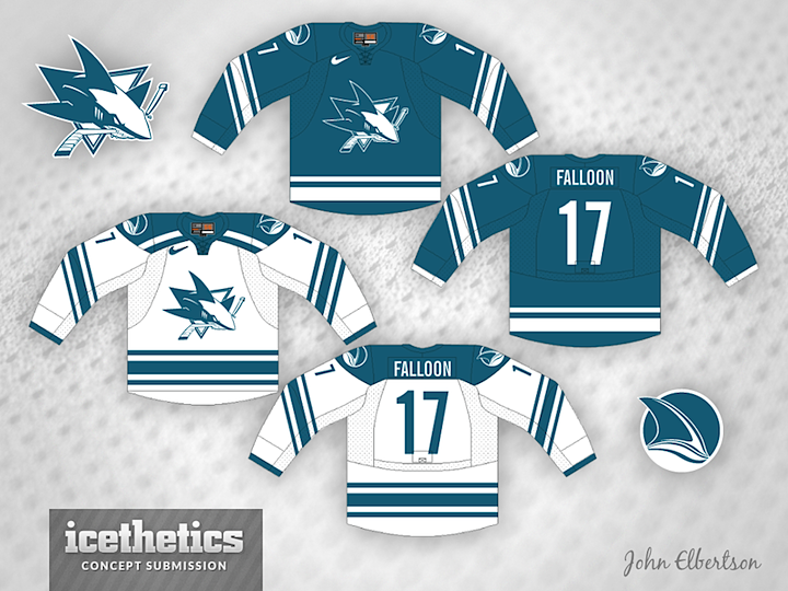
John Elbertson has been sending along some neat ones lately. How about this monochromatic treatment for the Sharks? The Red Wings and Maple Leafs have done it forever — the Lightning more recently. Any other teams that should consider the single-color look?
Designed by  John Elbertson
John Elbertson 
Reader Comments (13)
i like the color version better than the white, but it is definitely an interesting idea.
other teams? blues and penguins. (black and white only penguins makes sense, right?)
I never comment, but had to weigh in on this one...
I think that this concept is okay, but the throwback to Pat Falloon scored some big points with me!
I actually really like everything about the jersey, except the primary logo. I think it needs to stand out more. Everything else is great and I really like what you did to the secondary logo.
@JonathonC Well...when you consider that penguins usually have "yellow hights:https://www2.ucar.edu/sites/default/files/news/2012/Six_Emperor_Penguins.jpg (in which case my favorite logo of all time makes sense), gold has always and will always serve as a fitting color for a penguin-based identity.
And as much as I'm fine with single color schemes, I think it's better-fitting for the vintage teams, like Detroit and Toronto. The Lightning should always have jerseys like from 1992-2011. I personally think newer teams should have more modern identities, whereas older teams should look like older teams (in the case of teams like the Sabres, Capitals, Oilers and Islanders, I always prefer their late 90's-2007 looks). But I degress, this is a nice jersey and an emphasis on one of the best colors in sports.
I agree with Ryan Yuck about the primary logo, it doesn't stand out when you remove the other colours. I think I would also need to see the pants and helmet to really complete the look though. Would there be teal pants involved, or would they stick with black? The jersey striping itself is quite nice though.
It's an interesting idea. I find teal to be a nice color when mixed with white. Arm stripes seems kind of in a weird angle, but it's the kind of thing that's hard to judge on a 2d drawing. It could be also pretty rad, I dunno. That logo would need some tweaking for it to work with a 2 tone color scheme, but overall it's a neat concept.
And yes, +5 for Pat Falloon.
It might work with a chunkier logo, but the details get lost as is.
Remove the extra stripe in the shoulder yoke and you basically have a teal version of the Coyotes Away jersey (mixed with the tail stripes from the pre edge jersey).
Not a critisim mind you (I'm a big fan of the yotes jersey set, and of 'monocrome' jerseys in general).
Only negitive is the tail stripes on the color jersey dont match the rest of the set - which bugs me more than it should.
Sorry for the double commnet but noticed a second thing - as someone who does my share of reffing, the numbers seem too thin and narrow (as in the font is thin, and then is in a narrow 'space') which could lead to issues with identification (telling the difference between 11 and 77 at speed)
put some colour in the logos and thats a pretty hot design
The Sharks' logo doesn't work with just two colors. I think the Sharks could have a really amazing uniform if they had just teal and white on the actual sweater but still kept the current version of the logo (which doesn't get nearly enough credit).
While we're on the subject: Chris, I remember when this logo first came out that you mentioned that it looked like the fins and body made a "SJ" outline. was that just a random observation on your part or did the Sharks actually design the logo with that in mind?
Looks great but lose the waist stripes that way they will be faster ;-)
I was just over on the new CBJ posting and said I'd like less red. I've always thought that since we're called the Blue Jackets we should explore a mono-chromatic look. I think our current third has a little too much grey / classic white to really count. I've never so much as opened Adobe Illustrator in my life, so I have no hopes of creating something that I believe to be close.