


Wednesday
Oct302013
0621: Fixing Anaheim... Again
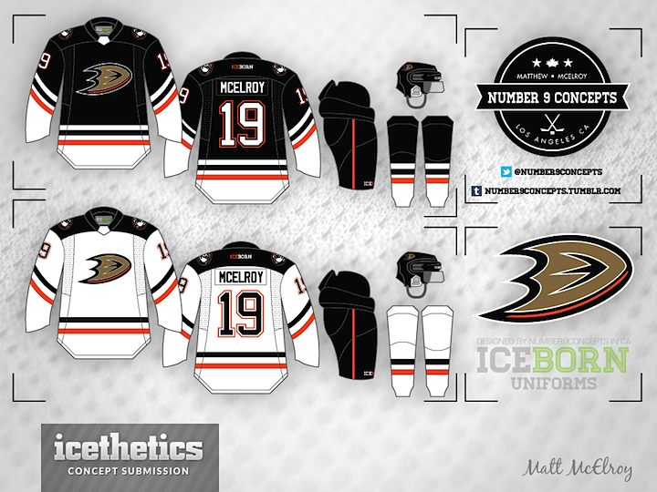
The Ducks looked great earlier this month bringing back the "Mighty" look, but I understand why they won't go back to it full time. So instead, how about moving forward the existing branding by knocking out that awful wordmark? Matt McElroy's concept does just that — even if the striping is a little reminiscent of the Stars' new uniforms.
Designed by  Matt McElroy
Matt McElroy 
Reader Comments (17)
It's not bad, but it really seems like a shift towards blandness for the Ducks. Besides the logo it's a Philadelphia color scheme; straight waist stripes look out of place for Anaheim; and the square shoulders, while a nice change for a lot of teams, don't quite work. To be fair, if the Ducks had redesigned their jerseys this year, this is exactly what they would have come out with.
While I prefer the older logo, this is still an excellent look! Add an orange alternate with the duck hockey mask logo and I'm completely sold.
Needs more orange.
I like this a lot. I may have put a gold stripe in between the black and the orange to make it not so Dallas like. Still a great concept
this is good if anaheim insists on keeping the current color scheme -after all that's what really needs to change. black is out!
i'm really drawn to the white tail on the home sweater and the black shoulders on the away. i'm not sure why, but i really like that element and how the bottom and top portions are identical in both but appear different in each.
I agree with Zav about putting a gold stripe in the middle in place of the white stripe, though my thought was to stop them from looking so much like Philly, rather than Dallas. I might also recommend keeping their unique number font. Otherwise, very cool look!
I like it, but it is not Anaheim. I see to much of Chicago in it.
Swap the gold and orange on the logo.
Maybe make the dark jersey primarily orange instead of black. The NHL needs more colour, not more black. The Ducks orange seems to be a different shade than the Flyers so that shouldn't be a problem. Also don't use black on the shoulders of the dark jersey and that will help differentiate it from the Flyers even more. I agree with the poster above about keeping the current numbering font that they use, it's very unique which is good.
i actually have a new rule I can only do Ducks jerseys
This would be great if it had the old logo and old colors.
Needs more orange. I would switch the orange and white on the dark jersey, as well as make the collar orange. On the white jersey, I would make the shoulder yoke orange and make the bottom white portion of both the body and the sleeves black. But other than that, it's very refreshing to see a Ducks concept that isn't based on their current set or their original Mighty Ducks set.
Yes Love them. As a Ducks fan we are in desperate need of some new home and away sweaters (or just promote the alternate), and these are great. My only complaint is that they don't have as much color as I'd like. I don't know if I'd add some more stripes or what but these are pretty good where they're at.
Don't know where you make requests but I'd love to see some Blue Jackets concepts because their current logo and home jersey one I really don't like all that much. I love the cannon and feel like that should be used somehow like the shoulder patch or the third jersey which I love.
As far as this jersey I'd like to see the black dropped in favor of orange and gold as a color scheme (if you could squeeze eggplant and that tealish/green color in that would be amazing) it would be unique to this franchise which I like. I'm a big fan of the webbed D vs the old hockey mask though I do like that mask as a third jersey logo. I'd love to see one of the many talented designers from the icehl take on coming up with some concepts for both ducks and blue jackets
Striping and colours look great on those ! Wonder what those sweaters would look like with the duck mask logo?
I kind of feel like the Ducks are one of very few teams in the league that don't look right in "classic" patterns. While it's not always a hit, they're trying something new, aren't trying to be a traditional franchise, and as bland as their jerseys are now (solved if they'd use their 3rds), with this color and logo scheme, they just don't lend themselves to this sort of look.
I really like these concepts. The only two things I would change is the striping on the black jersey since it is a little too similar to the Blackhawks and the other thing would be to make the black jersey orange. I know the Flyers identity stands out for them being orange but, I think it would be nice to see the Ducks in orange too. There are so many red, blue, and black teams that a second orange team would be a nice change. Anyways, this concept is awesome.