Saturday
Nov162013
0638: Outdoors in the Windy City
 Saturday · Nov 16 · 2013 | 8:00 AM PST
  5 Comments

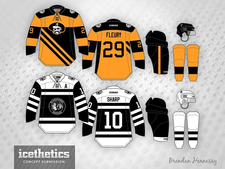
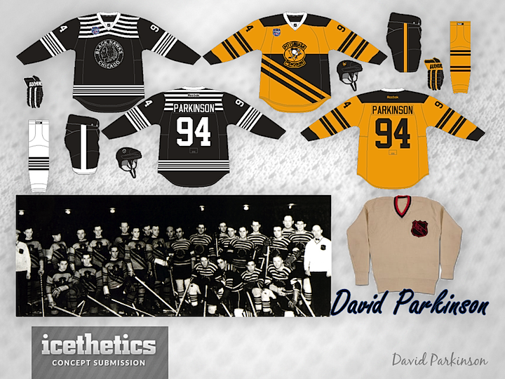
I always get a kick out of seeing to different artists come up with unusual yet remarkably similar ideas independently. That's what we have for this Outdoor Saturday post. Newcomers Brendan Hennessy (above) and David Parkinson (below) saw the same old photograph depicting the Pittsburgh Pirates and Chicago Black Hawks. It got them thinking about how the Soldier Field Stadium Series game could look.

So who do you think pulled it off better? Or do you like half of each? Both are very well done and could easily work for the big game if you ask me.


Reader Comments (5)
NHL: Needs more chrome !!!!! Everything looks better with chrome !!!!!!!!!!!!
Not a huge fan of just plain black and white but I'm really diggin Brendan's version of the Hawks jersey. Also really like how David combined the Pirates and Penguins logos for the crest on his. Great job guys.
Like the top Hawks better, and the bottom Penguins better, great idea though! I like seeing outside the box stuff like this
A nice nod to the oldest days of the NHL. Nice.
These really would work! Nice work.