


Monday
Nov252013
0647: Oiler Alternates
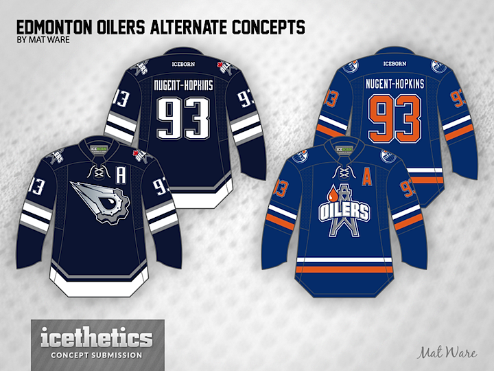
If we can all agree that the Edmonton Oilers now have their ideal home and road sweaters, what's left is a good third. Mat Ware takes a stab at a couple of options here. Which do you prefer?
Designed by  Mat Ware
Mat Ware 
Reader Comments (7)
like the colors/ design of the royal blue, but like the logo of the navy one. the logo on the royal blue is too close to the third logo design that the okc barons use and i don't like that logo in general. (maybe if that didn't exist, i wouldn't mind this one as much.)
side note: is that a maple leaf on the shoulder patch of the navy jersey? very cool.
I prefer the one on the right. The futuristic one doesn't fit in with the retro colour scheme for the home / road. Would be nice to see it in Orange.
I'm really liking the navy blue one! The lighter blue one looks good, but it isn't quite working for me.
I'd certainly love a return of the comet third jersey, I know some won't, but I loved the thing. Not so sure on the shoulder patch with with maple leaf on it. It doesn't sit well being out of sync with the other one.
As for the second idea, not a fan, it has all the looks of a AHL jersey, what with the Oilers patch on the shoulders. Nice attempt at something different, but it doesn't sit well with the me.
The lighter blue one. I like the logo on the darker one better though. Mabye combine them?
I'm a big fan of the Oiler's 2000's look, it's unique and it looks great. Not that I don't like the current/classic look, it's just that I prefer when they wore these. People want the classic though, and I'm not judging. I wouldn't mind seeing them never change, but then again, I'd love to see them bring back the navy blue days for a while.
Anywho, I like both of these. The left is obviously inspired by their 2001-2007 alternate jersey. It was a cool idea for a modernization of the franchise (along with the home/roads they were wearing at the time), especially that logo. Fun fact: the five spokes on the gear resemble the five Stanley Cups they have. I'd like this as an alternate.
This immediately reminds me of the Houston/Tennessee Oilers, for obvious reasons. Regardless, this is a good idea for an alternate, incorporating a unique logo that brings up the location-identity factor, which is always nice to see.
@JONATHANC: Yes, it is a maple leaf. The shoulder patch is the same as the primary logo from the second jersey, but with the leaf in place of the oil drop. I've got a larger picture here. I think the Oilers should incorporate a bit of nationalism into their uniforms, so I figured a subtle leaf like that would be enough rather than a full out flag (I'm looking at you, Calgary)
@NASCARFAN160: Completely agree with your stance on the 2000's look. The 2001-2007 alternate is one of my favourite jerseys of all time, I still wear mine. While the retro look is very sharp, I grew up in the navy blue era, so I have a preference for those. The alternate logo was largely inspired by the Houston Oilers logo. I think the Oilers could use more location-identity in their uniforms and nothing screams Alberta and oil more than an oil derrick.
Thanks for the positive feedback everyone!