Tuesday
Nov262013
0648: The Red Blue Jackets
 Tuesday · Nov 26 · 2013 | 8:00 AM PST
  14 Comments

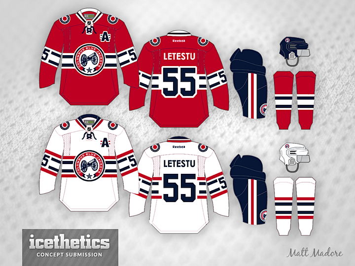
Given the team's name, it may seem like a non-starter, but imagine the Columbus Blue Jackets with red as their primary color. That's what Matt Madore presents today. It's a great looking set of jerseys even if it doesn't belong in Ohio's capital.
Update on Tuesday · Nov 26 · 2013 | 10:43 PM PST by
 Chris
Chris
 Chris
Chris

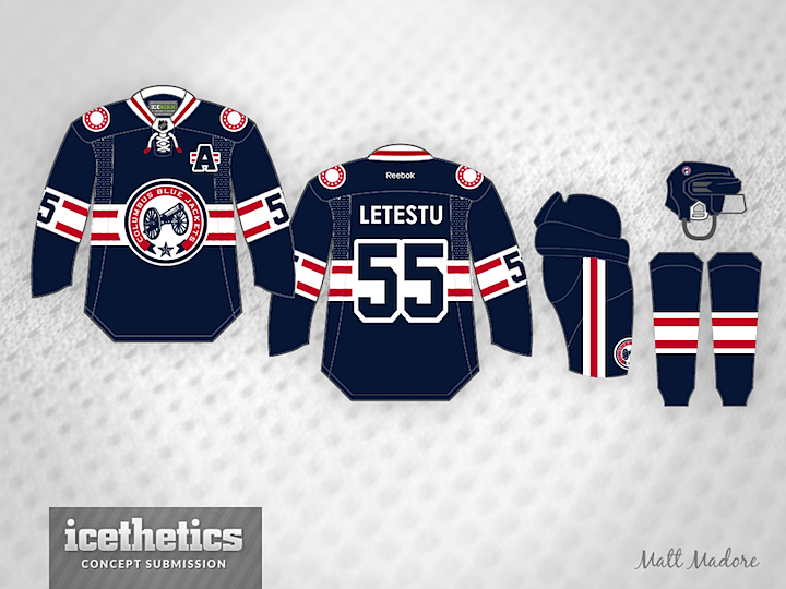
Matt decided to add a blue jersey to this set. Thoughts?
Designed by  Matt Madore
 Matt Madore


Reader Comments (14)
Wow. Extremely beautiful jersey set. I haven't voted or commented on this site in a long time, but I just felt compelled to say, "Bravo". I love it. If it were on sale today, I would buy both.
Great, GREAT job! Keep posting!
These are absolutely fantastic! I would love to see a set with a blue jersey, rather than red, however.
Nice touch with the 'A' patch!
I really like the design, would love to see a blue version though. Hint hint, nudge nudge.
Incredibly innovative pattern. I've never seen that one before. Special congrats on the white jersey for using two different color stripes. Just brilliant.
two words: love it.
The white jersey is great. The red uniform is a bit too close to the Canadiens jersey (red with white and blue across the torso and arms, blue helmet and pants). If, as others have suggested, you tried it with a blue base and white and red striping, then you might have something that will be immediately visible as the Blue Jackets.
Echoing what other people have posted, this is a great set. Maybe not ideal for Columbus, but that doesn't take away from the design at all. Great job on the design Matt.
Both are fantastic, I love the striping. While both are great, the white jersey stands out as the superior of the two. I'll agree with everyone in saying that a blue jersey may work better than the red. Awesome job.
Great jersey set, just throw a Winnipeg logo on either and they'd have a great third.
Love the set, just not the red one and no offense but it will never happen.. they're named the blue jackets because the factory that made the North's uniforms during the civil war was in Columbus... If they go wear red, well they wear the ennemies color lol!
anyways, it's a great set, I'm a big fan of the B-Jackets. Only thing I would personnaly substitute is the cannon for their current logo, the cannon should go on the shoulder.
Oh and no red jerseys, just the blue and white, otherwise, great job!
They need to switch to these jersey....love the Alt Jersey logo. I like all the colors. With the new team idenity, a new look would be great for my Blue Jackets.
i think the striping on the Blue one should go Red-White-Red-White-Red to match the striping on the Ohio flag. Also, I think the width of the stripe should match instead of having alternating widths.
Those blue jerseys with the white.... Damn that'd make a nice set!
Matt Madore, bravo! This is a wonderful set. I hope this finds its way on to someone's desk in Columbus. Unlike a few of the comments above, I like the red jersey. I do agree that your blue design would probably make more sense for the franchise, but all three are beautiful sweaters. A completely new design, but has that classic NHL feel. You've scored a hat-trick here. I would love for USA Hockey to take a look at these and maybe use them for the Junior National team next year. A bit too late for the Olympics, but maybe in four years. Awesome work Mr. Madore.