Wednesday
Nov272013
0649: Back to Black and Red
 Wednesday · Nov 27 · 2013 | 8:00 AM PST
  11 Comments

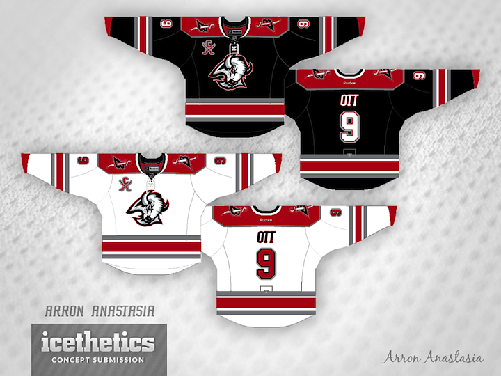
The Buffalo Sabres recently debuted their controversial new two-tone third jersey. That got Arron Anastasia thinking of a previous era for the club. Anyone interested in seeing the the Sabres return to a color palette like this?
Designed by  Arron Anastasia
 Arron Anastasia


Reader Comments (11)
one of my favorite jerseys ever is the Sabres' red alternate from 2000-06. when I think of "sabres", I think fighting. I think blood. a red jersey seems appropriate to me. plus, that logo is ripe with 1990s nostalgia, which is never a bad thing.
Stay with the blue and gold. And a sabre is a sword, not a mammal. I could never understand why their logos always feature the animal rather than the weapon.
Love the white jersey, but since there's hardly any black on it, I'd make the home jersey red.
Switch the Captain patch to the right, make the NOB or numbers on back on the white jersey black. Great colors and striping choices.
I have to agree with Mark. It never made sense that the Sabres logo included a buffalo, or that their third jerseys featured only a buffalo.
Would it make sense for the Kings' logo to be an angel or the Coyotes' logo to be a bird? On second thought, somebody work on those concepts...
As a 6 year old Stars fan, that logo in the 1999 Stanley Cup final made me think that a sabre was a buffalo for quite a few years, use your name as your logo, pass
@Mark
Maybe because of the city of BUFFALO
Wouldn't want to see a full time return to these colours, but either of these would be a perfect third jersey for Buffalo. At least 100,000% better than that atrocity they currently inflicted upon us. The '90s element is way underutilized in third jerseys; it's the perfect opportunity for some teams to incorporate tradition into an alternate, without going to the fauxback look so many of you hate.
I love this era, it's my favorite era of Sabres jerseys. This is a great usage of the 90's logos and colors. I'd definitely love to see them bring them back as a throwback someday.
This reminds me way too much of the Carolina Hurricanes. Wasn't a fan when they changed their colors from the Blue and Gold. It didn't look good for the organization.
Not sure how well these jerseys would look with the colors were swapped out to the current palette.
The Sabres should have never ever ditched their blue and gold. What they should have done was change the royal blue to navy. Having the Sabres in black and red is like having the Leafs in red and turquoise or the Flyers in powder blue and silver.
When it comes to sports uniforms, I am so glad the 90s are mercifully gone.