Friday
Nov292013
0651: Devil of a Freak Out
 Friday · Nov 29 · 2013 | 8:00 AM PST
  9 Comments

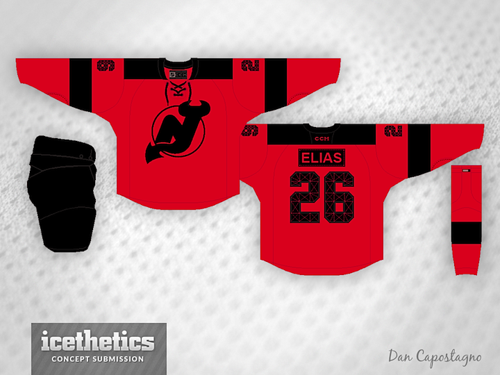
Freak Out Friday isn't about bad design — just stuff that's a little out there. I think it'll be a long time before we see a permanent third jersey for the New Jersey Devils. But when we do, Dan Capostagno imagines it without a shred of white. Always a fascinating choice to me.
Designed by  Dan Capostagno
 Dan Capostagno


Reader Comments (9)
This jersey is screaming out for some white on it. Or maybe it is just screaming.
humm.... kind of like it. i think it would be impossible to see the numbers and logo on tv, but an interesting concept none-the-less.
Conceptually I actually like this without white idea, however the black just makes it look odd. I'm trying to picture the black replaced by green, but then I'm not convinced either about that.
This is just the type of design concept for FOF.
I really like this, it's a great minimalist design. Which suits the Devils playing style perfectly too. I think this would be even better in real life as the black would make the red pop and look fantastic.
I want to know why it has Buffalo stitch numbers.
White instead of black might look good
Looks like the uniforms from Roller Ball.
If the Devs were to get a third jersey, I would bet on there saint pattys day one.
Looks like a or a practice jersey to me.