Tuesday
Feb192013
0367: Reviving the Metropolitans
 Tuesday · Feb 19 · 2013 | 9:00 AM PST
  8 Comments

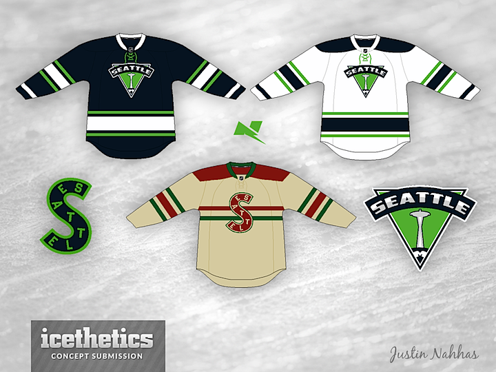
Here's a fun one. We continue our theme this week of reviving old hockey franchises. The PCHA's Seattle Metropolitans have the distinction of being the first American hockey team to win the Stanley Cup. So why has it been nearly a century and the Jet City is still without an NHL franchise? Justin Nahhas puts forth this uniform for the day pro hockey finally returns to Seattle.
By the way, fun fact: The first post of the Concepts page relaunch was Feb. 19, 2012 — and featured Ryan Haslett's Seattle Metros. Coincidence? Of course not.
Update on Wednesday · Feb 20 · 2013 | 12:48 AM PST by
 Chris
Chris
 Chris
Chris

Justin read through your feedback and made some revisions to his Seattle jerseys — which include a new primary logo for the home and road sweaters.
Designed by  Justin Nahhas
 Justin Nahhas


Reader Comments (8)
I really like the lime green and black for Seattle. I like cities where the colors match up, so with the soccer and football team rocking those colors it really works. I really like the throwback to, the only complant is that logo wouldn't have lasted this long. It works for a throwback style third but not for the home and away in my opinion. Still great though!
I think the jersey and logo are both too plain to be paired together, one or the other needs to change. Also not a fan of navy blue, there's way too much of it in the NHL already. Not saying this isn't a good concept, I just think if it was tweaked a bit it could be a really great design.
I'm really trying to like that logo but it's waaaaaaaaay too awkward to be an NHL logo, as a throwback sweater logo I'm fine with it but if Seattle is to have a franchise they need a better logo !
I'm totally on the same boat as you guys when it comes to the logo. Didn't think that anybody else would feel that way, or at least that is what I was hoping! I'll try to put something together and maybe Chris will put it up. Thanks for the feedback, appreciated as always!
Those are great jerseys. I just find the old Metros color scheme way too Christmas-y. I dig the Seahawks-esque color scheme way more.
Hello, after looking at your concepts, I d idn't see the Seattle Totems and maybe your already working on that. If so, I am looking forward to seeing it.
If a team moves to Seattle, I'd definitely be in favor of the name Metropolitans. And the nickname 'Metros' sounds really cool.
As far as the concept is concerned, I'm not really digging the logos. But the colors look pretty good, especially the lime green.
Is there a law that states all Seattle teams need to sport a logo featuring a 60's landmark? Cmon now. Seattle had some of the best minor league logos ever in the 50's through 70's. I think they can do better than "Metropolitans" and a revolving restaurant.