Saturday
Mar162013
0392: Battle of New York
 Saturday · Mar 16 · 2013 | 9:00 AM PDT
  10 Comments

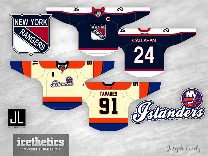
Last week, we got a look at a Winter Classic starring the clubs from Pennsylvania. This week, Joseph Loretz provides a New York-based game between the Rangers and Islanders. And like any good Winter Classic, there's some unnecessary vintage white in there for good measure.


Reader Comments (10)
When you have that NY Islanders logo above the script, it essentially says "NY Islanders Islanders."
Other than that, good concepts!
love the rangers design! the islander's is ok but i don't like the cream color and as already pointed out the logo has one to many "islanders".
That Rangers jersey is AWESOME! It could work as a great third jersey, or even with the statue of liberty logo.
The Isle jersey I think would have been better with the regular logo.
But overall, solid designs.
Would love to see the Islanders jersey done with the word Brooklyn instead of Islanders in the same script of course! Keep up the good work!
It would say NY Islanders Islanders but their logo does not have the word islanders anywhere in it. Thus it only says NY islanders, i think its a hella good concept and is a better jersey than their current third and away jerseys.
The Islander jersey is quite good for an off white uniform. I'd say just put their logo on the front and lose the black and you'd have a pretty good concept. The Ranger one is fine. I notice I'm not the only one who goes by just a single letter on the comments section of this site ahahahaha. XD
So i looked closer at the logo and it does say islanders, but its not super obvious so from a far it would appear to say NY Islanders only but I agree the Islanders at the bottom should be removed. It doesnt matter either way soon it will need to say Brooklyn Islanders.
really like the rangers one...but got to the islanders and......whaaaaaaaaat da fuq is that????
Is it me, or are the numbers on the back of the Islanders jersey black? If so then eww, and it looks like there is some black piping too. If the numbers were changed to royal, and the piping became white(creme) then they would look amazing!
Love the '70s era Rangers throwback (though with the color darkening on the crest it looks more like a fauxback).
The Islanders design, not so much. The vintage white doesn't work, the shoulder yoke and sleeves don't work, and the wordmark can't really make up its mind.