


Thursday
Apr252013
0432: Carolina Black
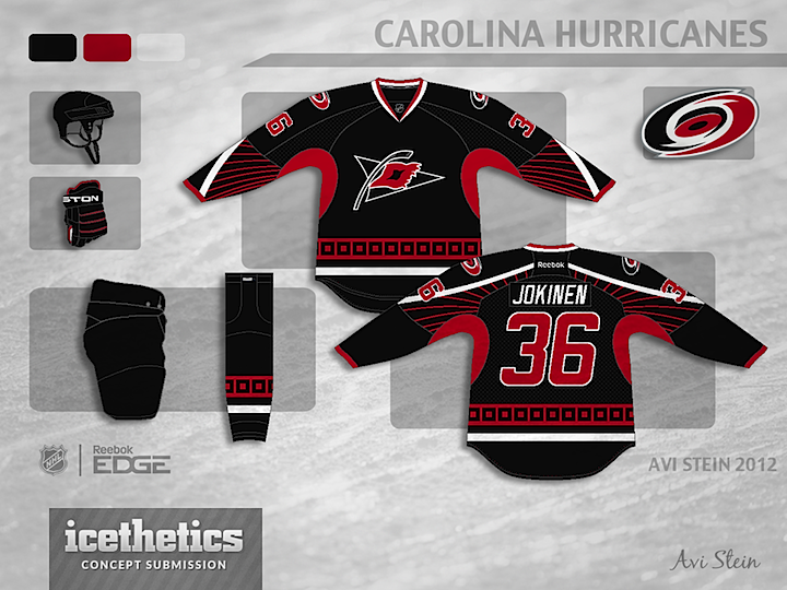
This concept by Avi Stein is a fairly simple mix between Hurricanes and the current NHL All-Star uniforms. This jersey actually kind of works for them. Maybe a replacement third?
Designed by  Avi Stein
Avi Stein 
Reader Comments (7)
As a hurricanes fan, I feel like we've needed something new for awhile, this probably isn't it, but a big step in the right direction.
Looks fantastic. I really like the added line design. Only thing for me that i'm not a huge fan of is the white stripe that swoops on the back. I'm not a big fan of numbers over lapping lines.
Great design though, Would love to see some home and away versions with the primary logo.
Great concept!
the 'Canes have the worst jersey in the league, probably ever. Its tough to work with the logos and color combos they have. They need a total re-do. This submission looks pretty good, but I dont like black jerseys, all red doesnt work either, thats the Red Wings. Anway, off the soapbox. I like how the stripes and red break up the all black look and the use of the alternate logo is a better choice
i didn't think i liked the thin red radial stripes, too 90s, but the more i look at it the more i like it. the whole look is really growing on me. i think i'd go with them either on the sleeve or on the torso, not sleeves on the front and torso on the back, but that's just my oppinion.
going with a black jersey seems to be and idea that passed a couple of years back but if the canes were to go that direction this is a very good candidate.
Solid concept, in my opinion, apart from the strange "sunburst" of red rays on the upper back and front lower arms. It reminds me of the WWII-era Japanese sunburst flag.
As a Hurricanes fan, bleh. All Star jerseys are usually too gimmicky these days to translate well into normal uniforms, Stars star jersey aside. And please, look up what a Hurricane flag is. They are not generally (ever) black with a red square. Yes, I realize the current third broke with that. I would like it far more if it did incorporate the red into the striping, and get the flags right.
I'm certainly open to changes of the Hurricanes jersey (and rumor has it we may get a new set for next season), but either get the flags right or ditch them. If the flag is red with black inside, it's a meaningful graphic reference. If it's black with a red square inside, it's just a geometric element.
Oh, and nuke the pit stains. Contrasting underarms never look good. Unless they're the Tampa victory stripes.
...so its a red/black version of the all star jersey...