


Friday
May032013
0440: Ducks Turn Twenty
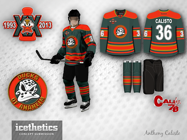
The Anaheim Ducks will mark their 20th anniversary next season. Check out what Antonio Calisto has cooked up for the occasion. (And this isn't his first time playing with Anaheim.)
Designed by  Antonio Calisto
Antonio Calisto 
Reader Comments (5)
I actually don't mind this. The color scheme is interesting. Not the greatest logo I've ever seen but there's isn't much hope when you are named the Ducks. This is better than anything they've worn to date.
Love the color scheme and the striping! Would make the green a bit darker more greener shade. With the original logo this would look great!
The more Ducks concepts I see that use a green and orange scheme, the more I think that they won't work by incorporating the gold that the team currently uses. That said, decedent concept, just needs some fine tuning
I really like this jersey! Great colors and I think I would buy this if they switched to this!
I'm sorry but this is hideous. The colors and the logo make my eyes burn.