0526: Metropolitan Green
 Sunday · Jul 28 · 2013 | 9:01 AM PDT
  9 Comments

Ever since the NHL announced the Metropolitan Division last week, I've been hearing non-stop about how it's a slap in the face to Seattle hockey fans. These people must be under the impression we want our team to be named the Metropolitans, after the first American-based team to win the Stanley Cup. I can only speak for myself but I seriously hope that doesn't happen.
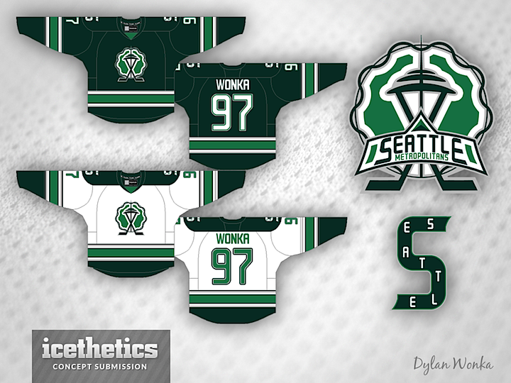
That said, in searching for a new theme for Sundays and noticing how many Seattle concepts sit in my inbox, it became clear: Seattle Sundays. At least for a little while. Dylan Wonka is up first. I think he has a fantastic design, despite using the Metropolitans moniker. The nice thing about his logos and jerseys is that the name can easily be swapped out for something better.
Check back next Sunday for another Seattle concept. And if you've got an idea, feel free to pass it along!
 Dylan Wonka


Reader Comments (9)
Is there significance to the wavy outline of the background??
I gave this concept four stars - I love the green colour scheme (what would these look like against Dallas?), but the striping was a little too close to Vancouver's and the wavy 'halo' around the logo looks a bit off to my eyes; maybe just remove it altogether.
I can only dream of the NHL one day seeing a two-tone green jersey...
Maybe it's just my - as Chris once put it - '1910s design sensibilities,' but I'd really prefer these if the logos were switched. That is to say the Space Needle logo was on the shoulder, and the Classic S logo was the primary logo. That being said, I love the jersey itself, and the green one would be high up on my list of jerseys to buy.
I'm looking forward to the Seattle Sundays series though! I'll admit that I was growing somewhat bored with the International Sundays, as there's only so much creativity that can be had when trying to create a jersey that appeals to nationalist senses... The Emerald City should inspire a number of green concepts though, and that's always good!
Out of curiosity, is there any chance we see another CHL week soon?
I know that the team was called the Metropolitans but I'd really prefer if Seattle didn't create a Metropolitans 2.0 when they get a team during the next decade. I think they should become the Seattle Sasquatch.
Their Squatch's logo would be that image of bigfoot looking over his shoulder (but carrying a hockey stick). Their mascot would either be Sassy Squatch the Sasquatch or Chewbacca. After every home game, every child would go home with a plush bigfoot and would become lifetime fan.
I think that if Seattle gets a team they should be called the Seattle Navigators. And they definitely can't have the same color scheme as the Canucks
Like Taoiseach , I would love the idea of a two-tone green uniform as well. However, if there is a perfect name for a Seattle NHL franchise, it's Totems. Most people think that Seattle's hockey history only relates to the Metropolitans. The original Totems of the old Western Hockey League existed from 1958 to 1975. They had great support back in the day and they had beautiful green and white uniforms with a timeless logo.
I see the Canucks eventually replacing the orca with the skating Johnny Canuck logo(used in the WHL) and a matchup with the Totems would revive the historic rivalry that once existed between these clubs in the WHL.
http://www.seattletotems.org/index.html
As the Totems, they could take part in a Heritage/Winter Classic as the Metropolitans and play Montreal, the team the Metros beat to win the Stanley Cup in 1917.
Nice jersey, colors, and striping. But can we please lose the "S" and seattle spelled logo? Just because it's old and "classic" doesn't mean it was a nice design. I find it stagnant and difficult to read, in any version of it.
As far as the "slap in the face" I've heard it used a couple times, but it wasn't that people were solid on using the Metropolitan name, but that an organization for Seattle, should at least get the right of refusal.
That said, great design and nice working of the Space Needle.
Looking forward to Seattle Sundays. One of my favorite themes in a while.