Friday
Aug022013
0531: Blue Jackets Freak Out
 Friday · Aug 2 · 2013 | 9:00 AM PDT
  9 Comments

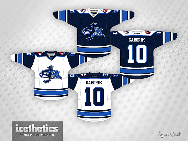
For this Freak Out Friday, Ryan Yuck mixes eras in Columbus. Check out that crazy crest.
Designed by  Ryan Yuck
 Ryan Yuck


Reader Comments (9)
Wow! As a Blue Jackets fan, I actually really like these! I wish we'd at least make our thirds our home jerseys.
Besides the logo...I actually like these.
I actually really like that concept. Use the third logo with the cannon's colors , with the off-white. I think this would look really sharp with off-white and a bit of red. Nice looking concept.
This is a thousand times better than what they're wearing now. Hopefully, they don't have red pants.
This is clearly a freak-out just because of the logos. The jersey design and colour scheme is actually pretty sharp, barring the shoulder patches.
Drop the blue sleeves on the white jersey, and go with a simpler logo on the front (don't try to combine the two, it makes it too busy) and you are onto something here.
I actually kinda like the logo, although it probably needs some tweaking. Seen worse CBJ concepts, including what the team has worn.
It's funny, I was just experimenting with lines on sleeves, and I thought that it would be cool to emulate military ranking bars on a jersey. The Blue Jackets are a perfect fit for that idea.
Creame and Yellow anywhere would complete this for me 9.9