Saturday
Aug242013
0553: Heritage Classic Revisited
 Saturday · Aug 24 · 2013 | 9:00 AM PDT
  5 Comments

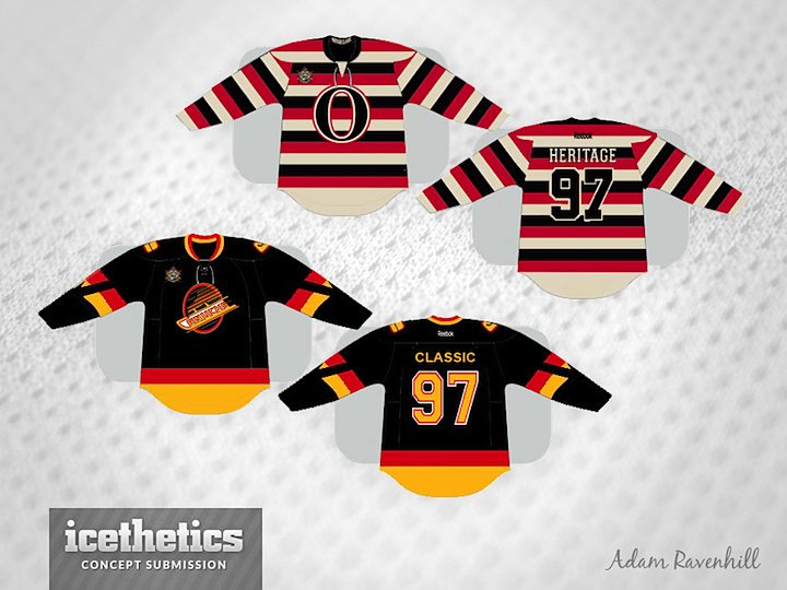
The 2014 NHL Heritage Classic has been a popular subject of concept art lately. This week, Adam Ravenhill presents his hope for Canada's outdoor event. His Ottawa jersey comes straight out of the history books while that Vancouver jersey blends a few eras if I'm not mistaken.


Reader Comments (5)
About " Canucks " jersey; I've never like that circle in a crest - would look much better without it . Skate, blade, script and diagonal streaks / stripes - would do just fine. " V " inserted in a sleeve stripes seems to be extra and has been overused by plenty of artists displaying on this blog. My biggest concern is a hockey stick on a skating rink being used as a shoulder patch - change the color scheme on that one into original white , blue and green. Than should stays classic and many folks from Vancouver will agree on that. White outline in numbers needs to be dropped, as well and same goes for a crest. Maybe a yoke outline with yellow/gold/red, as a top of the jersey looks a bit empty? Laces could be switch from white to yellow/ gold... Reebok must be in gold. About " Senators " jersey; I've seen an identical barber pole concepts in the past... This one is decent, but not a very creative, don't have that special feeling for the event. However, I would've been okay with filling bottom part on a front and a back of the jersey, making it all the way, like in that history book. Classic event - GO ALL THE WAY THEN !!! Collar need some white /red outline. Numbers need some red outline or they could be white with black/red outline, as well. Shoulder patches are missing and so, are the TV numbers on both jerseys... Also, I'm not sold on that crest on a " Senators " jersey for some reason... Looks like a BIG ZERO to me, but that just IMO.
I'm never really too crazy about the style of the Sens jersey. I mean, it's a great throwback and all, but it's just not really my style. Love to see it on the ice though.
Love the Canucks jersey, though. The sleeves (with the "V" in them, look closely!) is a tribute to their inaugural jerseys, whereas the logo, other design and colors come from the 80's-mid 90's. Creative concept, I'd buy this jersey.
The Vancouver jersey works. A complete blend of styles, colours, and logos. Drop the vintage white on Ottawa.
That would be fun. Vancouver needs to bring out the Black/Yellow/Red, whatever they do. Maybe we'll even get to see V jerseys?
Black/Yellow/Orange, sorry.