


Monday
Sep162013
0576: Just Add Green
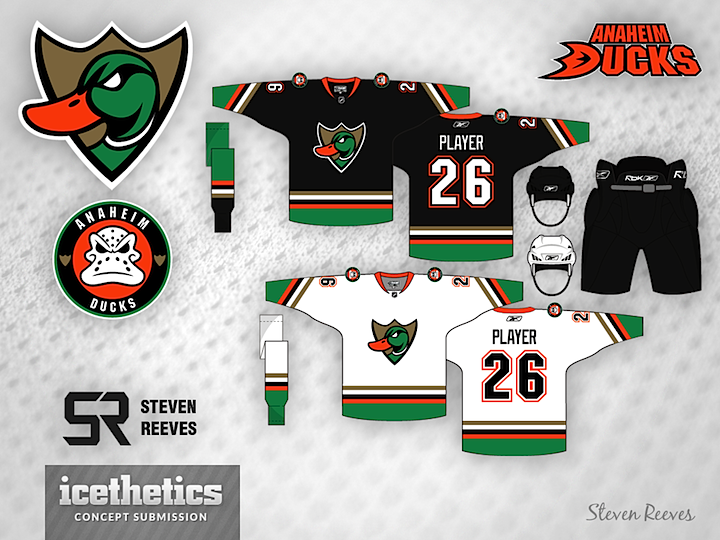
If the Anaheim Ducks were ever looking for a new color scheme, Steven Reeves has positively nailed it. This is a great look. It brings together old and current elements as well as entirely new ones. This is one of my favorite designs of the last few weeks.
Update on Tuesday · Sep 17 · 2013 | 12:37 PM PDT by
 Chris
Chris
Chris
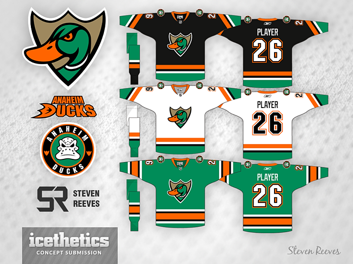
Steven has made some revisions to his Ducks concept.
Designed by Steven Reeves
Steven Reeves 
Reader Comments (10)
Love the color scheme!! That green is awesome... Only thing is, maybe replace the black with the original eggplant?? Can Steven Reeves make another concept with the same design, except replace the black with eggplant? I'd like to see what that would look like.
it looks nice, but it just looks like a rebranding of the quad cities mallards. same colors and everything:
http://myqcmallards.com/
The color scheme reminds me too much of the Dallas Stars' Mooterous
I do not like the logo. Agree with the Mallards comment.
Put the Mighty Ducks logo on it and we have a winner.
I think the whites would look better if the font was green instead of black. Otherwise it's a pretty solid concept that I wouldn't mind seeing on the ice.
I like the concept, but I'm not a fan of the primary logo. I love the old Mighty Ducks original logo.
The colors are similar true but the jersey design is different enough where it wouldn't be a problem I don't think. And even if it did QC Mallards have some of the best designs out there anyways.
Frankly I like the idea of some green with the Ducks set. Green Black and Gold can go places.
Fun fact: The Quad City Mallards' logos were designed by Matt Kauzlarich, a regular concept artist on Icethetics in the past.
Like the green jerseys... But still want to see what the jerseys would look like with eggplant rather than black.
Thanks for the feedback!
Must admit I'm chuckling at the Mallards comments. For the original draft of the primary I used a photo of a real life mallard for reference. I didn't have the QC Mallards in mind when designing this, although I am a fan of their identity.
Ryan & Joe: I'm a Ducks fan myself, and I like the mask logo as much as anyone possibly could. If it were up to me, they would still be using that logo. The point of this concept however is a total rebrand, therefore a new logo of my own design. But if you don't like it, well, fair enough.