Tuesday
Sep172013
0577: Wicked Jersey
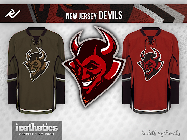
Rudolf Vychovaly has quite an idea for the New Jersey Devils. Too much for an NHL club?
Designed by  Rudolf Vychovaly
Rudolf Vychovaly 


Rudolf Vychovaly has quite an idea for the New Jersey Devils. Too much for an NHL club?
Rudolf Vychovaly 
Reader Comments (18)
Scary!
creative, stylish, and fresh -which probably translates to undoable for the NHL. it would interesting to see the olive drab introduced into the red sweater and visa versa. could make for an interesting and unique color palette and bring back the old red and green colors while removing the christmas feel inherit in them. i'm not 100% on the logo. it's close but i'm not quite sold.
This is really good. Really good.
It is, however, a little bottom heavy. To fix that, I'd add a triangular yoke.
Try it, then re-submit.
Speaking as a die-hard Flames fan, I truly despise that template. The piping and such is not great. I do, however, like the color on the the red jersey. Not huge on the logo, as it is also exactly the same as the logo my college's hockey team uses.
I'm not sure I would say it is too much for an NHL club, but it is too much for the New Jersey Devils NHL club. Their logo is pretty timeless, and the way Lamoriello runs the team - this would be completely out of character. Plus I don't care for the Calgary Flames knockoff jersey striping.
Recoloured Calgary Flames template. It would need a few more changes.
Here is too much about a logo and very little about a jersey. NJ Devils already have one of the most unique and simple logos from the entire NHL. This one with a few fix ups could be an alternate possibility or even a shoulder patch... A triangle behind a devil seems to be unnecessary. Also, there are too many white outlines in a logo itself. I agree with Rob Coulter that a top of the jersey looks empty and bland.
It's good, but too generic. Doesn't reference New Jersey nor hockey.
It could be Cleveland Devils lacrosse, Minnesota Demons soccer or Santa Fe Diablos lingerie football.
Similar to yesterday's generic Ducks...
Calgary Flames design... too "monotone", could use more contrast and something on the shoulders as well.
Like the logo, don't like the color scheme. Makes it too hard to see the logo because its dark on dark. More contrast and some additional design elements on the sleeves and body would make this a lot better.
This would be great for Albany! Agree with the triangular yokes. I would also lighted/ electrify the eyes-mustache-beard highlights. Maybe an electric orange? Don't like the drab though. Looks like the ashes after the hell-fire's gone out.
I'm not sure how well it fits the New Jersey Devils, but that's an excellent logo in its own right. A revised uniform set - one that isn't a recolour of another team's template, especially one that isn't very good in the first place - would certainly help to make this concept worlds better. Otherwise, this is an excellent start.
@Simon: Define "generic". Some of the best hockey logos don't reference hockey at all. The Red Wings, Wild, Stars and Blackhawks to name a few.
i like it, but not for the nj devils. if there was another devils team out there that didn't have new jersey's history, this would be a great design for them to go with. (like a minor league or college team.)
So...he took the calgary flames jersey and slid the "tint" bar over a couple inches....? Not original in the least. But I like the logo.
"Generic" as in clip art. There is no uniqueness (if that's a word) in this devil logo.
The Wild logo? That is unique. So many elements in that logo, from the star to the evergreens, represent Minnesota. As for the Stars, they did have the lettering and now have the initial "D" for Dallas. If they went with a star only (no lettering) it would be disappointing. Plus, you have to admit, the Original North Stars logo was awesome.
You do have traditional logos like the Blackhawks and Red Wings (the wheel represents the Motor City). New York just uses letters diagonally on their jersey, but it's the font and shadowing that make it stand out.
You even have older cap logos in the baseball that would be laughed at if they were introduced today: a plain Olde English D for the Tigers? Just a circular C for the Cubs?
Maybe "generic" is the wrong term. But there's nothing to rally around. It's a devil, but it's only a devil. It could be the new logo for Dust Devil.
This is obviously more about the logo than the jerseys. And it is an excellent logo at that. Faces are hard enough as is and at 3/4's you could probably just count me out. I think the logo is very cool and all though the devils would probably never wear it, it's great nonetheless
PERFECT for the ICEHL