Thursday
Sep052013
0565: Straight From Sunny Florida
 Thursday · Sep 5 · 2013 | 9:00 AM PDT
  11 Comments

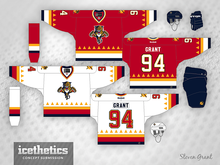
Steven Grant has made one of the sunniest hockey sweaters I've ever seen. These Panthers jerseys were inspired by the sun featured in the club's secondary logo.
Designed by  Steven Grant
 Steven Grant


Reader Comments (11)
I get the sun motif, but if you lose the triangles along the stripes you would make this a pretty good jersey.
Those triangles are awesome! It would be very original and fairly tasteful IMHO.
sorry but i absolutely hate those little teepees.
Eh not really a fan. Sorta reminds me of a cross between Phoenix's old jersey patterns and the Flames.
I am a huge fan of the Panthers identity, and this is a good idea, I think. It has that 90's third jersey feel, something we don't get anymore at all, sadly. I really like this concept, especially how it emphasizes on the alternate logo, which I'm glad they kept over the years. Although it feels a little empty on top. Maybe blue shoulder yokes would compensate. Otherwise, it's a great jersey.
I think that is a pretty cool use of the sun shine motif. I wonder if you could make a more retro looking jersey but maybe try and keep the idea and fit it in.
The triangles wouldn't be seen by the average fan. Instead of the intense gold, I'd have used the gold from the body of the panther. The waistband on the road sweater looks like the German flag.
Hey NascarFan,
Blue yokes would be too busy
the triangles would pop more if they were navy blue
Haha i really like this!
Until that logo goes, the Panthers will never manage to have a strong identity.