Sunday
Sep082013
0568: Seattle Thunderbirds Go Pro
 Sunday · Sep 8 · 2013 | 9:00 AM PDT
  15 Comments

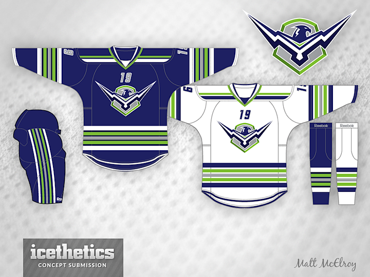
Seattle Sunday is back this week with Matt McElroy's idea for a re-imagined Thunderbirds team. Currently, the T-Birds play in the WHL, but what if they gave up their name to a future NHL club?
Update on Tuesday · Sep 17 · 2013 | 1:18 PM PDT by
 Chris
Chris
 Chris
Chris

Check out the revisions Matt made on his new IceBorn template. You can download the template from the new Templates section of the site. Look for the link on the right side of the page.
Designed by  Matt McElroy
 Matt McElroy


Reader Comments (15)
Decent concept here... In a crest that bell shape in garden green must be ditch out to make a crest simple and crisp. Too many stripes on a jersey and they are very conservative and boring versus that dynamic movement on a crest. I would make sleeve stripes , hem stripes , pant's stripes and socks stripes identical to a crest. Yoke might not be necessary after all. I'm not sold on that college numbers on a front - that doesn't belong to NHL.
I could do without the chest numbers, but other than that it's a solid set.
love the look, and the logo is great! I could see them taking the name over as the WHL team would likely be relocated.
The only change I would make would be the shade of green or the amount of it. That shade would work better as an accent color rather than the secondary color.
I see a big Sherbrooke Phoenix (QMJHL) influence in the logo !!
With that said I still prefer the T-Birds original logo and look !
This is a good concept. I would get rid of the pant stripes. It's just too much with all the stripes. Also for someone who isn't a fan of chest numbers, I think it looks pretty cool. It's unique and doesn't look all that bad. I give this concept a thumbs up!
SEAL Team 6 from Black Ops 2 anybody? (Logo-wise)
Sweet logo, but too many stripes and not a fan of the numbers on the front. Eliminate those and simplify the striping and this is a VERY good concept.
I like the logo, and the striping is good. The one problem I have with this set is that the colour scheme comes too close to that of the Vancouver Canucks, who would be Seattle's closest geographic rival, which would likely lead to an on-ice rivalry. Because the blue and green colours have such a rich tradition in Seattle as well (the Thunderbirds and Totem) it may be unavoidable. Perhaps go with a green base and blue stripes to try to differentiate a little? But please not the bright green like they have here - a kelly or darker green would be better.
It's a cool logo, but I think the striping is too busy and the colour scheme is just too similar to Vancouver. It's one thing to have similar colours to another team in the league, but to be so reminiscent of your closest geographical rival? I get that those colours are significant to Seattle, but imagine if Quebec City got a new team and they decided to use shades of red and blue, or if Houston got a team and went with forest green and dark gray
wow this is my favorite seattle concept so far!!!
@Adam: When Quebec City had a team, they did use shades of red & blue...
I actually had a visceral reaction to this design. Matt is usually producing awesome stuff, but this is just not in my taste wheelhouse. Personally, I prefer the big toucan-alternate they used to wear, and the current style is okay-ish in my book. But this hurts my eyes in color palette, striping, crest, and number font. Sorry, Matt. Like I said, I usually like your stuff. But not this one.
The wings on the logo feel like an homage to the Atlanta Thrashers.
stunning!
Very nice design. I'm just not a fan of the idea that BOTH Pacific Northwest teams should wear the same color scheme.