Saturday
Jan042014
0687: D.C. in Winter
 Saturday · Jan 4 · 2014 | 8:00 AM PST
  7 Comments

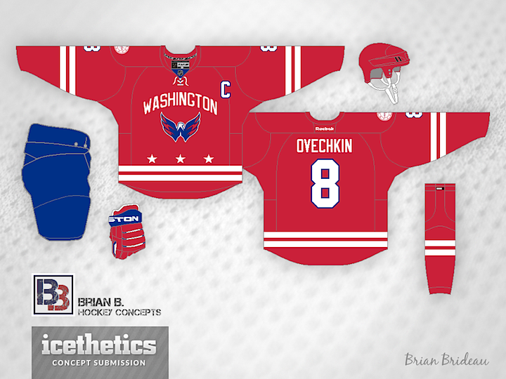
The Washington Capitals will host the next NHL Winter Classic in 2015. But what should they wear when they do? Brian Brideau imagines a uniform inspired by the flag of the District of Columbia.
Designed by  Brian Brideau
 Brian Brideau


Reader Comments (7)
Not a bad design by any stretch but just reminds me a little too much of the Hurricanes' new home uniform, I think some more blue would do this design a lot of good.
Going to see if I can go to that game!
Anywho, unsurprisingly, I, like a lot of you guys can't wait to see what they'll be wearing. Hopefully, something other than their current alternate...maybe it'll be a red version, or something...but dangit, I would be so happy if they brought back this era!
But all in all, this isn't a bad idea...just...could be a little bit better. The Weagle's on the front, so I can't complain.
If Carolina hadn't gone with the striping already, then this would be an absolute keeper. Maybe make one of the stripes blue (perhaps the lower stripe) to make it different.
I didn't make the stripes blue so that it can ressemble the DC Flag...
http://wwp.greenwichmeantime.com/time-zone/usa/dc/flag-washington-dc/
The idea of mimicking the DC flag is very cool, but there just needs to be more blue to tie the logo into the whole design. Blue Shoulder yokes? Blue Forearms? Something, I'm just not sure what. The logo just looks out of place since it's the only part with very much blue.
I don't think they would like wearing the jerseys of their longtime division rival Hurricanes...
Wow, I actually really like this design. I can't stand their current jersey and The logo on the retro alternates are not completely accurate ie. each letter used to be separate as opposed to a single crest. This would be a great update for the Capitals. Love the wordmark and the 3 Stars and of course the horizontal stripes! This works