Monday
Jan062014
0689: Carolina Alternate
 Monday · Jan 6 · 2014 | 8:00 AM PST
  11 Comments

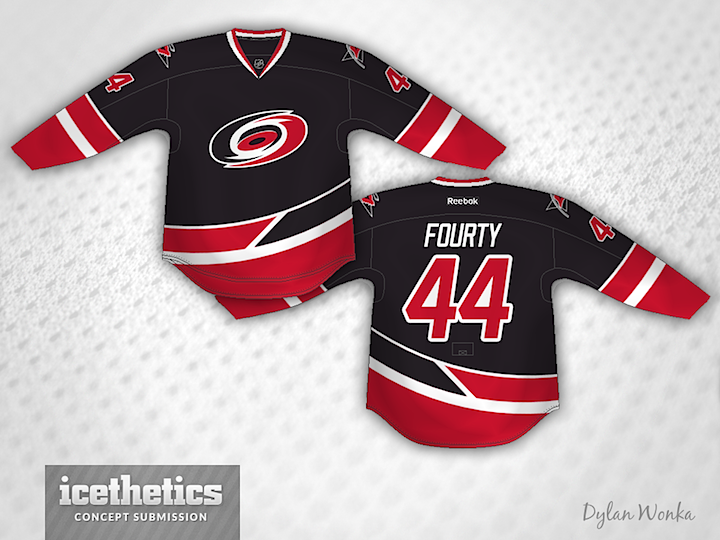
Sometimes you see a concept an have an instant reaction, good or bad. Normally I have to look at something a while before I can form an opinion. But this one from Dylan Wonka hit me immediately. I love this as a third jersey for the Hurricanes. It's one of the most unique striping patterns I've ever posted on these pages. What's your take?
Designed by  Dylan Wonka
 Dylan Wonka


Reader Comments (11)
This is great. And the best part about it is that they could keep wearing red pants and gloves with this set. I never like when teams need a whole new set of gear for their third jersey.
I have to say I like the motion in the stripe - it really says "hurricane strength winds" to me.
Great concept, I would like to see some extra black on the sleeve striping. I hate how bland the 'canes of gone..
very kool! how would it look if the ends of the sleeves were black? but very good nonetheless.
It would certainly add back all the identity that they lost with their new set. This screams Hurricanes. High marks for this one
I really like their current third but I love this jersey too. This is really creative. Is there any chance you could do a red as well as a white version of this jersey? I bet those would be amazing. Great job, this would be an awesome third jersey.
Holy hell, that's amazing!
It seems that everyone is kind of on the same page with the "more black on the sleeves" thing. May I recommend having the top red stripe on the left sleeve be black to match the waist stripe more.
Looks amazing, would also love a see a white and red version of it
I like the idea. Just thinking out loud: should the angle of the separating line between the black and red on the waist stripe be sharper, so that the points of each color a longer, and more curved to match the bottom of the logo. Also, as others have suggested, the same treatment could be applied to the sleeve stripes.
I never post on here, but it's a great site. I just wanted to say that this one should be on the ice today. Gotta promote this jersey any way you can. Solid stuff.