0660: Norway in Sochi
 Sunday · Dec 8 · 2013 | 8:00 AM PST
  3 Comments

Eric Westhaver's Olympic series picks up in its third week with Norway. Another solid design. Maybe Nike should've hired this guy.
 Eric Westhaver


|
|

Eric Westhaver's Olympic series picks up in its third week with Norway. Another solid design. Maybe Nike should've hired this guy.
 Eric Westhaver

As our International Sunday series returns, we're taking a look at a neat set of Olympic jerseys created by Eric Westhaver. Last week, we saw his take on the U.S. This week he tackles Canada. He writes:
Simple, traditional, yet bold. Kind of like Team Canada, right? There are eight gold maple leaves on the back hem of the home and away — and on the right cuff of all three jerseys — to represent eight gold medal wins, and the words, "TRUE NORTH STRONG AND FREE" written on the left cuff. The third is based off of the uniforms worn by the 1948 gold medal winning RCAF Flyers.

 Eric Westhaver

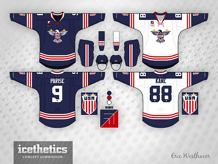
With the Olympics now more than three months away, I'm bringing back International Sundays. Each week we'll take a look at some interesting national team concepts. We're kicking things off with Eric Westhaver — a designer who's work you'll be seeing a lot here — and his take on Team USA. Below is his explanation of the design choices.
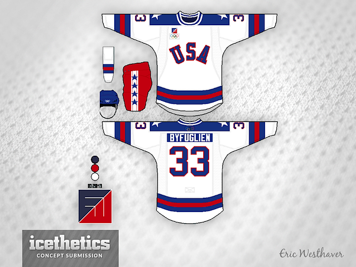
Patriotism reigns supreme here. There is a new eagle logo on the front, a new crest logo on the arms (shown on the side) and a brand new, totally original font with subtle stars and serifs. Eagle and crest both have two gold stars because of the two Olympic gold medals. The throwback is, of course, the Miracle on Ice. Because why not? U.S. hockey has never had a bigger moment after all!

Eric submitted a series of concepts for most of the countries taking part in this winter's Olympic tournament. They will be featured each Sunday.
 Eric Westhaver

Skipping our Winter Classic Saturday series today for something more timely. On Thursday night, the world got a sneak peek of what may be Team Canada's 2014 Olympic jersey. With that in mind, a few concept artists have toyed with the idea. Francis Matte has a revised version of the red sweater along with a white one to match.

Adam Ravenhill decided to stick with the Nike design for the red jersey and also add a white version. Any chance the maple leaf in the middle of that one could be white? Or is that sacrilege in the Great White North?

And now for something completely different. Devin Durocher submitted this one last week, prior to Thursday's leak. He writes: "It's very simple with a few accents. There is a gold 8 in the V of the collar for the 8 golds Canada has won at the Olympics. Also inside the collar at the back of the neck it says TRUE NORTH."
Thoughts on these designs? Are you worried about the official unveiling of Canada's sweaters?
 Adam Ravenhill&
  Devin Durocher&
  Francis Matte

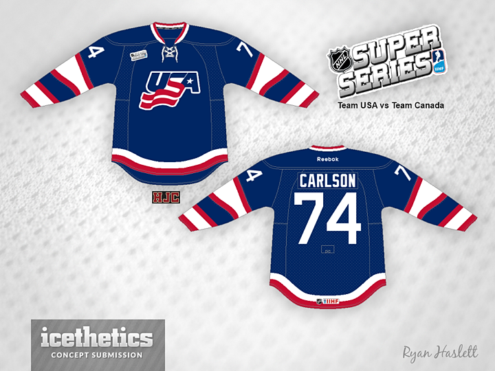
Think it may soon be time to find a new theme for Sundays. Or perhaps to drop the Sunday theme altogether. But for now, Ryan Haslett shares this look for the United States.
 Ryan Haslett

We head back to Scandinavia on this International Sunday with a Team Sweden sweater from Steven Grant. Gotta like a team that doesn't have a white jersey.
 Steven Grant

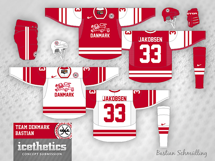
This International Sunday brings us Bastian Schmülling's take on Denmark's national team.
 Bastian Schmülling