Entries in new york americans (6)

Thursday
Jul042013

0502: 237 Years of Americans

It's America's birthday, so how about an Americans concept? The New York Americans, to be precise. Niklas Brinkmann has a full uniform set based on the classic logos of this former NHL club. (By the way, apologies to my Canadian friends for not properly marking your nation's birthday on Monday. I'll make it up tomorrow. Sort of...)

Monday
Feb182013

0366: Reviving the Americans

As we embark on our second year of concept posts, I've got a new theme for this week. We're going to be looking at reviving old hockey franchises. Imagine we live in an alternate universe where it was the New York Americans that emerged as the Big Apple's dominant NHL franchise. Imagine the Rangers merged with the Americans and adopted their name 70 years ago. That's what Matt McElroy has done with today's concept.

Monday
Dec172012

0303: The Americans

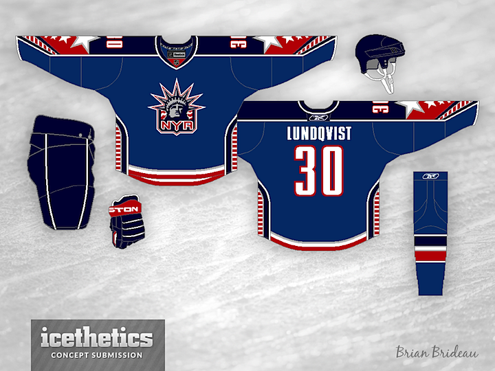
Got a fun one today. Brian Brideau altered the New York Rangers' Lady Liberty logo so it could work as a modern day New York Americans crest. Then he created a really interesting jersey to put it on — with lots of stars and stripes.

Wednesday
Jul042012

0137: A Day for Americans

We're celebrating America's birthday with an Americans concept from Nick Burton. Enough red, white and blue for you? Enough stars and stripes? If not, check back for a Team USA concept scheduled for Sunday.

Monday
Jun112012

0114: The Stars of New York

Stars Week continues with a double feature. What if the New York Americans were still around? What might they look like today? These guys have a few ideas. Brian Bridea put together the first one. Very clean and simple. I could see it in use today. Of course something would have to be done to get the name on the back.

Meanwhile, Scott Saffran's design feels much less modern and more of a throwback. Maybe it's all that "vintage white" we love so much. It's still a neat look. Which of the two do you prefer?

Saturday
May122012

0084: New York Americans

It's a Retro Weekend so Micah Loyed is digging up the past with his New York Americans concept, which is absolutely superb, in my view. I'm especially enjoying the secondary logo. But overall, I like the simplistic look. More NHL teams could stand to look this good.