


It's Back!
Since my return to Icethetics, it seems like I've brought back every feature but one. Arguably, your favorite one! I get emails all the time asking where the concept art went. Well it went to Twitter, but many of you have said that you want it back on the blog.
It's time to revitalize this stagnant Concepts section here at Icethetics. My goal is to get at least one new post a week on this page and ramp it up as more artwork comes in. Let's start with one of our most prolific contributors, Mike Ivall.
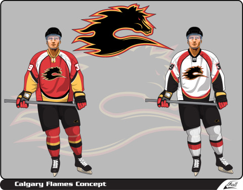 Calgary Flames concept by Ivall
It's a kind of merging of the Flames' old third jersey logo and the classic Flaming C. The jersey designs are very interesting as well, almost evoking a sense of fire and flames — though I don't want to make too much of a case in favor of the Edge design.
Wild fans, this one's for you. Untvar has come up with several different ideas for the forthcoming alternate sweater. Take a look and tell us what you think. Each one is labeled.
;) Minnesota Wild alternate concepts by Untvar
Minnesota Wild alternate concepts by Untvar
Personally I prefer the shade of green in A but I'm also partial to the striping on E. Not caring much for the North Stars-inspired designs but to each his own.
That's what I've got for now. I'm going to comb through my inbox and try to find some artwork I haven't yet posted — including all those Ducks concepts I asked for a few weeks ago! In addition, the Ice Bulls will be announcing their final decision on their new logo tomorrow so I'll be posting all of the submissions I received that didn't make the cut.
It'll all be right here in the newly reinvigorated Concepts section!
 Chris
Chris
Bonus concept!
;) Colorado Avalanche concept by Ivall
Colorado Avalanche concept by Ivall
Mike Ivall just sent in this concept he made for the Colorado Avalanche — with a very Nordique twist.
By the way, if you've got concept art you'd like to see posted. Email it to me at icethetics@gmail.com. Be sure to include your name or the way you'd like to be credited.
Chris
Looks like after all the comments, Mike took another stab at a Colorado Avalanche alternate jersey.
;) Colorado Avalanche concept by Mike Ivall
Colorado Avalanche concept by Mike Ivall

Reader Comments (22)
I like the Nordiques throwback concept a lot... not sure about the white socks though... think they need to be blue!
hmmm. not original at all... would be good as a tribute to the nords, but I would be embarassed to ice a tream wearing this uniform.
Yikes!
For the wild jerseys, C is awesome. too many of them are trying for northstars, and it really doesn't work for the wild.
I really like those Flames concepts, though I would have dome the colouring a little differently. Maybe switch the positions of the yellow and the white on the home jersey, and switch the red and black on the away jersey. Great designs, though. I especially like the reimagined horsehead. Very nice Minnesota and Colorado concepts too.
I love the Flames logo, very creative.
The Flames Concept is absolutey terrible. Logo is Ahh ok but Jersey just hidious!!!
Flames concept is actually really good, but Mike Ivall should probably trash the jersey idea....
That Avalanche/Nordiques logo is... well, interesting. I love the idea, but it just looks tremendously awkward. In a good way. Nice work, Mike.
I loved/love the Nordiques and Avalanche but this uniform is horrible. Those footprints instead of the fleur-de-lys and the horror that is the crest instead of the old "n" igloo is waaaay bad!
Like the avs, looks interesting. +1 for creativity in the CA logo! Calgary...meh not on the bandwagon. As for the wild jersey my fav is b, I like that cut and the yellow is stellar.
Yeah i have to admit i really didnt put much thought into that Avs Design. and your all right! It is very subpar. sorry guys!
You didn't put much thought into it? Are you serious? Except for the the fleur de feet, it's perfect. I probably would have substituted the feet for stylized mountains. I'm thinking along the lines of the old NHL Rockies logo without the red and yellow.
@Backburner
yeah i wa thinking that after i had looked this posts last night. so maybe this idea is not so dead?
That Nordiques tribute would be one of the best jerseys ever. Saying "one of" because the Nords jersey itself was the best ever.
The New Aves third is better then the first attempt, but I think it'd look even better with burgundy pants and gloves and maybe helmet instead of black and white.
where does mike find the player template?
Not a fan of the Flames concept. The Flames already have two of those RBK Edge monstrosities. They don't need another. Go with a traditional hockey jersey that looks like a hockey jersey! As to the logo, it's very creative, but too much so. That "horse" looks more like a flaming Loch Ness monster than a horse.
And what's wrong with a flaming Loch Ness monster? (Besides the obvious jokes, of course.)
That redone Colorado concept looks awesome! It even makes the foot logo look good.
Bring back the North Stars. Let's have Dallas and Minnesota do a compromise. Dallas can be called the Lone Stars and the Wild(STUPID name) be renamed the North Stars with rights to the old North Stars history and record book. If baseball can have both the Red Sox and the White Sox, then what's wrong with two Stars names with each having a different version? Hockey would win bigtime.
What Is That "C" Horse Eating?
I hate to say it...the Canucks DID have a red jersey....and it was one of their worst which is saying a lot!