


USF Ice Bulls Entries
As promised, I'd like to share with you guys all of the USF Ice Bulls logo submissions that didn't quite make the cut. I'll start with the designs that were among the finalists as the team was making its final decision. You can currently see the final logo, designed by Gary Cekus, on IceBulls.org.
All of the following logos and creative artwork are posted on Icethetics with the permission of the designer. Reproduction or use of this artwork in any way without the consent of the designer is expressly prohibited.
FINALISTS
The first runner-up was created by an Icethetics regular, Mike Ivall. In fact, two of Mike's designs were featured in the previous concept post.
;) Mike Ivall
Mike Ivall
Another top contender came from Anthony Lamberty. I prefer the version with the downturned head with the USF lettermark.
;) Anthony Lamberty
Anthony Lamberty
Cale Putnam's concept had some potential. I particularly liked the image of a puck with a horn going through it.
;) Cale Putnam
Cale Putnam
These are just a fraction of the great entries Icethetics received. I'll share more of them later tonight. And not to worry, eventually, I will get around to posting ALL of them.
 Chris
Chris
HONORABLE MENTIONS
The next group are the logos I thought were impressive and deserved a decent shot. Paul Leicht put together a great pair of designs but I think the extremely warped perspective and the cartoon nature of the bull eventually led to its downfall with the team.
;) Paul Leicht
Paul Leicht
Marc Springston went with a simplistic yet effective look — which I recently discovered was disappointingly unoriginal. For shame, Marc. But here it is anyway.
;) Marc Springston
Marc Springston
Aaron Thompson opted for a more symmetrical approach with multiple color options.
;) Aaron Thompson
Aaron Thompson
Another great pair of logos came from John Quincy King. If you want a ferocious-looking full-bodied bull this is definitely the way to go.
;) John Quincy King
John Quincy King
UPDATE: Yeah, no wonder it was the way to go. It's all a lie. It's a stolen logo! Adding John Quincy King to the dishonorable mentions. Unbelievable!
That's it for now. Take these in, digest them, and I'll post more in the morning. Still have about 19 to go.
Chris
Continuing with the honorable mentions in the Ice Bulls logo contest entries.
First up, I have a few entries from some of our best IceHL designers. The IceHL's most prolific artist threw his hat into the ring for the USF hockey team. This is from the other Chris Smith — not me.
;) Chris Smith
Chris Smith
Jason Usher came up with a very pointy look for the team.
;) Jason Usher
Jason Usher
Tony Lardie, who has submitted IceHL work under the moniker Tone Loc Productions, gave the Bulls a very dark feel with this logo set.
;) Tony Lardie
Tony Lardie
Despite being located in a tropical climate, the South Florida Ice Bulls got a desert-style identity from Jeff Wozniak.
;) Jeff Wozniak
Jeff Wozniak
We'll finish tonight with Nick Marks, who also opted for the dead bull look, but managed a couple of hockey-specific elements.
 Nick Marks
I've got even more coming tomorrow. And don't think you've already seen all the good ones. There are still something great logos yet to come!
Chris
I still have two or three more groups left to post, so here's another one now.
Kevin Pearson has a solid and simple design to contribute.
;) Kevin Pearson
Kevin Pearson
A completely different feel for the team comes from Patrick Grixti.
;) Patrick Grixti
Patrick Grixti
Ben Uhrich's bull is staring us down. Don't mess with it.
;) Ben Uhrich
Ben Uhrich
The final set for tonight comes from Marcin Nowicki, who cleverly worked a pair of hockey sticks and a pair of pucks into his Ice Bulls logos.
;) Marcin Nowicki
Marcin Nowicki
Two more groups to come, including a bunch of "dishonorable mentions." You'll see why.
Chris
This group will wrap up the honorable mentions. First up, Jake Niehl's bull is wearing an old-fashioned goalie mask. He even included a 20th anniversary logo in his set.
;) Jake Niehl
Jake Niehl
Brice Bairhalter included a 20th anniversary logo and a jersey design with his primary logo.
;) Brice Bairhalter
Brice Bairhalter
Brian Cerruti's bull is doing some heavy breathing — notice the icicles on the nostrils.
;) Brian Cerruti
Brian Cerruti
Our last honorable mention is a bit abstract. Slightly reminiscent of the Buffaslug, these logos by Steve Howell are definitely something you can stare at for a little while.
;) Steve Howell
Steve Howell
Tomorrow we'll get to the final group — the "dishonorable mentions." After that, we can start getting back to some of the other concept art that's been coming in.
Chris
DISHONORABLE MENTIONS
Tonight we finish off the Ice Bulls logo contest entries with the dishonorable mentions. These are renegades — the people for whom rules are merely a suggestion. The outlaws whose penchant for rebellion have earned them zero consideration in this project.
We start with one I mistakenly posted in the previous "honorable" mentions. There's no honor in thievery. Elias Cripotos nabbed his bull from iStockphoto of all places. He added a stick and changed the colors. This does not make it original.
 Elias Cripotos
Jesse Desrochers joined the trademark infringement club with this particular logo. It's origin escapes me at the moment, but I know there's an astute Icethetics reader out there who will place it for us in a jiffy.
 Jesse Desrochers
Though tongue-in-cheek I'm sure it was, it's nevertheless unsettling to see my inbox cluttered with "joke entries" such as the one provided by Charlie King. At least, I hope it was a joke.
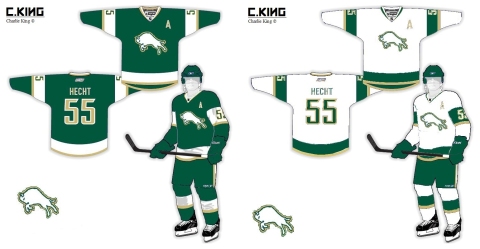 Charlie King
Bart Nelson was one of the lawless renegades who decided the rules were optional. He didn't really design a logo — unless you could the 20th anniversary attempt. Instead, he designed jerseys which were never asked for. Sorry Bart, they just needed a logo.
 Bart Nelson
Yet another designer didn't bother with a primary logo — not even a jersey design. Jeremy Cannon offered up nothing more than a 20th anniversary logo made solely of text — and not even with the recommended font. Such outlaws!
 Jeremy Cannon
And finally, Joseph Lee needs no introduction. He knows what he did.
 Joseph Lee
I apologize to anyone who felt offended by this part of the post. My intention was not to ostracize so much as point out that some rules are, in fact, not meant to be broken. And perhaps in the future, you'll think twice about submitting stolen artwork to a contest for a real world hockey team.
Now we'll get back to the good concept posts. I've got some awesome artwork on the way!
Chris
Just got a late entry from Chad Stilson that I really wanted to share.
;) Chad Stilson
Chad Stilson
Fantastic work by Chad. If you're still working on an Ice Bulls concept, feel free to send it along and I'll add it to this post.
;)
;)
;)
