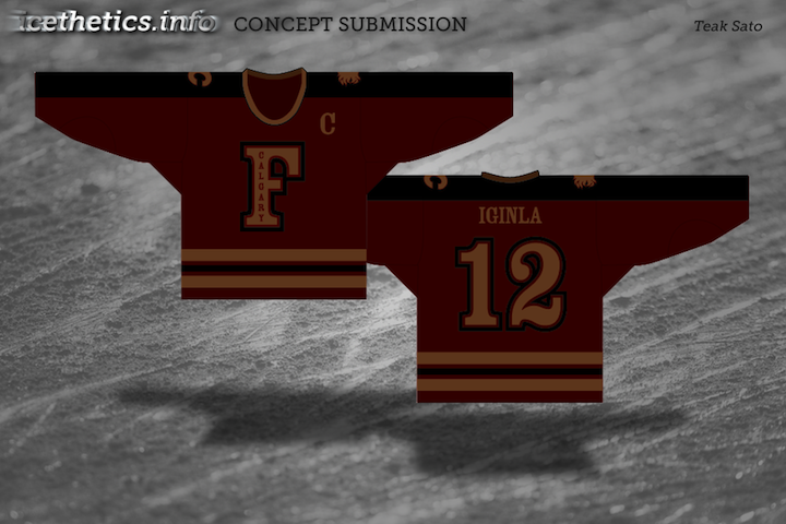
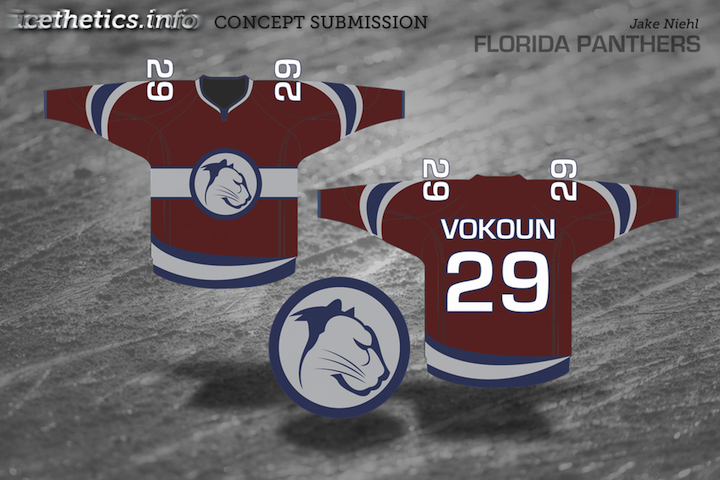
Entries in flames (9)

Monday
Dec192011

Concept Collection 51

Yes, it's been a while. But it's better now than never, right? I'm currently trying to develop a new system for posting concept art that makes things simpler for me. (That's always the unreachable goal.) In the meantime, I'll do my best to keep this page updated a little more often.

One last thing. Help me out here. I know some of you think I've been "making you wait" for new concepts, but that's not how it is. Having said that, if you perhaps don't care for the designs in this set and feel like commenting to say something like, "I've waited months for this?!", don't bother. It'll only tell me there's no point to updating the page in the future. Rate the designs, move on, and check back later. I can't please everybody, nor will I try to do so. Just know that I'm doing my best to keep all aspects of Icethetics updated.

Thursday
May052011

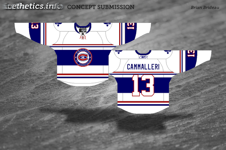
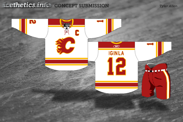
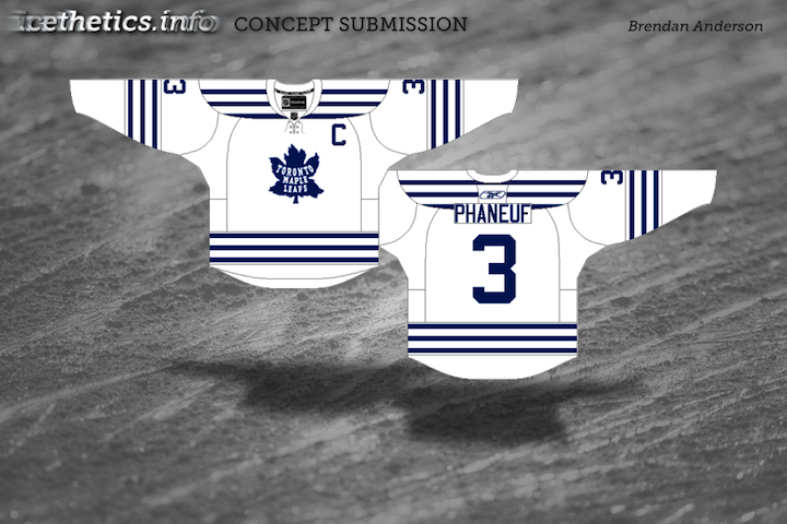
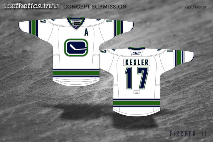
Collection 28: Canadian White Out

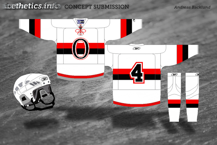
It's weird. Last time I updated Concepts was only a week ago and the Lightning had just dispatched with the Pittsburgh Penguins in the first round of the playoffs. Now the Bolts are already moving on to the Conference Finals with a sweep of the Capitals! So much can happen in a week.

Now with a brief break in the action, I thought it might be time for a concept post that honors a playoff tradition — the white out. And it just so happens these are all Canadian teams.

If it seems my team's unlikely playoff run is resulting in fewer updates to the site, I won't argue with that. I fully expected to be enjoying the Stanley Cup playoffs from the sidelines. But with my team in the middle of it, I find it hard to spend my free time doing anything but cheering them on.

I'll do my best to keep the updates coming when I can.

Friday
Mar252011

Concept Collection 19

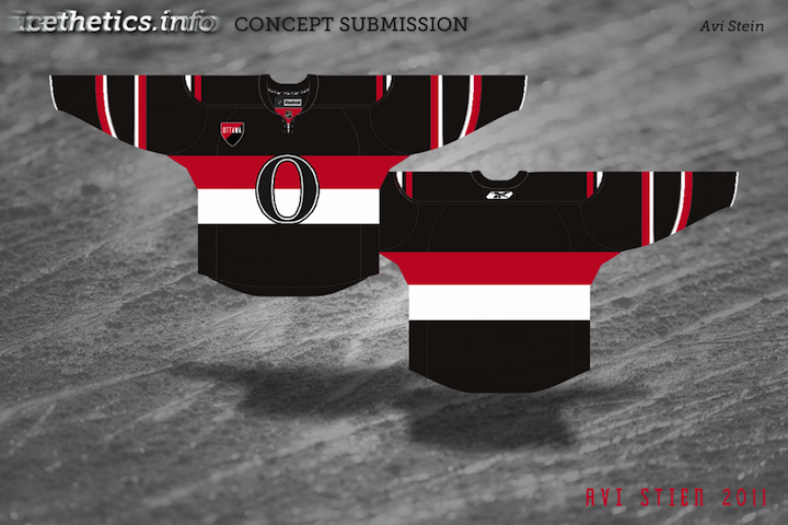
No theme for this collection. Just a nice, varied assortment. But of course we have to start with the Senators' forthcoming Heritage Jersey — which we got a sneak peek of this week.

The way the jersey is folded in the photo the Sens provided leaves the design open to interpretation. It's not a bad attempt by Avi, but I think he may have strayed from the target. The shield he's put on the chest appears to be on the shoulder instead. And if it is in fact the "O" on the front, the photo does show that it doesn't have the double-stroke seen here. Otherwise, I'd bet it's pretty close. Anyone else want to take a crack at it?

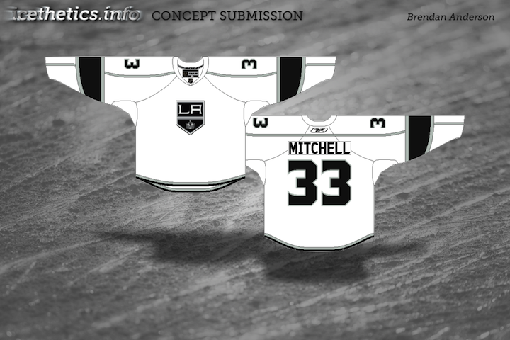
Brendan's design is likely pretty close to the road uniform we'll see from the Kings next season. I'd bet on a black collar and maybe more black on the sleeves to add contrast. Now for the fun stuff...

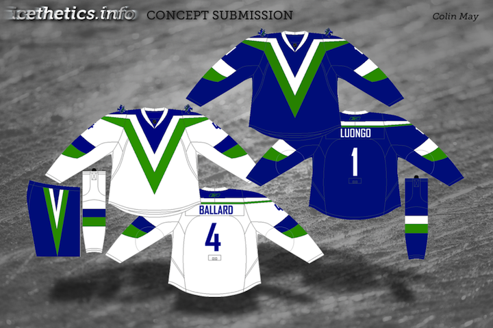
So what do you think of that? I'm particularly fond of Colin's Canucks design!